Shop The Look: The Writer’s Room at The SF Decorator’s Show House
Author:Abigail StoneKristen Pena of K Interiors shares the story behind the The Writer’s Room she created for the 2019 San Francisco Decorator Showcase. Photos by R. Brad Knipstein

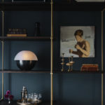
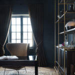
Maybe it’s because I’m a writer but I’m always curious how designers translate the setting for my work into a space that’s inviting and comfortable. Here, Kristen Pena’s visual answer to that question, based on the room she created at the SF Decorator Showcase, hits all the right notes. Dark walls set a contemplative tone, there’s an inspiration board to tack up quotes and help keep track of the beats of a long story. Interesting artifacts, well-thumbed books and sexy barware round out a room that touches on all the facets that bring order to the chaotic world of creativity.
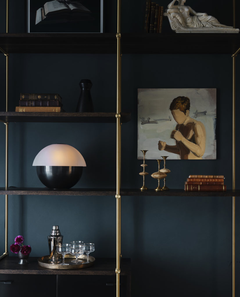
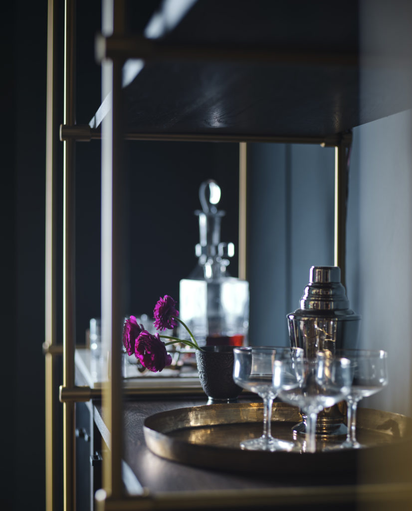
“The room design started with this Amuneal shelf. We very much wanted to include a shelving system that was large in physical scale, but was not overwhelming visually. The mix of blackened oak, brass and steel really set the tone for the masculine and sexy vibe that we were going for.
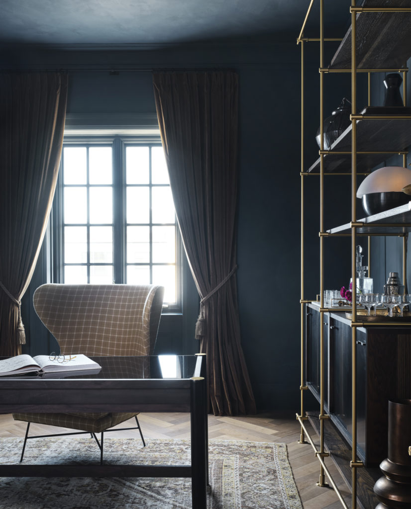
My favorite piece in the space, the custom Peña desk, was a collaboration between Thomas Hayes and myself. We had been talking for a while about making a piece of furniture together and this felt like a great opportunity. The mix of materials – hand stitched leather, brass, and walnut with charcoal oil and black glass could not have been more beautiful. The design process started with the circular legs that ran from the top of the desk to the floor and the mix of materials.
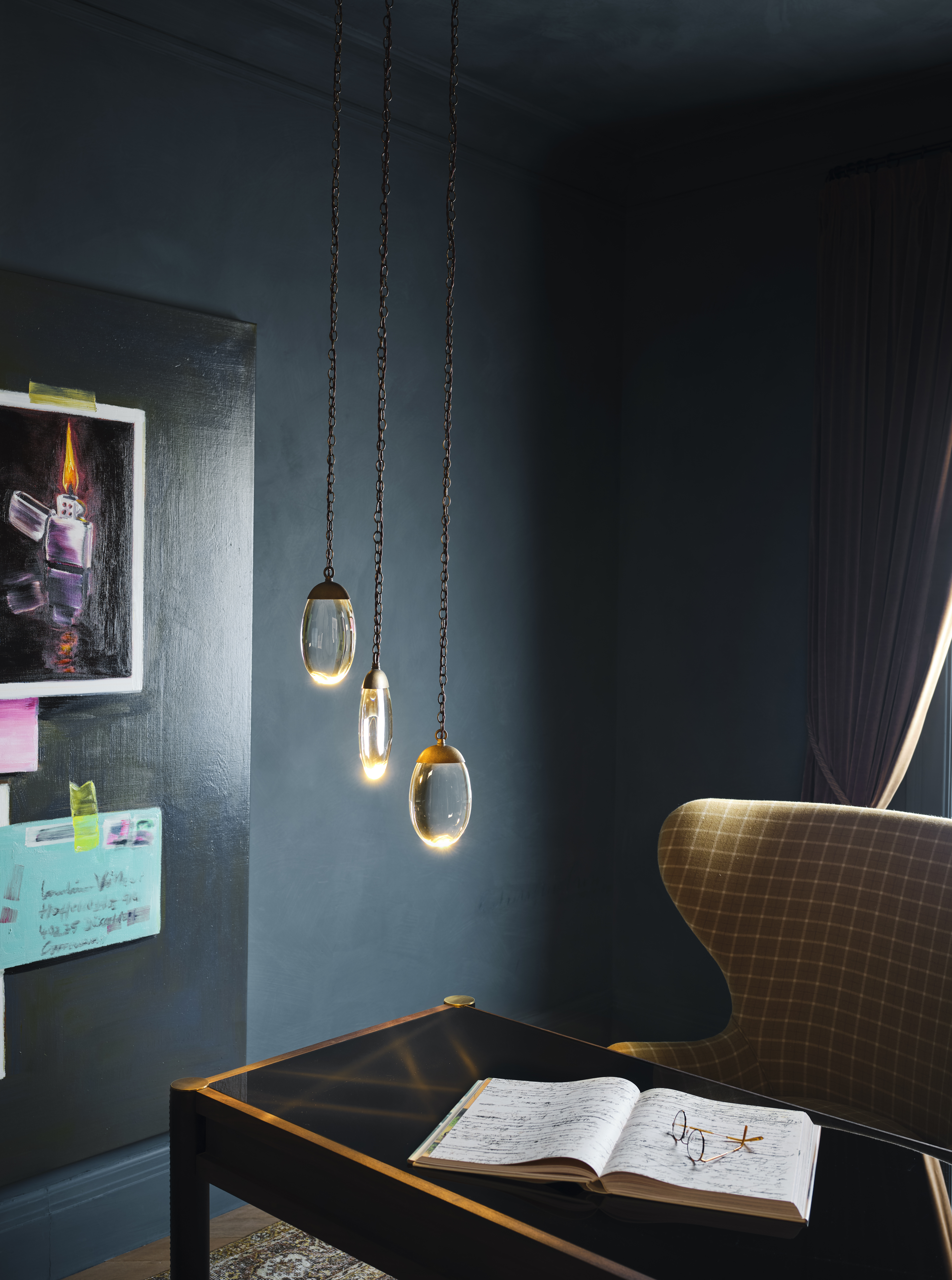
The way the 3 Pebble Light from Ochre pendant reflected on the glass desktop was a lucky bonus; an invisible lightswitch from Forbes & Lomax keeps the jarring elements to a minimum. The Highland Wingback chair was the perfect — majestic but enveloping and cozy — accompaniment.

The room needed something old and something feminine. The vintage chaise was the perfect piece to do both. The chaise was rebuilt and upholstered in partnership with Revitaliste in a Fog & Fury hand-felted wool, silk and mohair textile. The curves of the piece and the organic luxurious textile were the perfect balance to the harder, darker and more masculine materials.
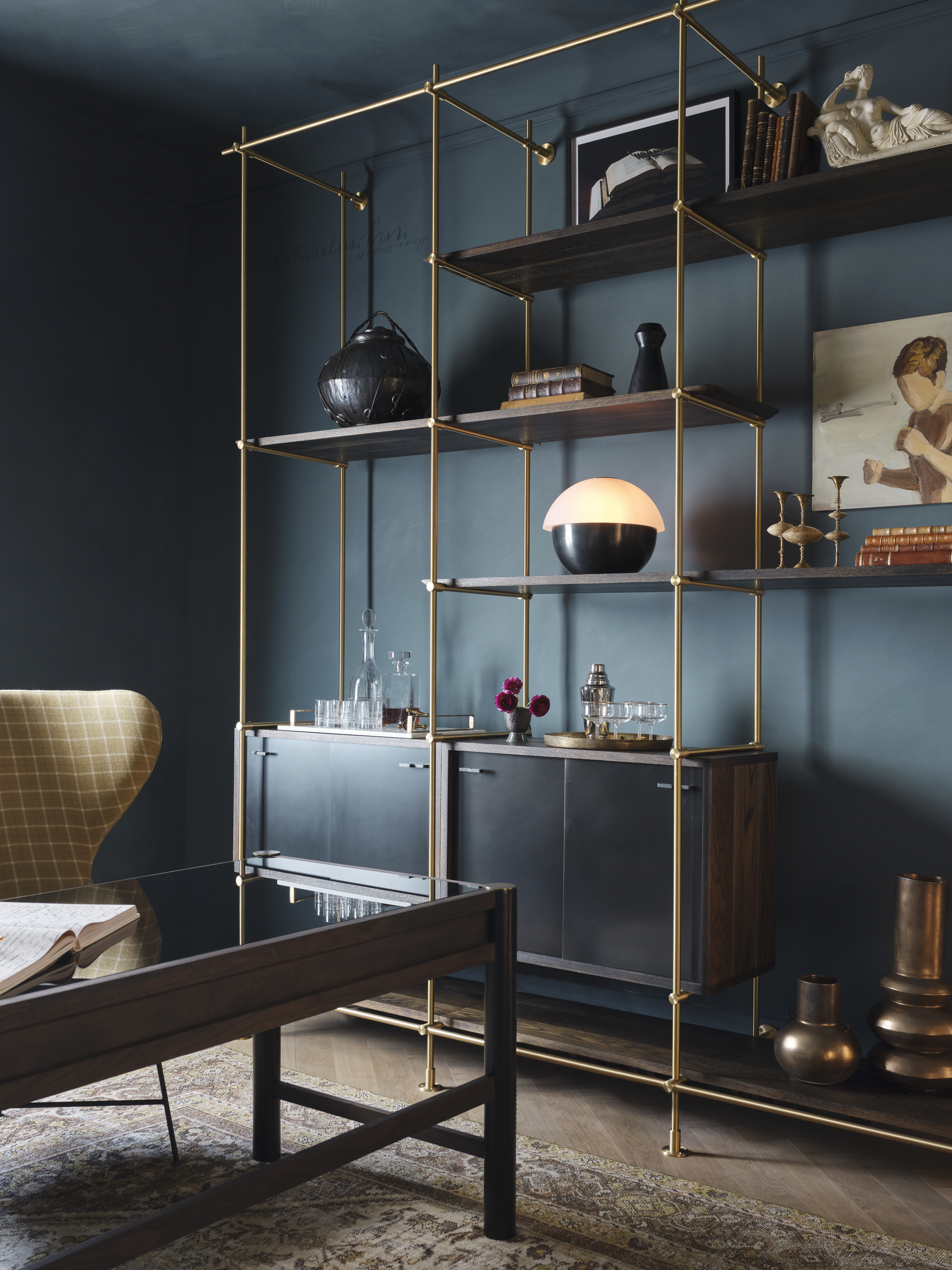
The original floors in the space — a mix of fir and oak — were in rough shape. We knew we needed to redo the floors, so we turned to Hakwood. Our hope was to have the space feel Parisian with the dark lime walls and herringbone floors. Hakwood herringbone floors in Ideal were the perfect choice.
Who doesn’t love a worn 1920’s Persian rug? The subtle color palette of the Marc Phillips Antique Mahal Rug was the piece that tied the walls and the textiles together into one unified whole and really solidified the feel of the room.
