Historic 1920’s West Adams Adobe, $1.6M
Author:Philip Ferrato
Built for the poet Alice Lynch in 1922, this chic throwback to another era was a collaboration of the prominent architect Henry Harwood Hewitt and architect/contractor John Byers. Hewitt was a graduate of MIT and the Ecole de Beaux Arts in Paris; Byers was a specialist contractor in addition to being an architect, producing much of his own building materials, including the adobe bricks used in the Lynch house. Although Harwood built a number of substantial residential, civic and commercial projects, he was well-connected to LA’s literary and theatrical milieu and worked with Byers on a number of adobe structures. At almost 100 years old, the Lynch home is a survivor, and significantly, Los Angeles Historic Landmark 621.
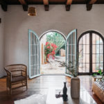
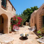
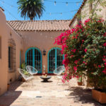
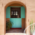
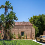
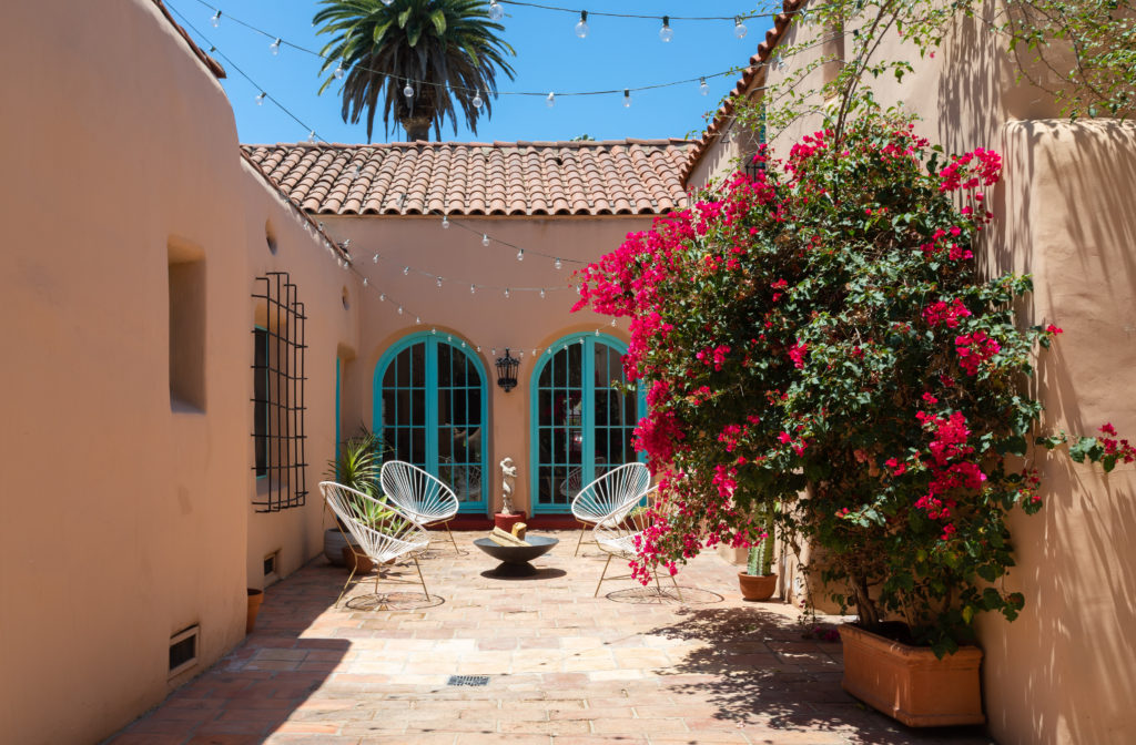
Adobe was the original building material of Spanish Colonial California, from Escondido in the south to the Presidio at the Golden Gate, resulting in an iconic building type that would remain the standard until the arrival of the timber-built tradition, brought by ships’ carpenters from New England just before the Gold Rush. The original adobe (the technique would become the style) was a simple sun-dried brick covered in whitewashed plaster. Below, the unassuming but striking street front. The house forms a U around a central courtyard.
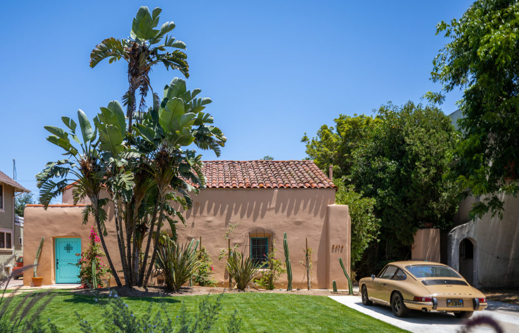
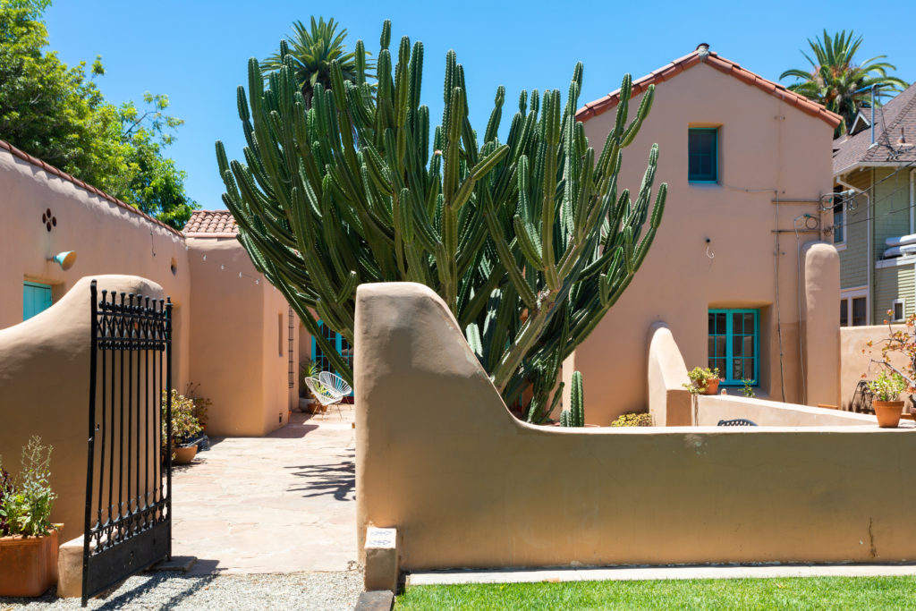
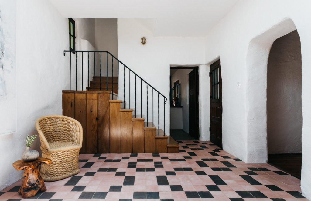
Los Angeles is littered with Spanish Revival structures, a huge variety ranging from multi-unit structures and bungalows to handsome mansions and banks, many of which were built in the 1920s, except that very few are actually adobe. Even in the 1920s, this was a romantic and radical house, handmade with techniques dating back to the 18th Century– and yet inescapably modern.
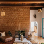
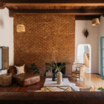
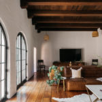
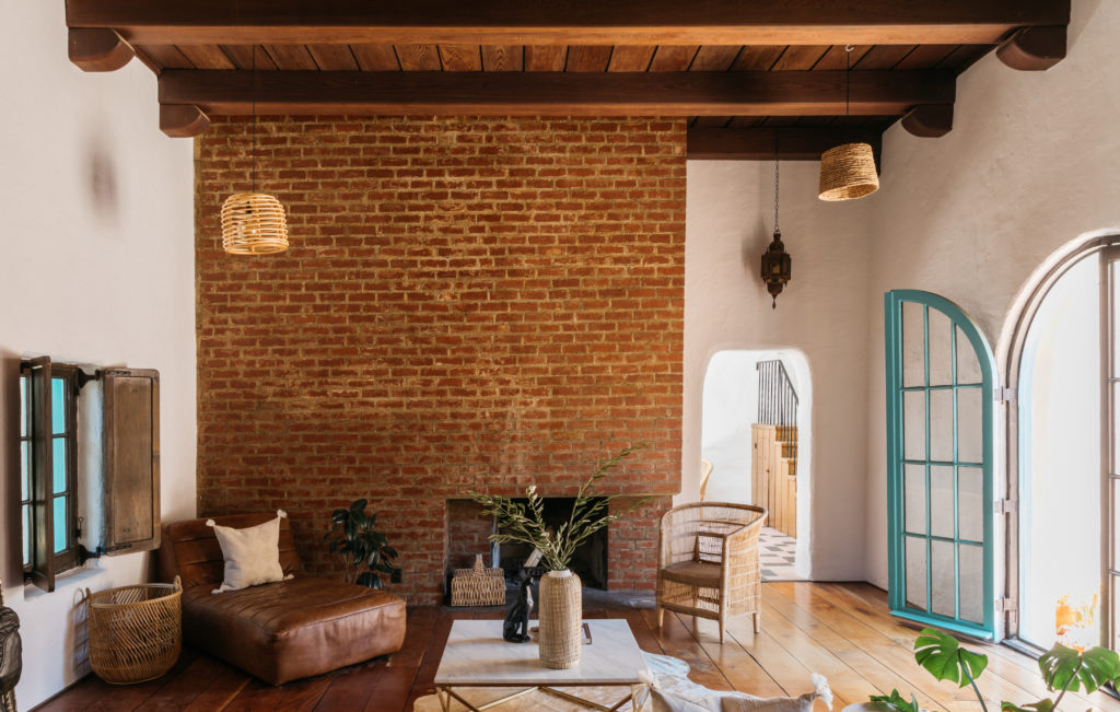
The owners had already undertaken a sensitive and stylish renovation and entrusted designer/realtor Julian Porcino (with whom they worked previously) to restyle the house for sale. At top and below, the living room scale and volume comes as a surprise, and Porcino told us the massively austere brick fireplace is a Hewitt signature design detail.
“I was inspired by the simplicity of the Adobe architecture and how something so old and beautiful can feel so minimal and modern at the same time. Old/new is one of my absolute favorite contrasts. When styling the home I wanted to pare it down, keep it minimal and allow the architectural beauty of the home to shine.”
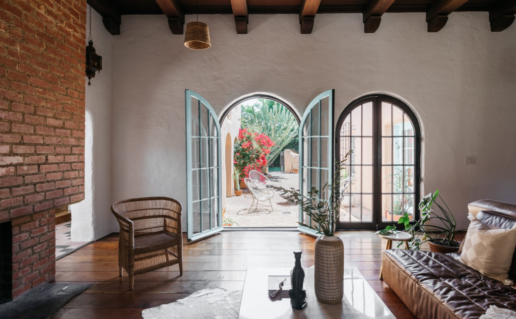
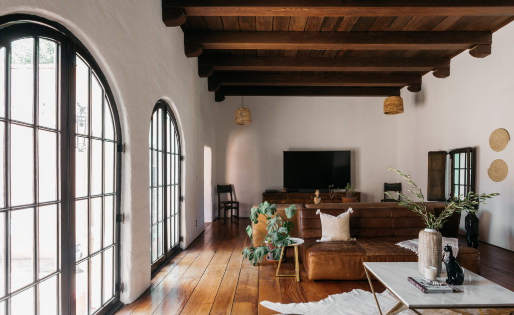
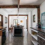
Below, the kitchen still has its timber original framing, and a doorway has been cleverly converted into a pass-through to the patio.
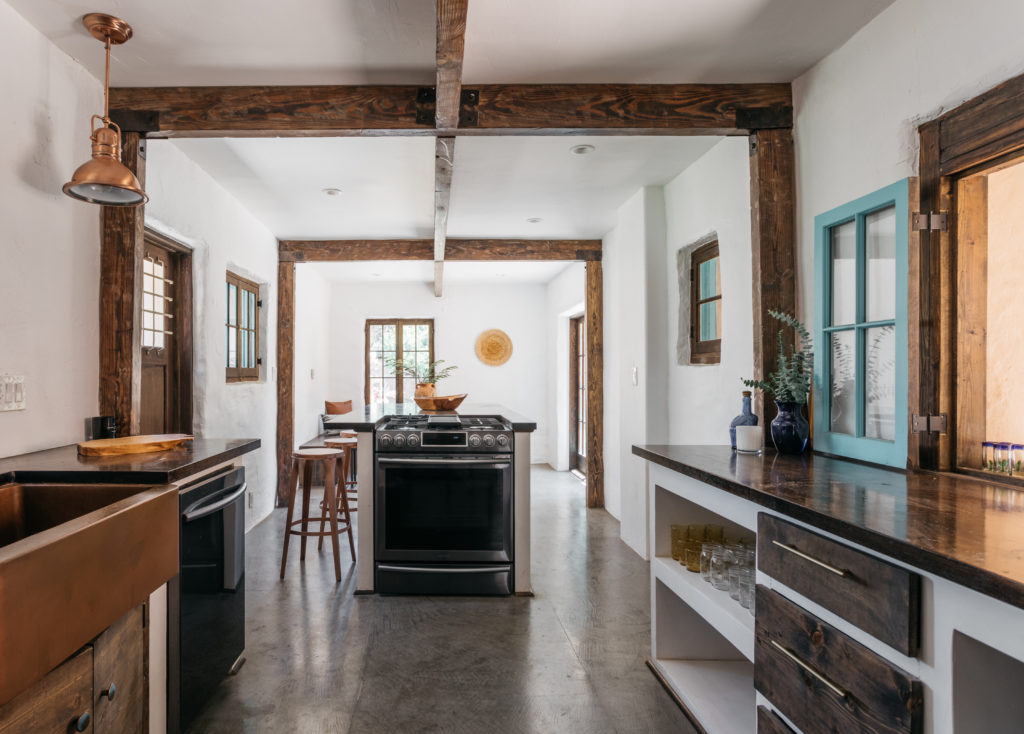
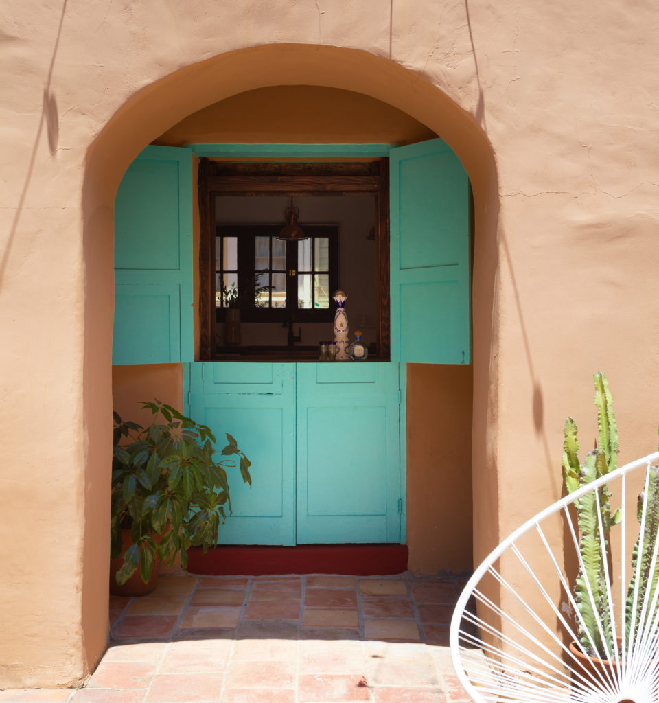
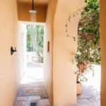
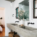
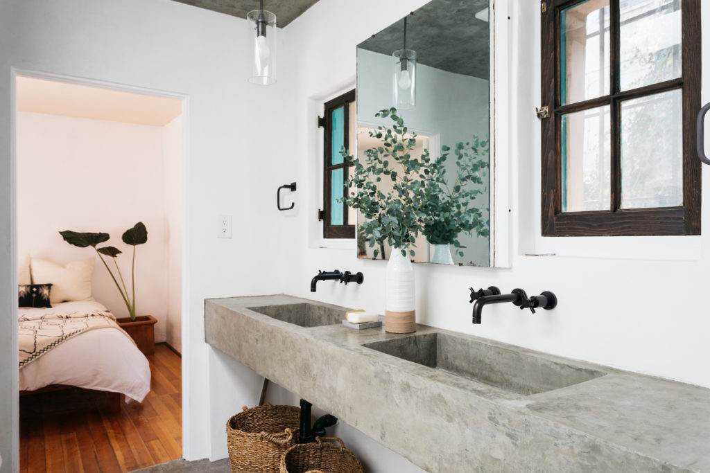
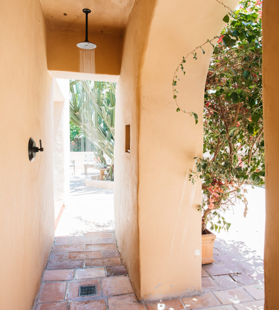
The owners also renovated the baths (one of which is below) but also managed to find the perfect nook for an outdoor shower in the loggia.
More: Go to the listing for additional images and details. An extraordinary opportunity to own a prime piece of Los Angeles architectural history, represented by Julian Porcino at Compass.
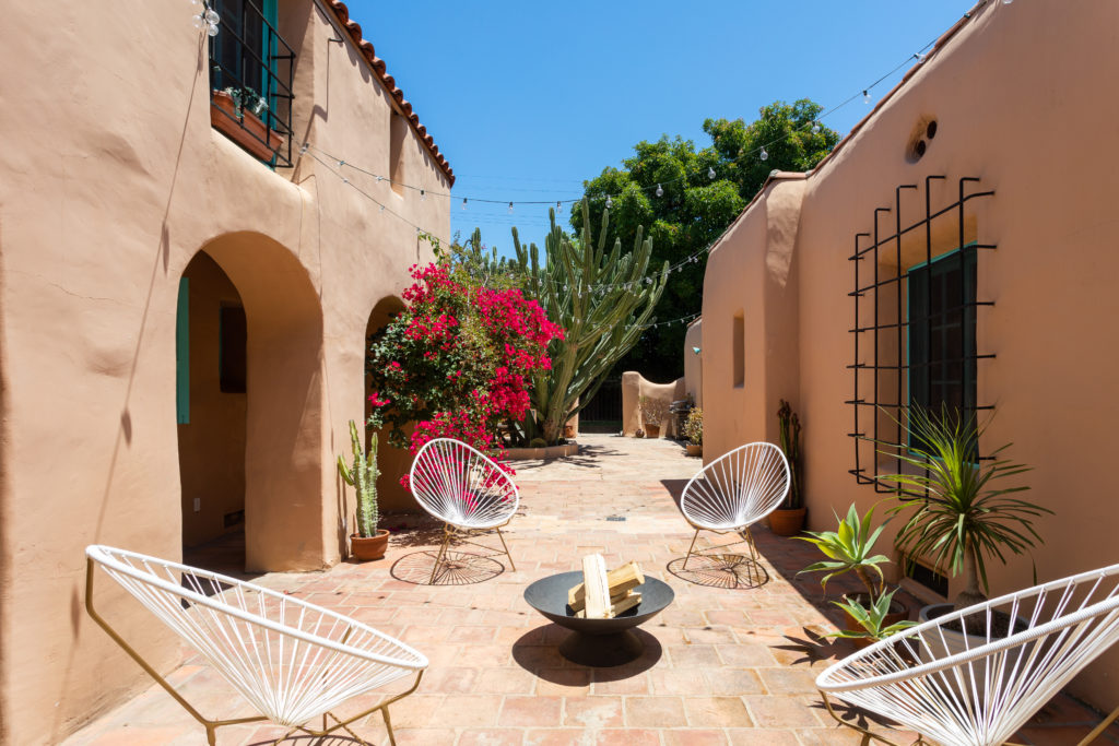
Photo Credit: Virtually Here Studios for Compass
