True Colors
Author:Lindsey ShookStudio Heimat curates a gallery in the San Francisco sky
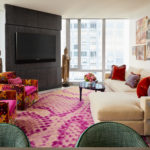
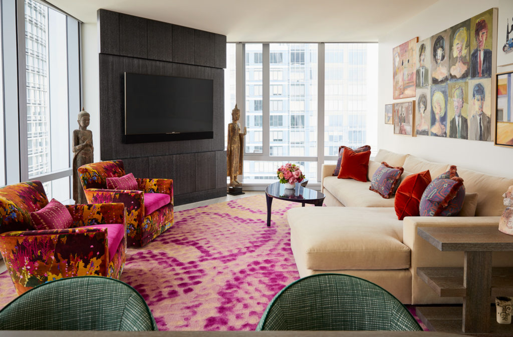
“We believe a home is a unique interaction between our physical space and the beings that live within that environment. This particular interaction results in memories and moments that impact us for years to come and become a part of our narrative,” says Eva Muller Bradley, co-founder of Studio Heimat. When tasked with the opportunity to define a space within San Francisco’s luxury condo building—181 Fremont—they honed in on their client’s love of art, color and activism, making a bold statement.
Photos by John Merkl.
“In this project, we tried to envelop our client in a feeling of warmth, and color, a feast for the eyes in texture, pattern and hue,” says Bradley’s partner Alicia Cheung on the overall approach to this 1,600-square-foot high-rise apartment. “She is extremely warm, very passionate about specific charitable causes benefiting women and children. She is a champion of artists and creatives and is a lover of fashion.”
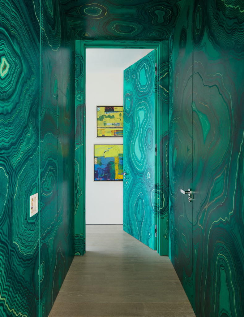
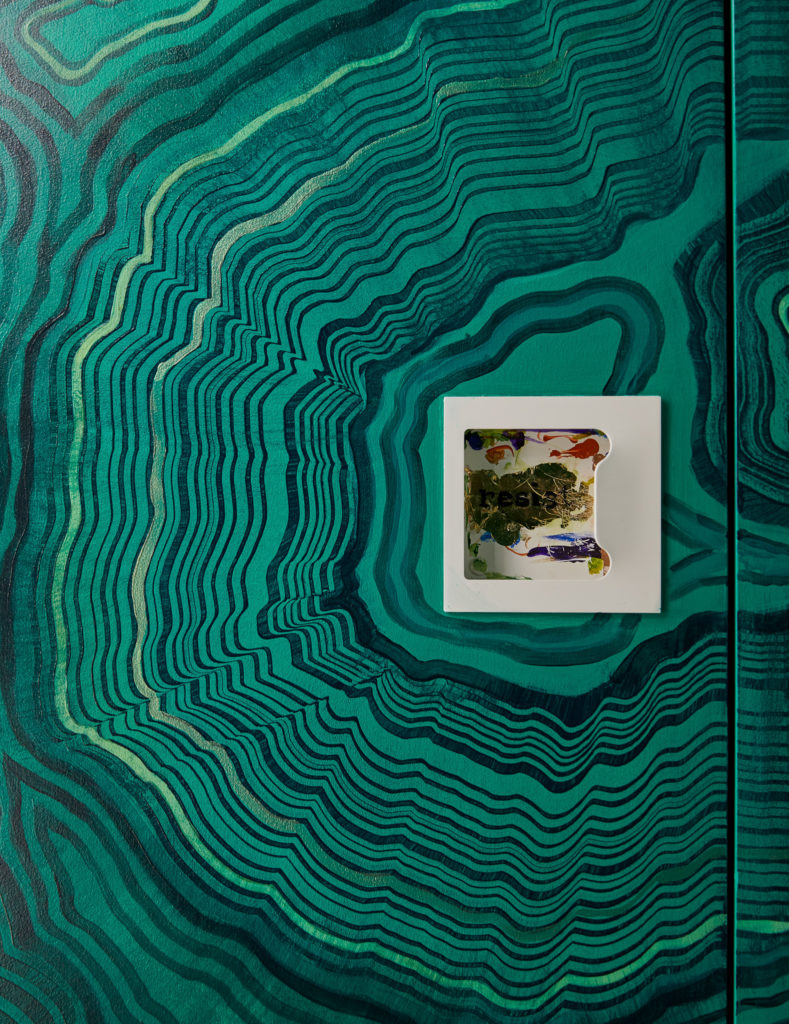
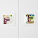
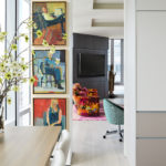
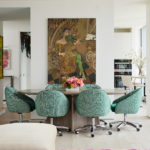
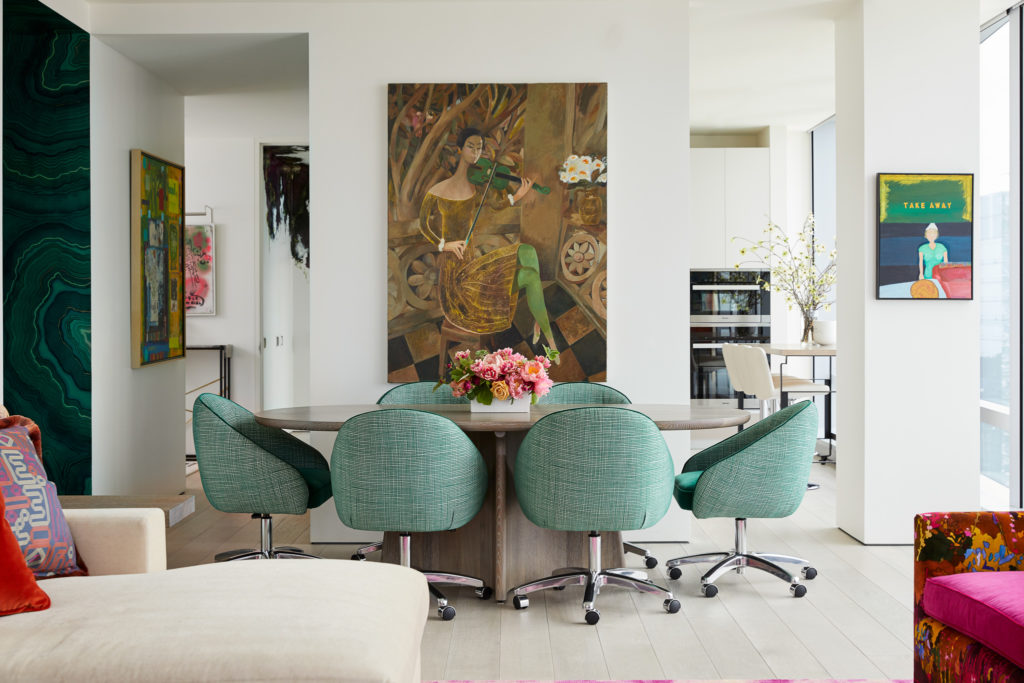
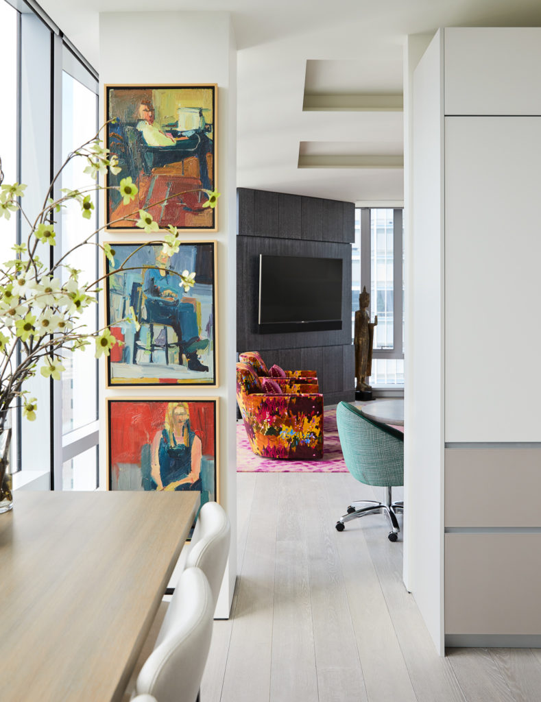
Having worked with the client on two prior projects, they took cues from her vivacious style and focused on blending bold color throughout. “Our inspiration is always art—and luckily for us—our client has a great eye and an extensive art collection that we curated,” Bradley notes. “The artwork, composed and arranged to fit the space, really gives the home a fun yet approachable vibe.”
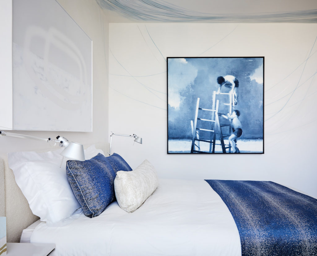
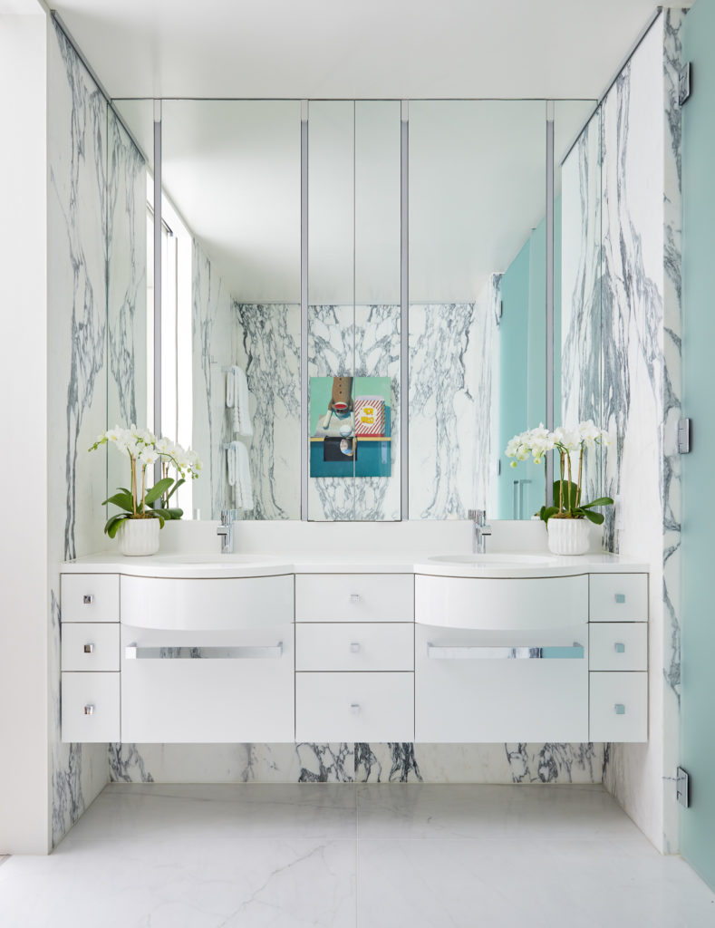
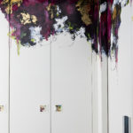
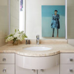
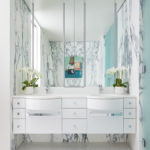
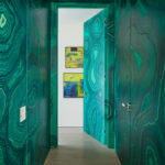
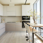
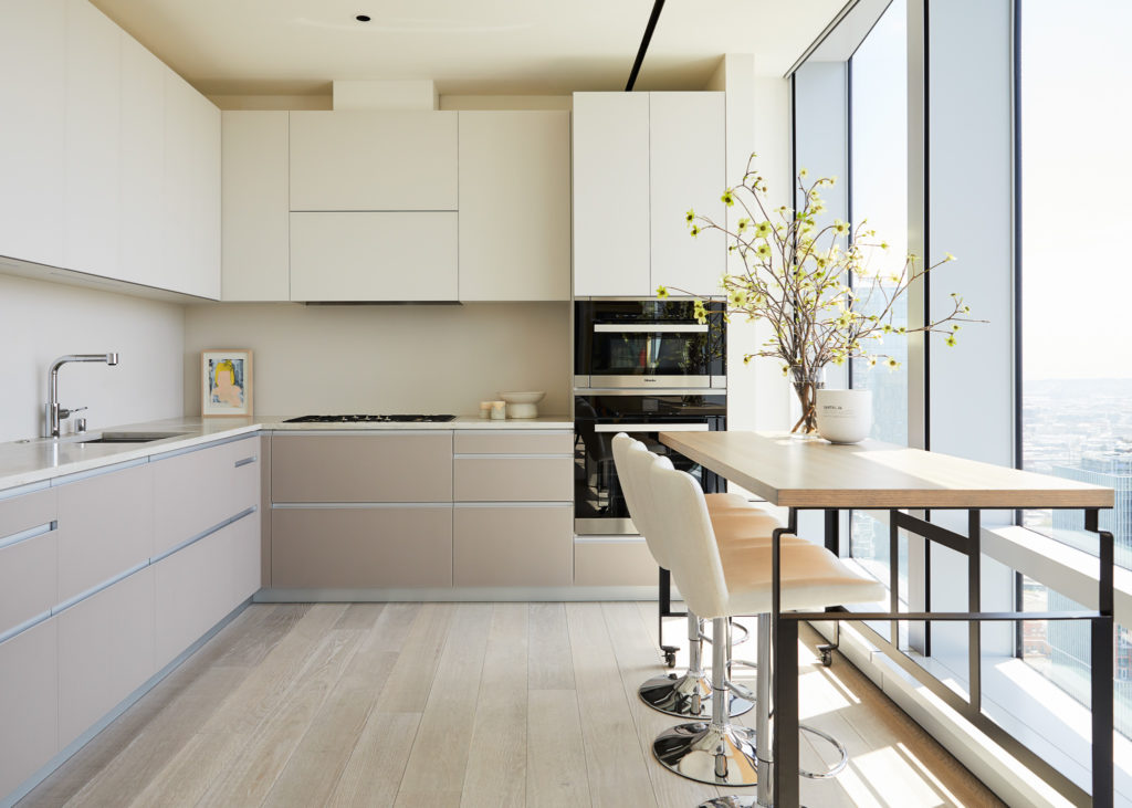
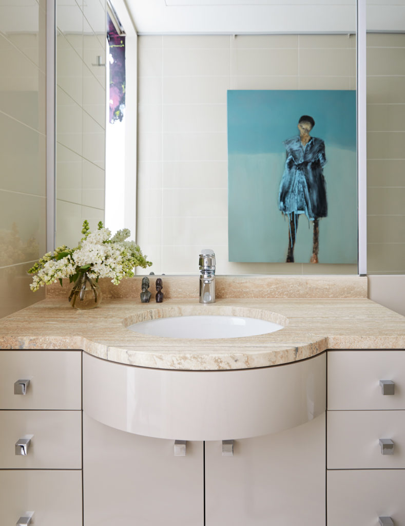
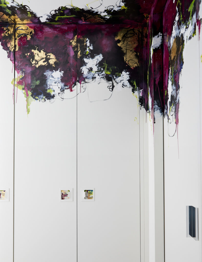
Each room—bathrooms included–serve as a gallery for the art while maintaining a sophisticated style and functional flow. The existing shell lacked luster and efficient storage for the client’s expansive collection of clothing, shoes, handbags and jewelry. They began by infusing the space with colorful details including a hallway covered in a green malachite decorative treatment by Caroline Lizarraga Decorative Painting.
Photos by John Merkl.
Photos by John Merkl.
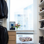
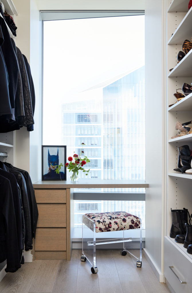
The focus then turned to maximizing the storage. They transformed a den into an expanded master, walk-in closet, equipped with, “a vanity that seamlessly fits into the window area- and it feels like you’re putting your makeup on, floating in the sky,” Cheung notes.
Photos by John Merkl.
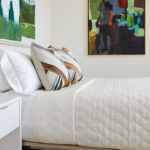
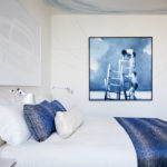
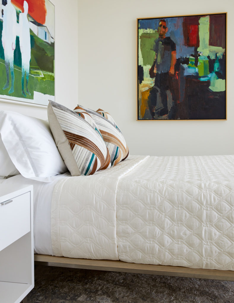
In the master bedroom, they designed a custom headboard with integrated nightstands made of thick stainless steel material that have outlets built-in. “There was a fair amount of electrical work to coordinate to make that come to life,” says Bradley.
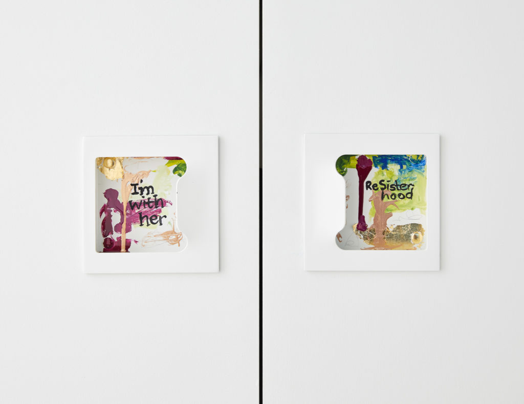
The final result is a gallery that feels as if it’s floating in the San Francisco sky. “Our client was thrilled to move in and be settled,” Cheung says. “She enjoyed the way we curated her artwork together, particularly over the sectional in the living room.”
