Starting Fresh
Author:Lindsey ShookS.F-based MALONE breathes new life into a dated spec home for a young family
“Studying architecture gave me understanding of the broader strokes of interior design—light, flow and space. Whereas fashion, gave me an appreciation for detail which ultimately translates into anything from the layout of tile to the placement of a bathroom knob,” says Malone Detro of MALONE on how her diverse background contributes to the firm’s design philosophy.
This approach is what appealed to a young family from Brooklyn, NY who recently moved to the Bay Area and were about to embark on their first major renovation of a 5,000-square-foot home in Hillsborough, CA. “The family loves entertaining, and together we created a home that they do not have to be afraid to live in,” says Detro. “Instead, the house acts as the catalyst for playful days and enlivened nights for years to come. “
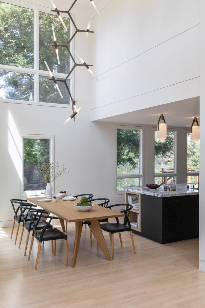
Photo by S.E.N. Creative Co.
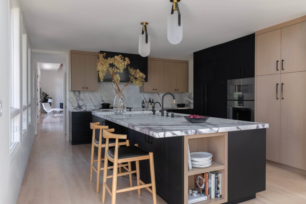
Photo by S.E.N. Creative Co.
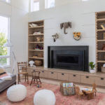
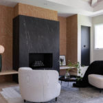
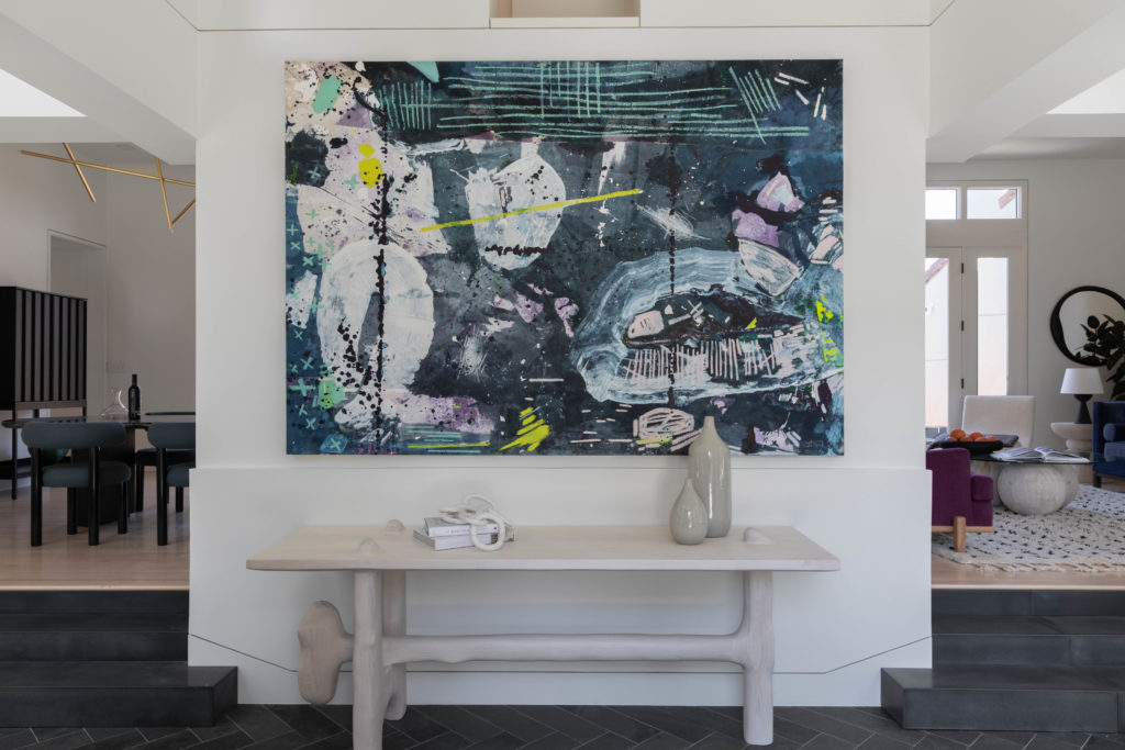
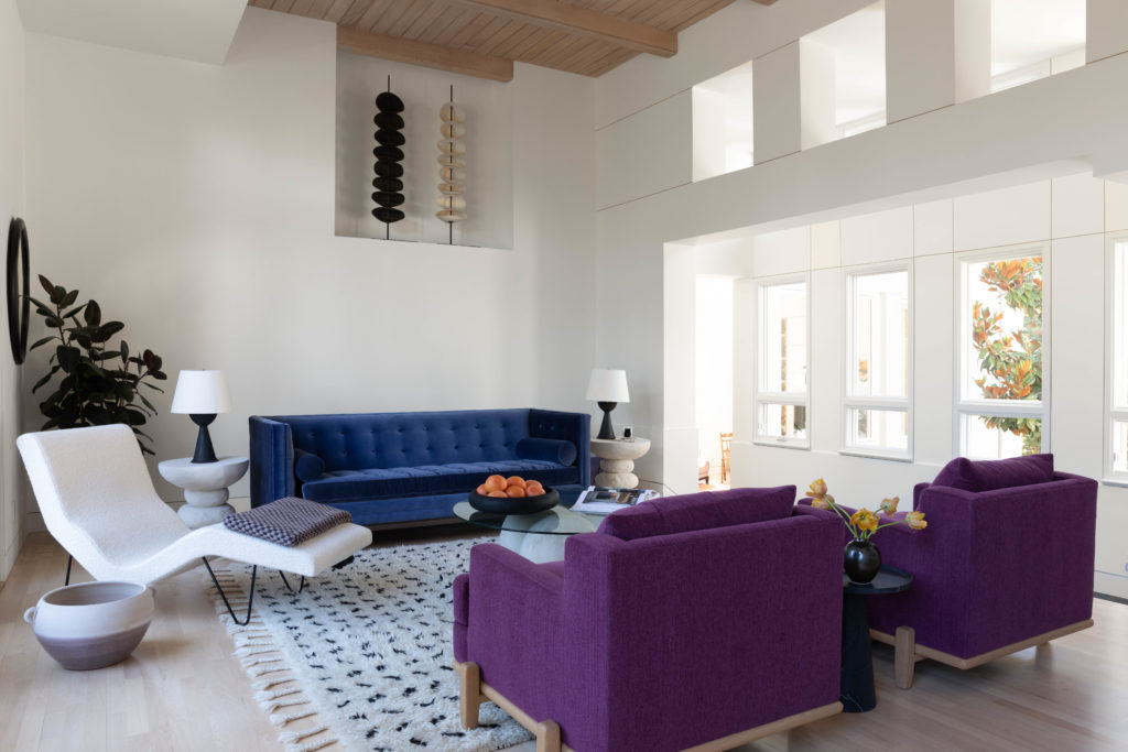
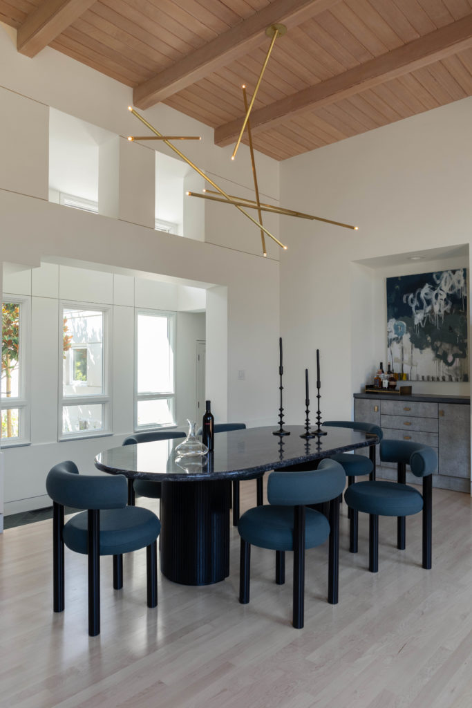
Built in 1992 as a spec home, the exterior style was California Mediterranean while the interior was a blend of 2000s contemporary. “While some aspects had become outdated (fireplaces, bathrooms, kitchen) the bones of the house were still gorgeous and unique,” she notes. “My main approach to the space was to keep the original design intention relatively in tact while using materiality and custom detailing to bring it into the modern era.”
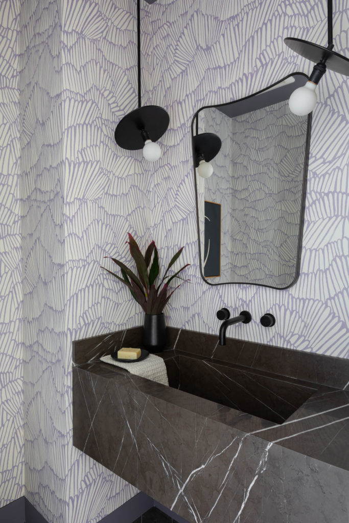
Photo by S.E.N. Creative Co.
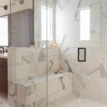
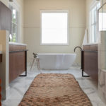
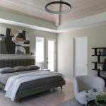
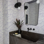
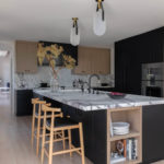
The overarching goal was to create clean and functional spaces that were fun and would grow with the family. “We gutted the kitchen, primary suite, bathrooms, and laundry room to rework the floor plans and create a better flow throughout,” says Detro.”Otherwise, it was just a matter of updating fixtures and materials to allow the original architecture to shine in a more modern light.”
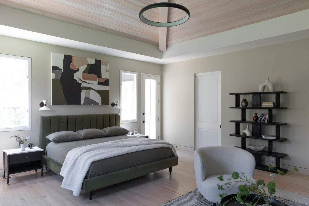
Photo by S.E.N. Creative Co.
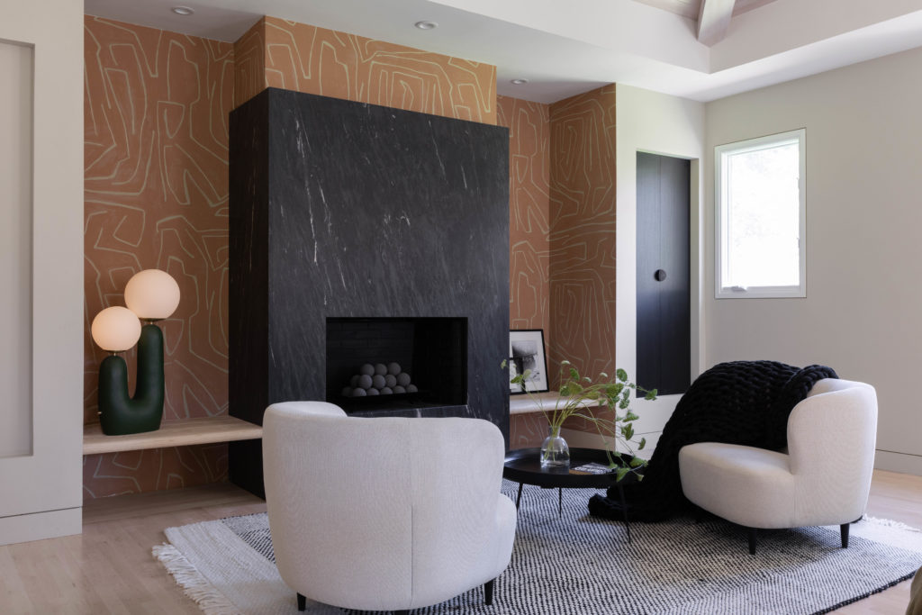
Photo by S.E.N. Creative Co.
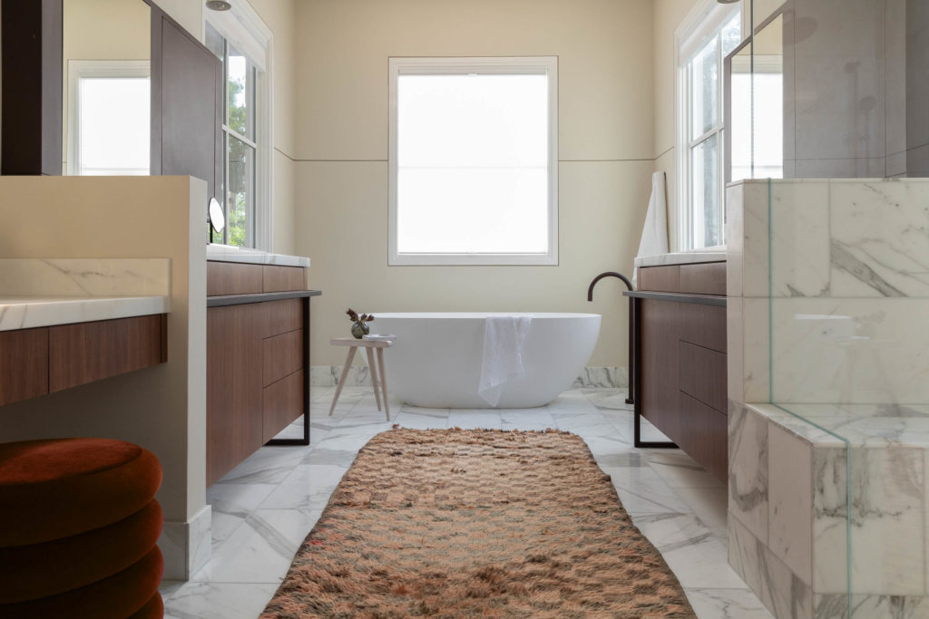
Photo by S.E.N. Creative Co.
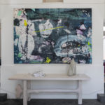
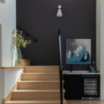
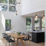
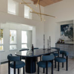
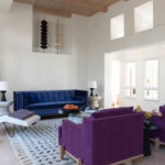
Luckily the wife had an eye for art and color and a bold sense of design and allowed Detro and her team to create unique details in every room including notched oak bookshelves in the kids playroom, custom metal vanity railing and medicine cabinets in the primary bath and more. “Being all about materiality, it was important to me to let the material elements we brought in become the spot light,” says the designer. “The incorporation of concrete, blackened and powder coated steel, stone, and wood complimented the architect’s original white walls and clearstory windows throughout.”
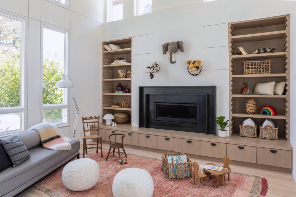
While the pandemic intermittently delayed phases of the design—during which the clients had to move in before the project was complete—they were still thrilled with every single touch. Detro notes, “I would receive excited messages and pictures as elements were being installed that made me feel like all the trials and tribulations we went through as designer and client were well worth it in the end.”
