Space, Light and Order
Author:Lindsey ShookAlexandra Loew reimagines a monolithic Marina del Rey home into a subtle sensation
The home should be the treasure chest of living,” once said the prolific architect Charles-Édouard Jeanneret, more commonly known as Le Corbusier, whose work and philosophies on design and urban planning inspired L.A. designer Alexandra Loew while studying architecture at UCLA. However, it was the great influences of Eileen Gray and Andrée Putman that inspired the revitalization of a contemporary compound located on Marina del Rey’s Silver Strand waterway. “They each experimented with industrial materials in residential applications and elevated them to a luxe effect,” says Loew. “The sense of luxury came from restraint rather than excess. With this remodel, reimagining the box with white stucco exterior and steel windows felt reminiscent of early Modernist homes, the kind you might see in the 16th arrondissement of Paris.”
The existing 11,200-square-foot dwelling, originally designed by architect Michelle Ertzan, was a sight for sore eyes. Her obsession with concrete created the bulky stone exterior and jangled windows, while the previous owner ornamented the home with garish details like a life-size rooftop chess set, a 10,000-gallon shark tank and a red glitter-clad subterranean disco. Once Loew saw past the flash, she called upon her knowledge of Corbusier and Mallet-Stevens to realize a more graceful abode that maintained an industrial feel, as if it were on the outskirts of Paris.
Photos by Roger Casas.
Loew worked with architect and developer Hope Alexander to overhaul the building in congruity with their client, who is the daughter of prominent art dealers and the niece of a celebrated space and light artist. “The biggest challenge was changing the perception of a concrete house into something inviting and livable,” says Alexander. “The house was a very cold, impenetrable concrete monolith with low eight-foot ceilings.”
Photos by Roger Casas.
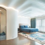
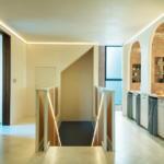
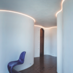
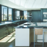
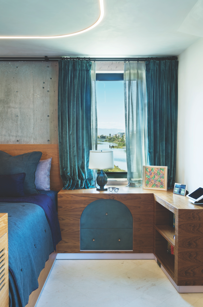
They began by gutting the entire building down to the five concrete slabs and installing new steel windows throughout. Altering the layout, flow and lighting were essential to softening the house and making it actually livable. “On each floor we attacked the issue of the low ceilings in a different way,” notes Alexander. “In the kids’ bedrooms we designed undulating ceilings to mimic water rippling, while in the master suite we added lights and arched detailing, and on the top kitchen floor we also added lights in addition to floor-to-ceiling glass, which opens the space naturally.”
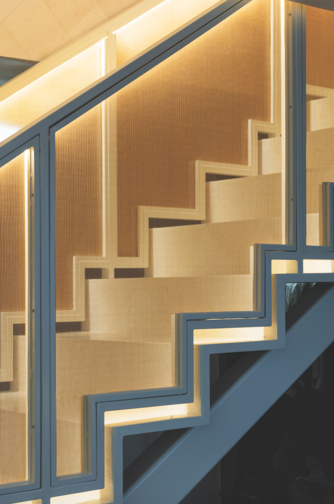
Photo by Roger Casas.
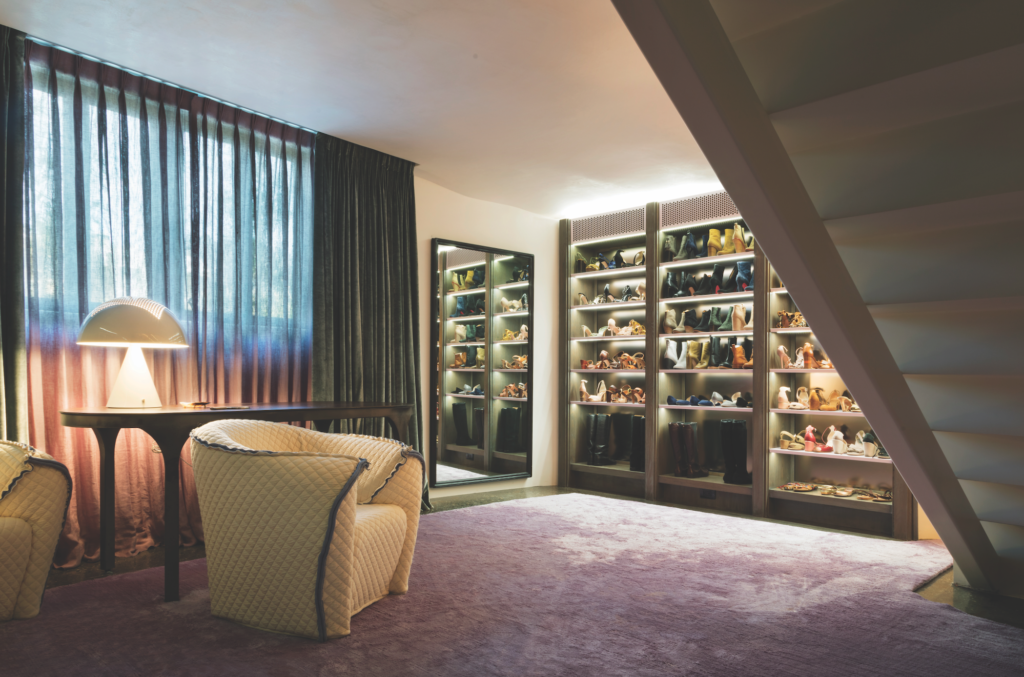
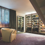
on lavender carpet from JD Staron in the master suite dressing room. Photos by Roger Casas.
Alexander, a problem solver at heart, installed an innovative surface- mounted radiant system behind the rippled walls that required no demolition of the existing concrete. “The radiant heat was another way to warm the whole environment while avoiding often ugly and cumbersome ductwork,” she notes. “Concrete is hard and cold, but its mass makes it a perfectly efficient material for the transmission and retention of radiant heat.”
Photos by Roger Casas.
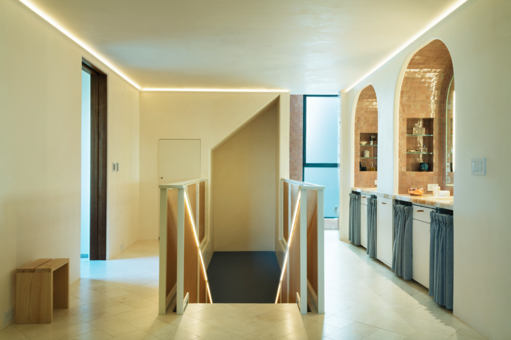
Photos by Roger Casas.
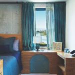
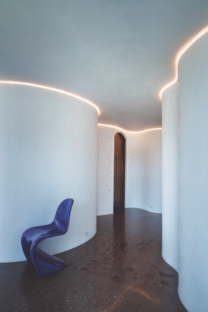
Lighting designer Dan Weinreber of KGM Architectural Lighting was enlisted to figure out how to illuminate each room without compromising the concrete structure. The KGM team worked with the overall design direction and installed clever systems behind the rolling layers of plaster walls that create an angelic glow. Faced with many technicalities along the way, Alexander, Loew and the client were able to forge their different points of view into a seamless effort that created an extraordinary home that honors its industrial roots while exuding modern sophistication and a more poetic flow. Having been raised in a backdrop of white, the client was very clear on her desire for weaving color throughout. “We developed a rule system around using color,” says Loew. “We responded to the surrounding environment by playing with a gradient of tones to create an Ed Ruscha-style L.A. sunset in one space while installing monotone, muted palettes in others.”
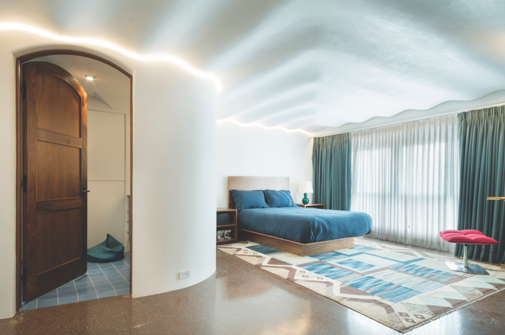
Lighting designer Dan Weinreber of KGM Architectural Lighting was enlisted to figure out how to illuminate each room without compromising the concrete structure. The KGM team worked with the overall design direction and installed clever systems behind the rolling layers of plaster walls that create an angelic glow. Faced with many technicalities along the way, Alexander, Loew and the client were able to forge their different points of view into a seamless effort that created an extraordinary home that honors its industrial roots while exuding modern sophistication and a more poetic flow. Having been raised in a backdrop of white, the client was very clear on her desire for weaving color throughout. “We developed a rule system around using color,” says Loew. “We responded to the surrounding environment by playing with a gradient of tones to create an Ed Ruscha-style L.A. sunset in one space while installing monotone, muted palettes in others.”
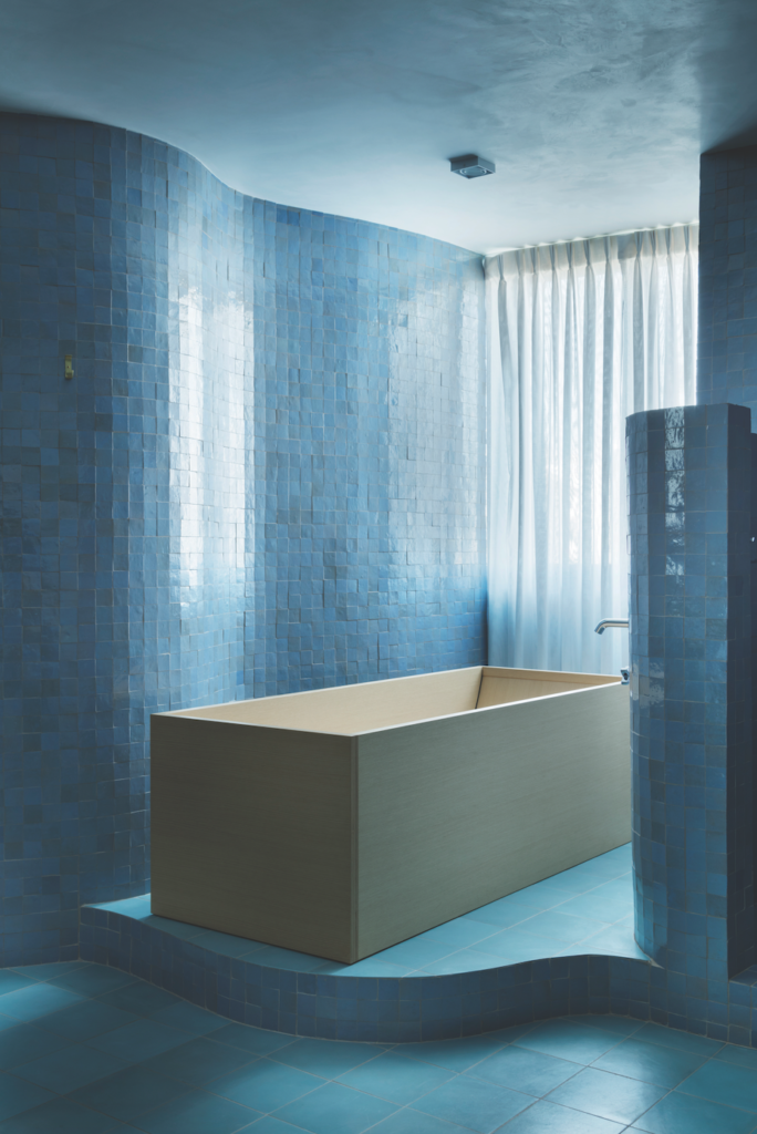
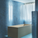
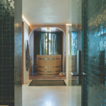
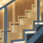
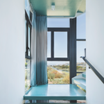
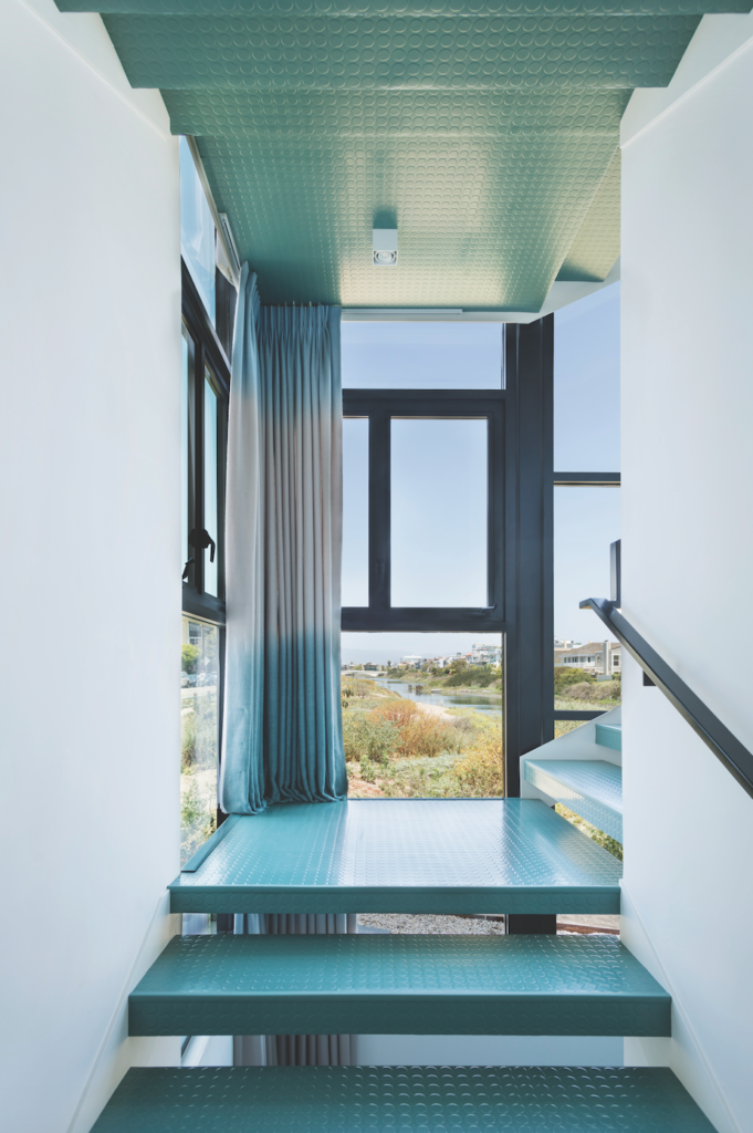
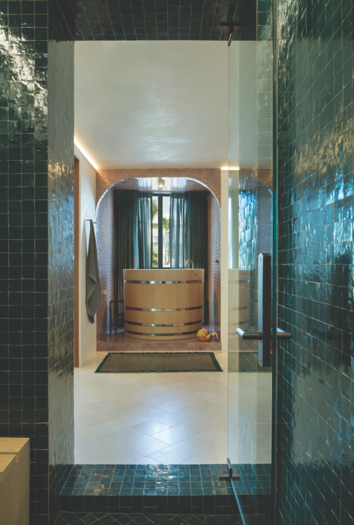
Loew further softened the home’s edgy foundation by curating an impressive collection of finishes and furnishings in a palette of color-blocked pastels and jewel tones throughout. “Every room has its own color story,” she says. For example, sea foam green rubber flooring by Nora climbs the stairs against custom dip-dyed alpaca drapes by Rosemary Hallgarten, intended to evoke shades of the Venice Canals below and the sky color above. In the master a Japanese cold-plunge pool made of hinoki wood is surrounded by a sea of blush ceramic tiles from Mosaic House, all in the same shade and size.
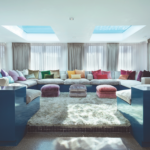
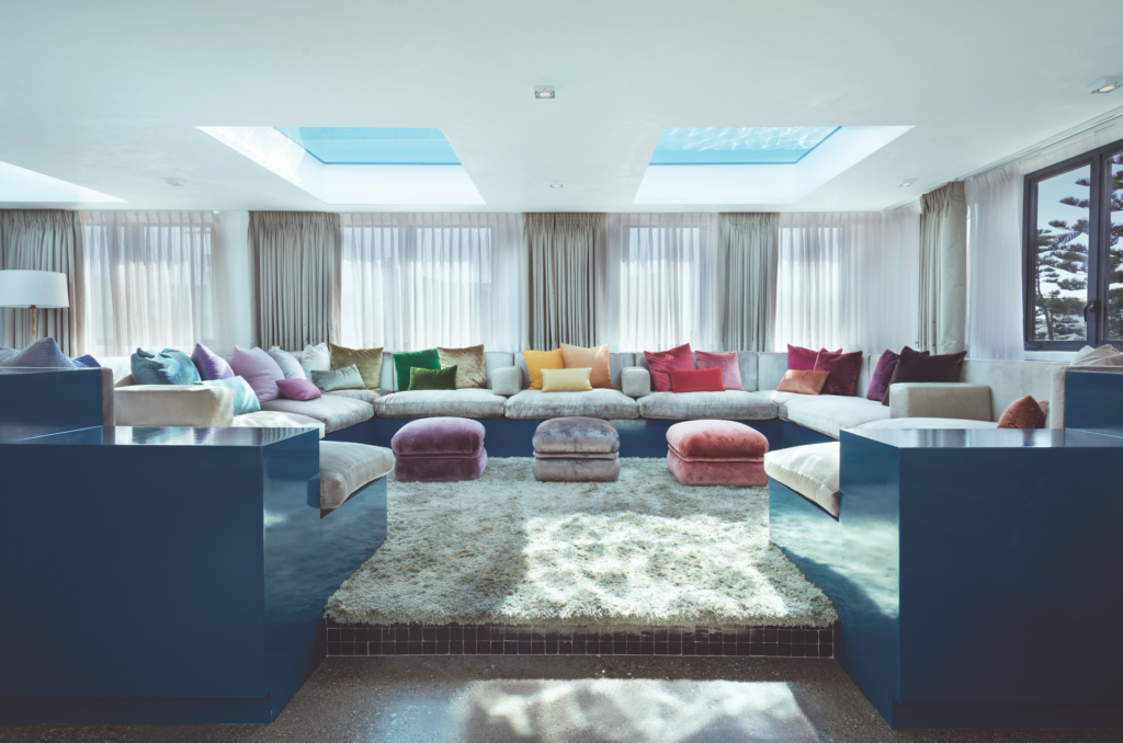
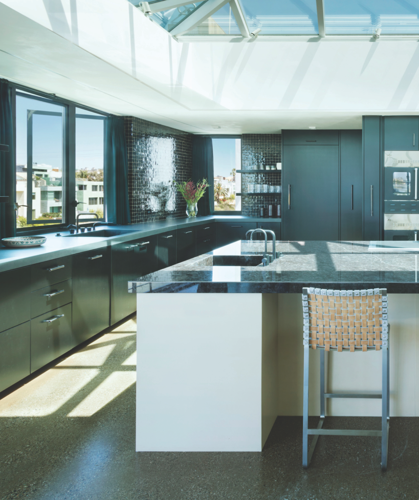
On the top floor, the moody black kitchen features a truly artistic detail of pink onyx laser cut with black onyx countertop. Directly across is a plush conversation pit where guests can dive into a rainbow of pillows while watching swimmers through a window in the floor of the rooftop pool above.
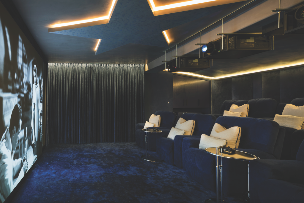
Paying tribute to Corbusier and Mallet-Stevens, Loew played with curves and rounded angles in each room to placate the redundant angularity throughout. “The curves are kind of gentle and cradle the body and also soften the concrete walls, posts and floors,” she notes. The overall transformation is a monumental expression of thoughtfully composed color and materiality that transports one to a delightful indulgence of design.
