Simply Sweet
Author:Lindsey ShookCathie Hong Interiors curates a warm and subtle design for a young couple living in S.F.’s Potrero Hill
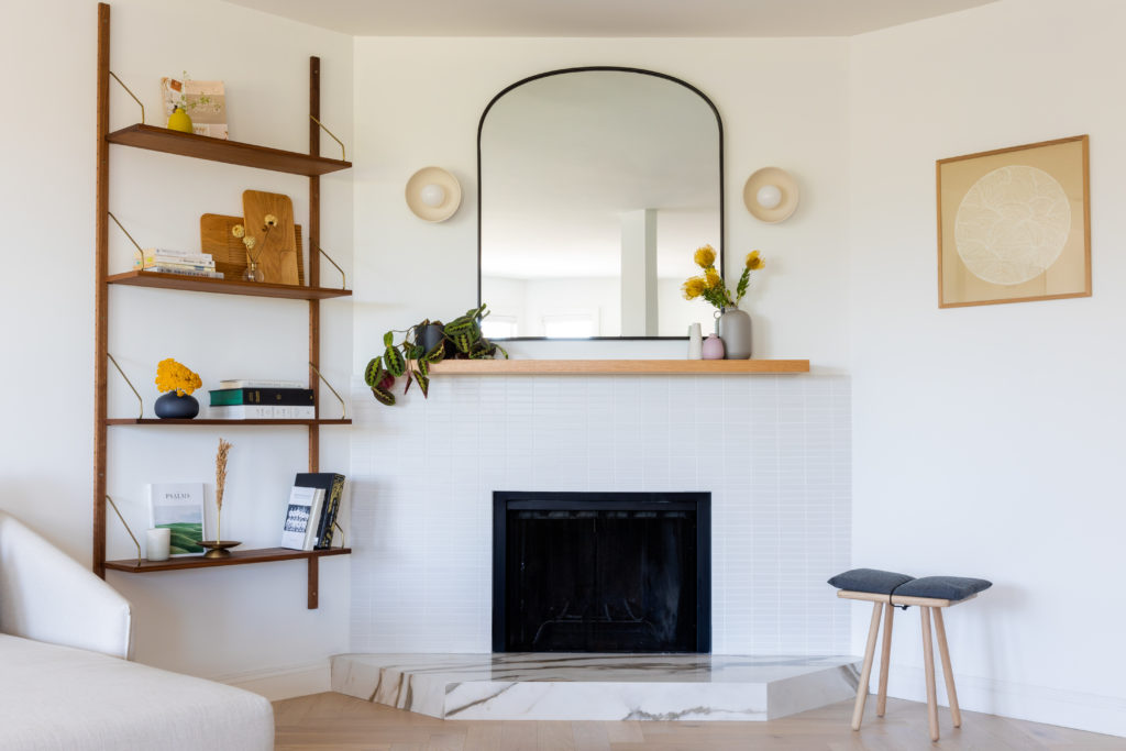
Ann Sacks Savoy Large Stack in Chalk dances up the fireplace. Photos by Christy Q. Photography.
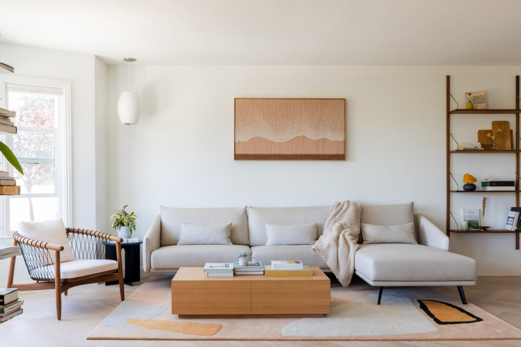
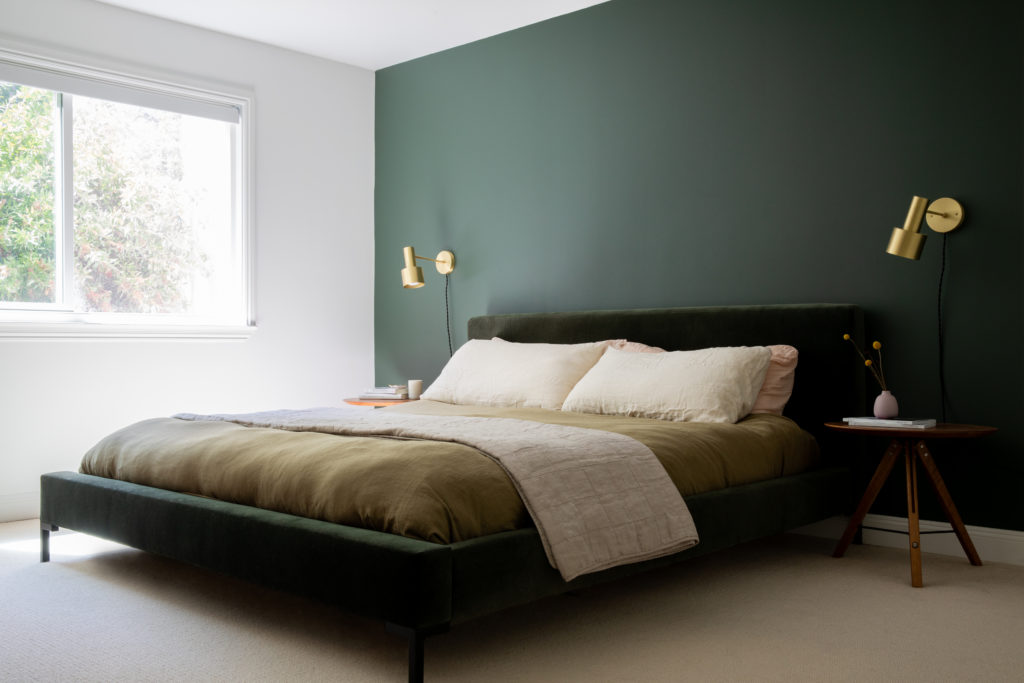
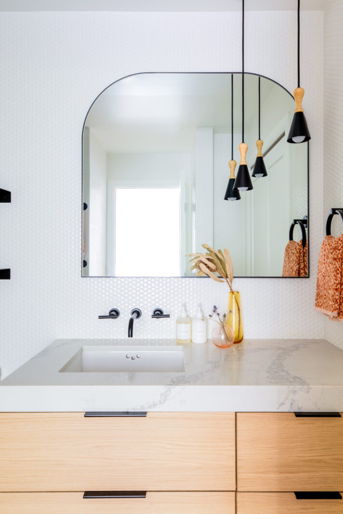
“When designing a space, I veer toward soft minimalism—simplicity in lines, soft tones and playful shapes and colors that don’t overwhelm,” says Bay Area designer Cathie Hong. “It’s critical to me that spaces feel warm, so I love to incorporate wood wherever I can.” Hong and her team achieved this balance of clean, warm curated design in a lovely condo located in S.F.’s Potrero Hill neighborhood. “We started with a base layer of bright whites and warm oak tones, layered in a little walnut for contrast and depth, and a healthy dose of neutral textiles with some muted colors and curved lines for an element of something unexpected,” she notes.
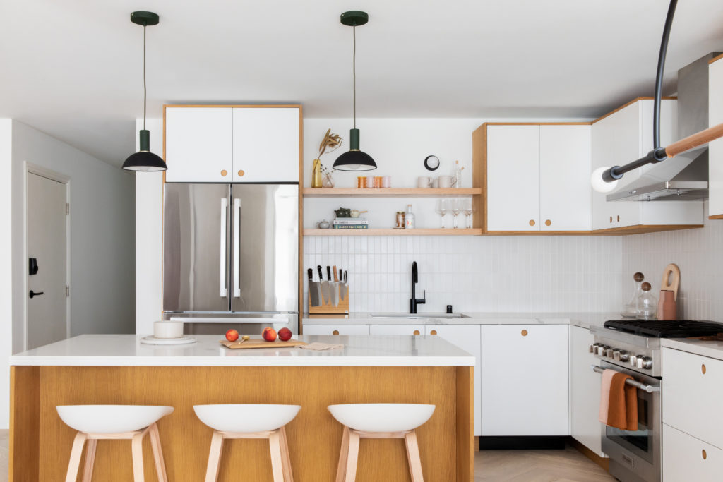
The young couple and their Golden Doodle discovered Hong’s work on the website of a Cabinet Company they were researching. “Ironically, we ended up going with a different cabinet company, Reform CPH, inspired by their travels to Copenhagen at the onset of our project,” she says. “This trip to Copenhagen lingered with them and inspired much of our big picture design direction for this project, from the white oak herringbone floors to most of the furniture selections.”
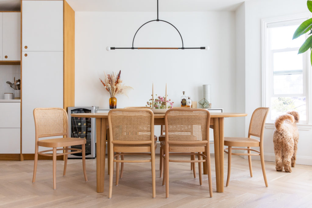
Before the furnishings and finishes were finalized, the process began with opening the kitchen and living room to access the sweeping S.F. views and allow for more natural light to flow in. “The iconic San Francisco bay windows in the dining and living room let in beautiful natural light, but the original kitchen felt dark because it was boxed in with walls on all sides and all of the cabinets and backsplash were a dark gray color,” says Hong. “Because this house is on the second floor of a 3-story building, there were structural limitations that prevented us from opening everything up completely, but Roger Wong of Live Architects managed to remove all but one structural column.”
Unfortunately there was no big reveal moment for the clients due to pandemic, work-at-home restrictions. “They were living downstairs and itching for construction to wrap up so they could have their own offices, but suffice it to say that they were relieved when all was done!”
