On the Bright Side
Author:Anh-Minh LeVibrant finishes and furnishings go a long way in softening a modern setting
Since launching Joy Street Design in 2011, Kelly Finley has developed a reputation for projects with rich palettes. In 2023, thanks in part to rooms featuring an ombré wallpaper and a prismatic mosaic backsplash, she was the HGTV editors’ pick for Color + Pattern Designer of the Year. On Instagram, Finley has been known to employ the hashtag #NoWhiteKitchens. “We actually have a rule that we don’t do white cabinets in our firm,” she says with a laugh.
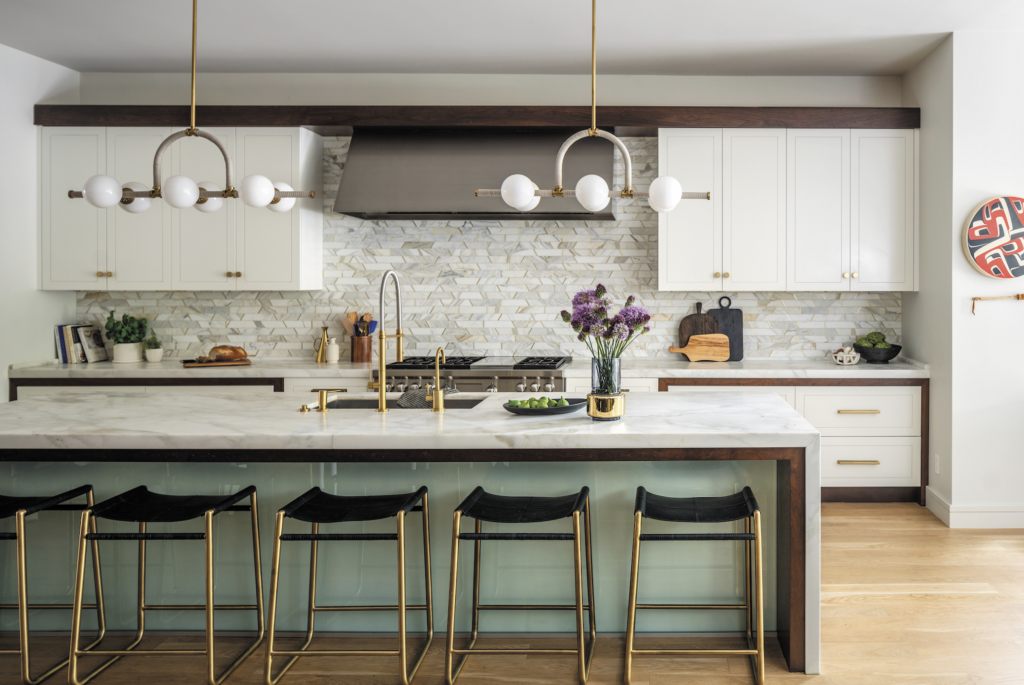
But rules are indeed sometimes meant to be broken. When clients in San Francisco’s Pacific Heights neighborhood requested that she design around their white kitchen—the cabinets and countertops were staying put—she met the challenge with aplomb. Along with installing a backsplash of trapezoid-shaped marble-and-brass tiles, she painted a side of the island green.
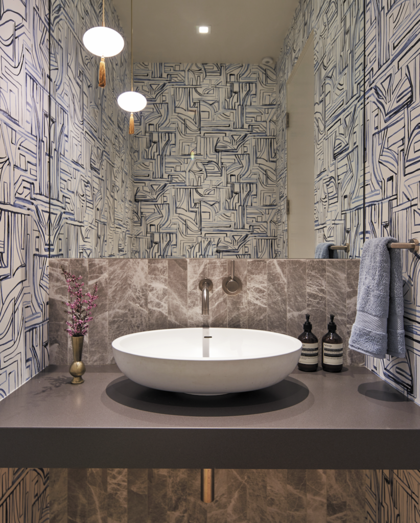
Elsewhere in the home, the Oakland-based interior designer’s hallmark reliance on color is more prominent, contributing to the overarching goal of softening the decidedly modern interiors. Although the 6,200-square-foot residence dates to 1906, various remodels had nullified original architectural elements. By the time her clients—a couple with three young children—bought it, glass, metal and stone permeated its four stories. “The outside didn’t match the inside,” Finley says. “It was sleek, and a lot of the rooms didn’t feel very homey.”
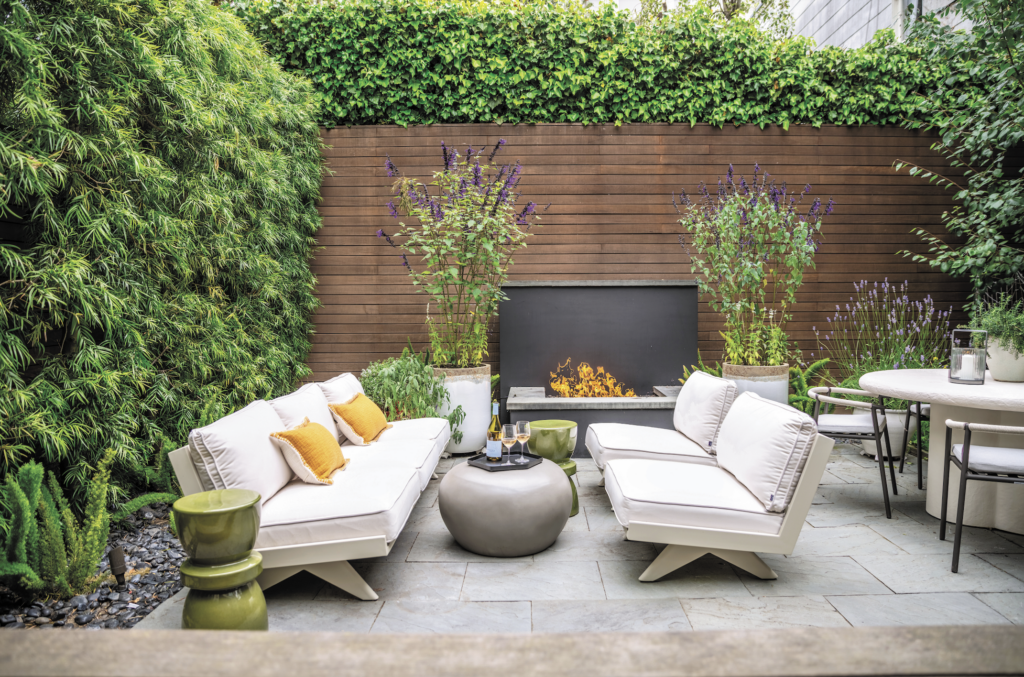
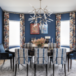
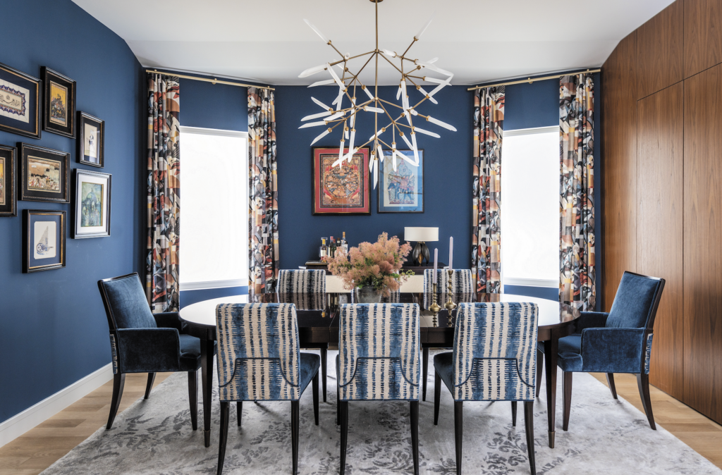
To remedy this in the dining room, she chose Farrow & Ball’s Stiffkey Blue to harmonize with an existing wall of wood that conceals a bar. “We had never used that color before, but it was on our wish list to use,” says Finley, who further punched up the space with S. Harris textiles. The clients’ own chairs were reupholstered in a solid blue and a striped blue, while the window treatments are an abstract pattern.
A similar color scheme carries over into the living room, where a pair of navy shagreen side tables with gold banding flank a sumptuous nine-foot-wide sofa. Large-scale ink splashes appear on the drapes and the wallpaper on the ceiling has painterly plum-hued lines. A diptych by local abstract artist Jaime Lovejoy relates to the other colors in the space while imparting a sense of movement.
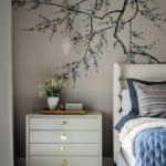
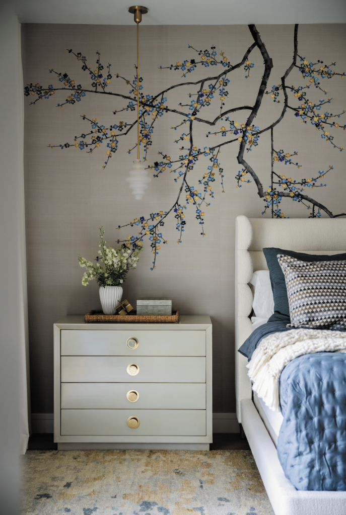
To create an accent wall behind the headboard in the primary bedroom, Finley chose a hand-painted and embroidered Fromental motif with flowers in shades of blue and yellow. “We wanted it to be the star of the show,” she explains. “The clients wanted something that was really special but didn’t want to go overboard with more color than necessary.”
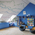
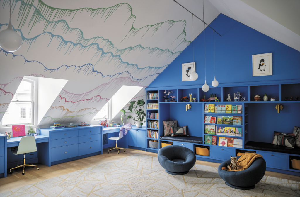
The kids’ playroom on the top floor, however, epitomizes exuberance. The custom millwork—which includes a wall of shelving as well as a desk beneath each of the three windows—is painted in Benjamin Moore’s Waterloo. “It’s a bright blue, so it feels youthful and energetic,” Finley says, noting that it complements the multicolored wallpaper selected for the ceiling.
Reflecting on the project, she emphasizes that “this is a good example of a minimal amount of construction where the soft goods have a big impact.” Fabrics, wallpapers and rugs do heavy lifting. “It’s a really fun house now, in a way that it wasn’t when everything was white and sterile,” Finley continues. “It was pretty, but just not a family home. I think people underestimate how much you can change the look and feel of a space without renovating.”
