Modern-Day Maximalism
Author:Anh-Minh LeFrom jewel tones to bold prints to statement ceilings, Jeff Schlarb’s more-is-more approach surprises and delights
“Nice and neat,”is how interior Schlarb sums up the 1940s Marina District home his client purchased several years ago. While perfectly fine for some, those are hardly the words that come to mind when surveying the portfolio of Schlarb’s eponymous San Francisco firm—known for its exuberant and eclectic style with often daring uses of color, pattern, texture and art. In this particular case, it all combines for a residence that teeters on the edge of contemporary maximalism.
“We had an absolute ball,” says Schlarb of the project, which was three years in the making and completed during the pandemic. “It’s so artistic and so unique. The client still walks around the house and marvels at what was created.”
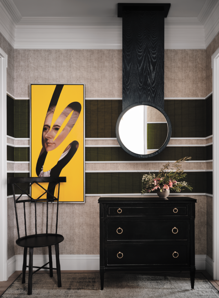
Throughout the dwelling are concepts that Schlarb and his team executed for the first time. Take the cerused mirror in the foyer; they had not previously done a mirror that drops down from the ceiling. Its circular shape contrasts with the linear bands of olive-hued wallpaper, which is bordered by white trim that distinguishes it from the lighter green wallpaper that is prevalent in the space. Schlarb commissioned Spanish artist Lino Lago for a piece that has a mostly yellow canvas, with a glimpse of a portrait of George Washington.
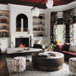
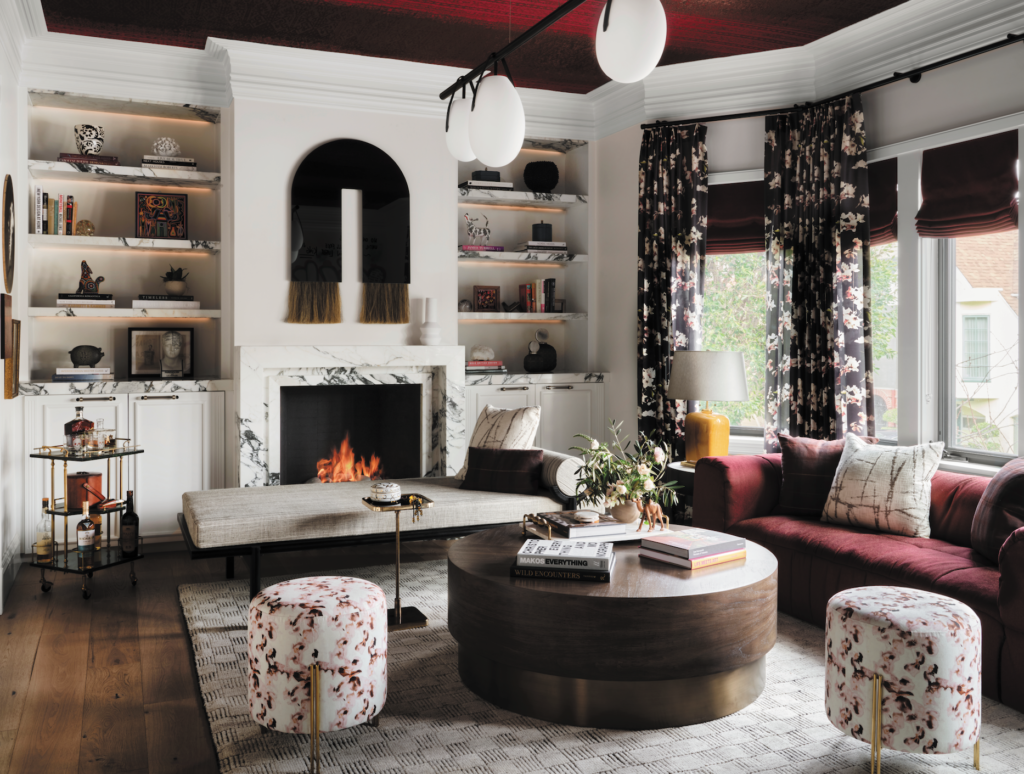
The golden hue is carried over into the adjacent living room, with a table lamp that punctuates the merlot sofa, window treatments and ceiling. In here, the previously traditional wooden mantel has been replaced with a Calacatta fireplace surround; the material also forms the flanking shelves. A mirror by Ben & Aja Blanc consisting of Mongolian horsehair is a focal point above the fireplace. The drapery is made with an Ashley Woodson Bailey silk dupioni that Schlarb describes as “a sophisticated floral.” A flowery motif appears on a pair of round stools as well.
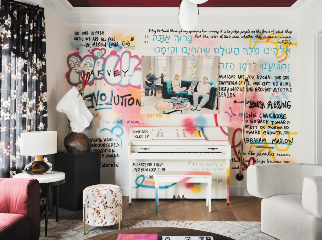
“There’s a duality to this room,” he observes. “The fireplace is roaring, the marble is exquisite, the crown details are substantial, the light fixture is amazing. Then you turn around and you’ve got this electrified graffiti mural. And it’s all in one space; it’s a space like no other.” Opposite the fireplace, Schlarb enlisted Juan Manuel Carmona for a mural composed of various quotes selected by the client. The artistic effort extends to the piano placed against the wall, too.
Photos by Douglas Friedman.
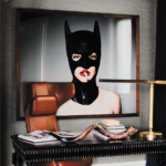
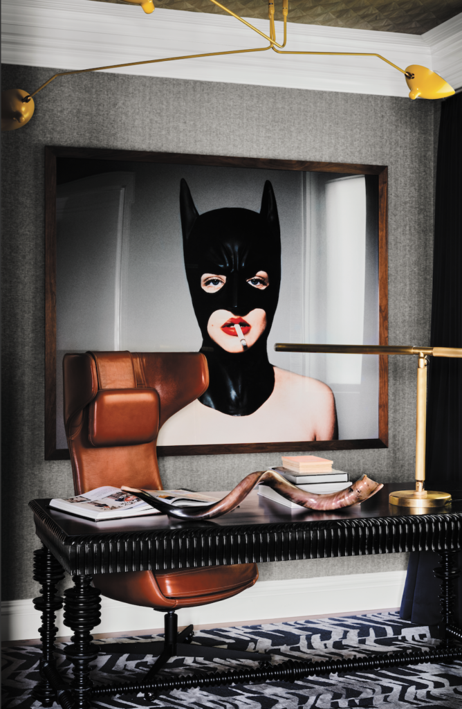
From the living room sofa, the client’s office is in view. Once again, to visually connect neighboring spaces, Schlarb incorporated yellow: the chandelier, suspended on a ceiling lined with a wood veneer wallpaper (another first-time implementation for him). On gray flannel walls that imbue additional texture, Schlarb positioned a striking Tyler Shields photograph, entitled Batman; it depicts a woman in the superhero’s mask, a cigarette dangling from her bright red lips.
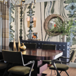
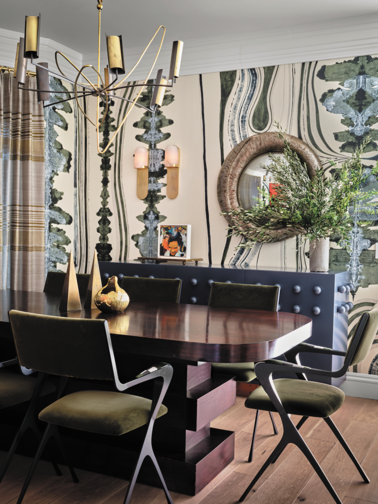
Elsewhere on the same floor, the dining room features blues and greens. “We just kept moving around the color palette,” says Schlarb. “Everything wanted to be exciting and activated.” The pattern of the custom Porter Teleo wallcovering is reminiscent of a Rorschach test, with hand-painted inkblots. A blue sideboard and a table that previously belonged to the client’s mother are partnered with a Jean de Merry mirror, Lauren Hwang striped textile for the drapery, Tom Faulkner steel-framed chairs upholstered in green velvet and Porta Romana’s Sputnik chandelier.
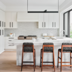
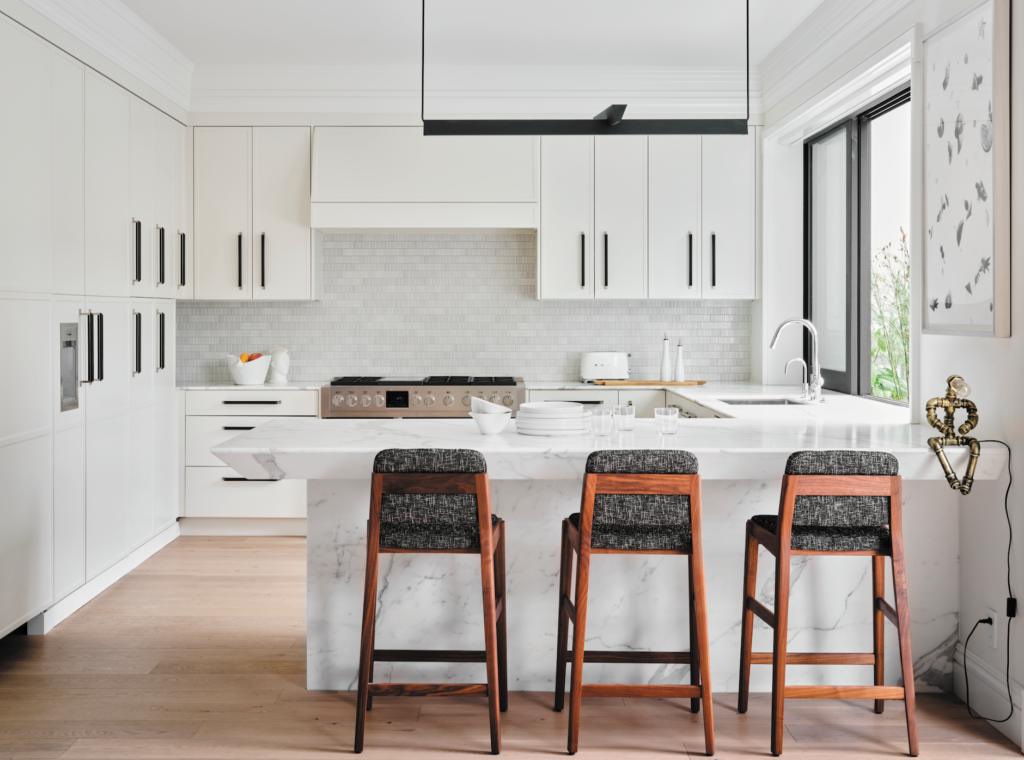
The kitchen deviates from the home’s vibrancy, though it is no less eye-catching. “People love white kitchens, so we try to reimagine them in new ways,” explains Schlarb. Calacatta Oro constitutes the chamfered countertop. While Schlarb installed it with a three-quarter-inch thickness in the areas with the range and sink, on the peninsula the marble is a hefty five inches. Above the peninsula—the front of which is also wrapped in Calacatta Oro—hangs a dark green Lambert et Fils light fixture. (A concealed pantry provides ample storage for the homeowner and allows him to easily tuck away small appliances.)

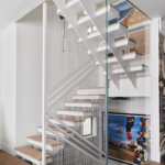
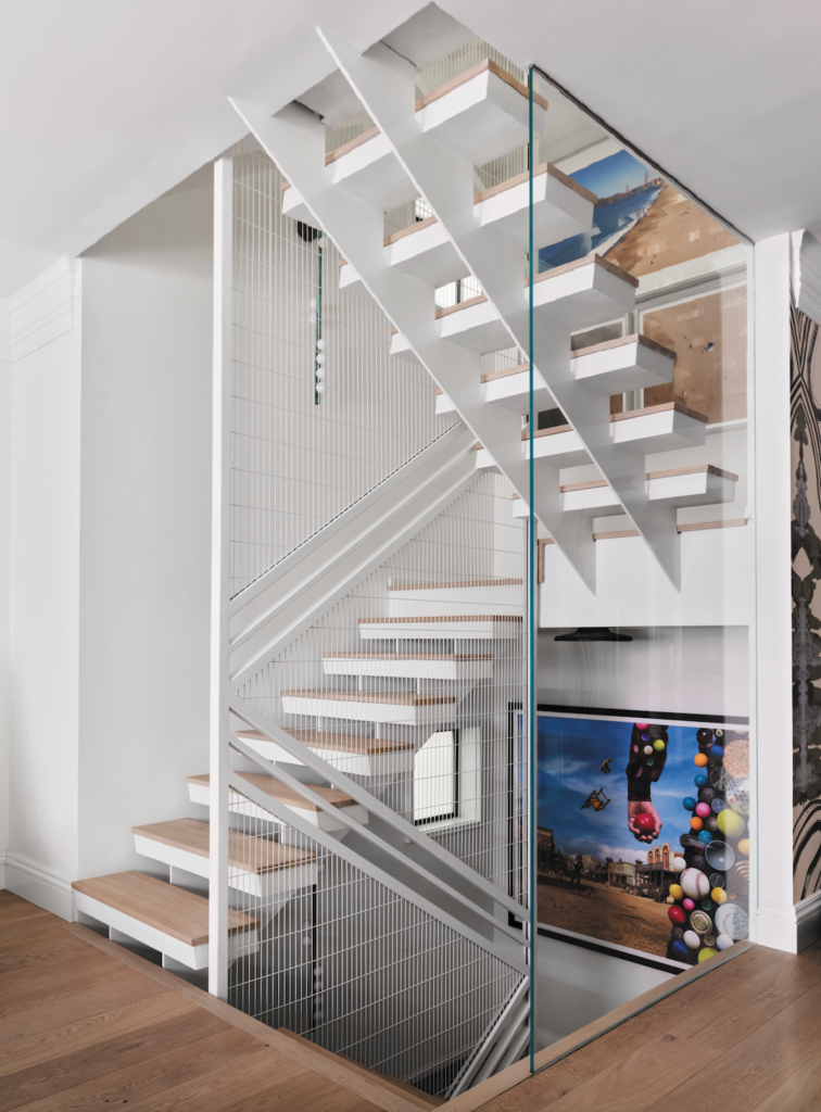
The angle of the chamfered marble is echoed in the stairs conceived by architect Seth Brookshire, whose design and build practice is headquartered in San Francisco. With glass walls, along with metal handrails and guardrails, the stairwell offers another chance to display large-scale artwork—such as a drone photograph of Baker Beach, which includes the client and his family among those frolicking on the shoreline. “It’s wonderful,” says Schlarb. “One of those hidden little secrets.”
Photos by Douglas Friedman.
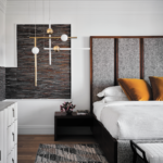
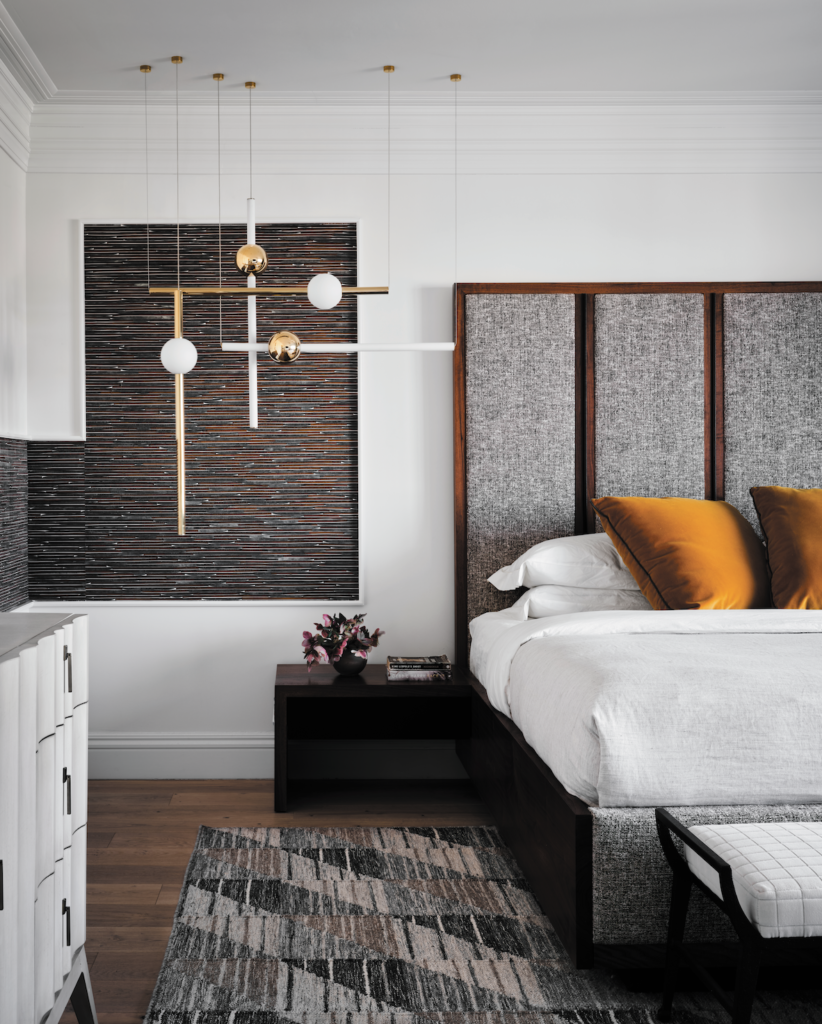
In the primary bedroom, four ceiling-mounted Lee Broom lighting designs—two each of the Orion tube and globe fixtures, running vertically and horizontally—are “art in their own right. They’re unbelievable,” says Schlarb. “Instead of a white wall, where the lights wouldn’t really pop, we added texture behind them with wallpaper.” Similar to the foyer, he installed white trim in the corner and inset a burnt-orange grasscloth wallpaper. The bed is his own design, with the headboard and base comprised of walnut and tweed.
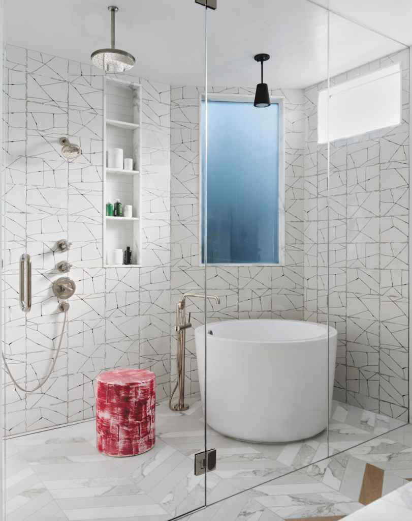
Although a number of rooms boast statement ceilings, in the primary bath, it’s the flooring that awes. “When you walk into the room, it’s all herringboned wood,” Schlarb elaborates. “Then it starts to pixelate into marble.” (And, yes, it was his first attempt at this effect.) The wet area, which contains the shower and tub, is swathed in a ceramic tile from Ann Sacks whose geometric pattern complements the herringbone. Ceramic garden stools by Paul Schneider, with a red drip-brushed glaze, inject splashes of color.
Photos by Douglas Friedman.
Even months after the project was finished, the client continued to email Schlarb to express his gratitude and immense satisfaction. “The house really reflects him and his interest in having a unique home,” says the designer. “This client was never afraid to do something new and different. He celebrated the new and different. We never felt like we had to hold back on our ideas and we were never too scared to put an idea in front of him.”
