Mid-Century Made Modern
Author:Lindsey ShookJKA Design deftly coaxes a 1950s Cliff May-designed house into the 21st century
Photos by Jose Manuel Alorda.
Interior designer John K. Anderson’s appreciation for mid-century dwellings can be traced to his childhood in the Dallas area. While he grew up in a traditional Georgian-style abode, his grandparents lived close by in “a beautiful 1956 house in the country designed by O’Neil Ford,” he recalls. “It was a modern house on the prairie, with cattle and donkeys and horses. And it made such an impression on me. My love of that architecture started back then.”
Photos by Jose Manuel Alorda.
Years later, now with an interior design practice in San Francisco, Anderson had the opportunity to reimagine a Lafayette, California, home by a Ford contemporary: Cliff May, the architect credited with creating the California ranch house that gained popularity in the mid-20th century.
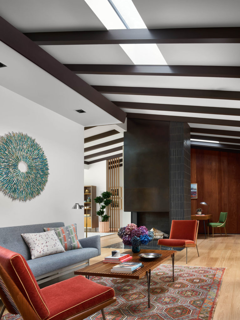
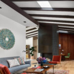
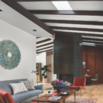
a rug from Tony Kitz Gallery and a pair of lounge chairs reupholstered in blood
orange mohair from Kneedler Fauchère—as well as a table from Lawson-Fenning and a glazed porcelain wall sculpture by Syra Gomez. Photos by Jose Manuel Alorda.
Anderson’s clients, a couple with three young children, purchased the 1954 property after the original owner passed away. Although there were concepts worth preserving—like the triangular window just below the ceiling in the family room that “brings in light and nature, but at that higher point where you’re seeing trees and sky, and also getting privacy,” observes Anderson—renovations were necessary to better suit its incoming occupants. The goal was to transform the house into “the best version of what it wanted to be,” says Anderson of the collabora- tive effort with architect John Voekel, builder North Coast Remodeling and Construction, landscape designer Lutsko Associates and project manager Spectre8.
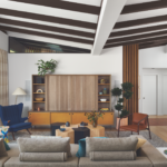
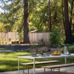
For starters, the entire roof was raised two feet throughout, yielding a “more lofty feel,” says Anderson. The square footage increased from 2,700 to 3,500, thanks in part to the conversion of a garage into an office/guest quarters. A new two-car garage was built on an area that previously contained a carport. A large glass-enclosed porch was sup- planted by an expanded family room, whose wall of windows frames the backyard.
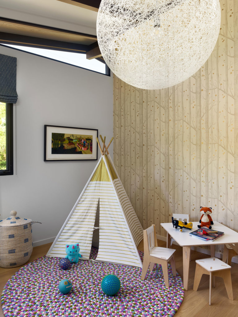
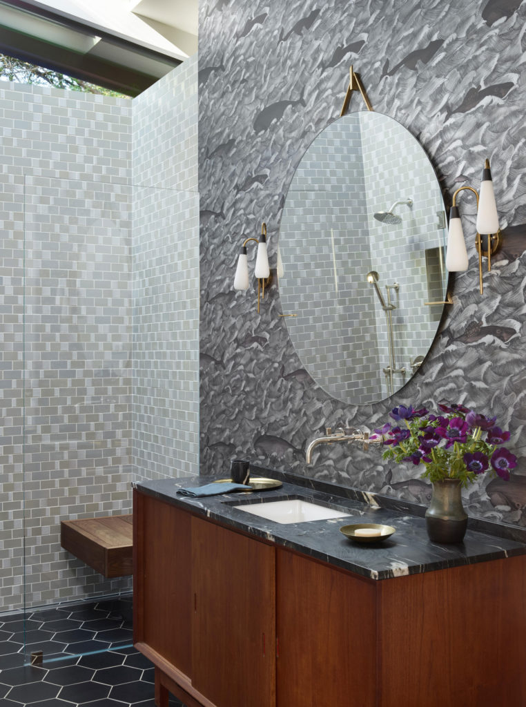
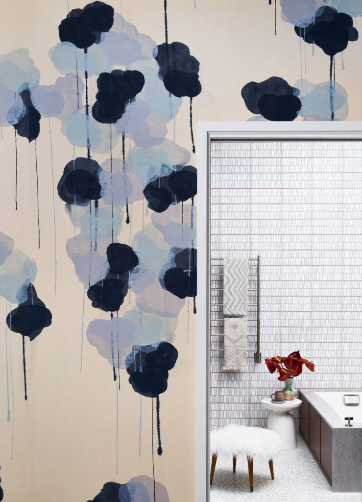
A neutral palette was proposed—a tactic often employed by Ander- son’s firm, JKA Design. “We generally wanted this neutral environment,” he explains. “Then we folded in color with some of the furnishings, the pillows and the art. Shades of blue found their way throughout the house. It’s a favorite color of the homeowners and of JKA.”
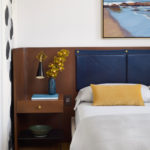
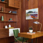
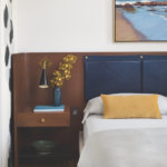
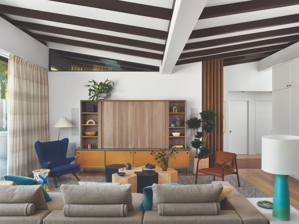
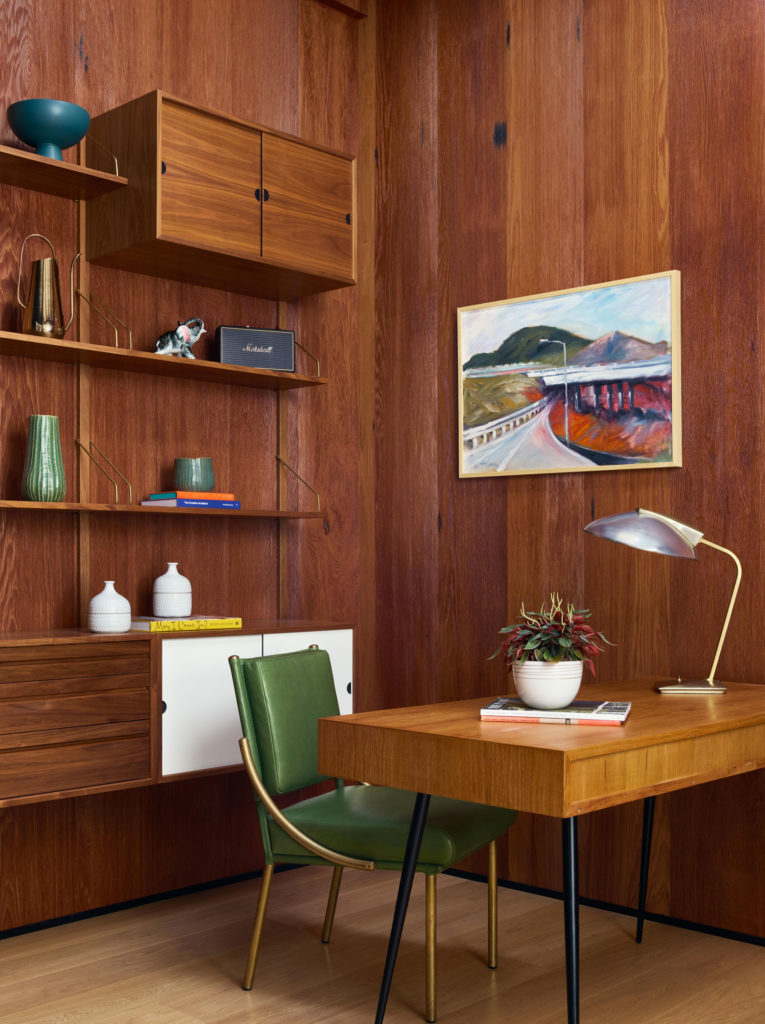
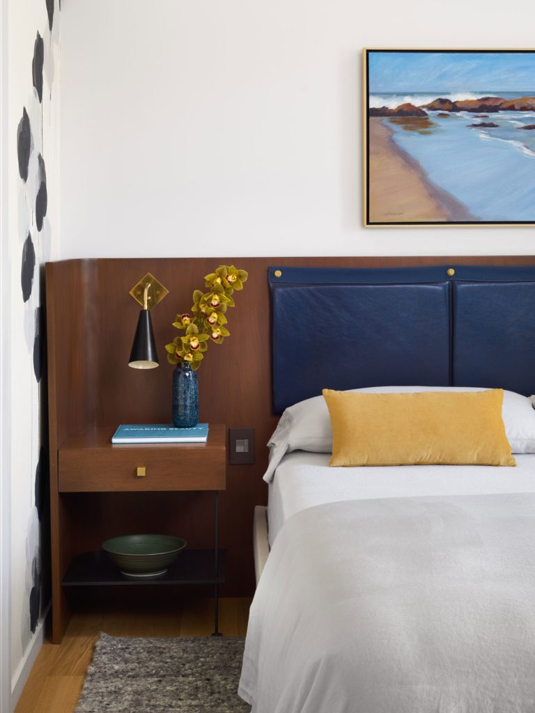
European white oak floors also offer a visual throughline. According to Anderson, “mahogany that we bleached and then stained to take the red out of it” makes frequent appearances, too; for example, in the kitchen as well as the bedroom’s custom-designed headboard and storage. The walls are painted in Benjamin Moore’s Calm and the ceiling beams in Farrow & Ball’s Mahogany.
For the furnishings, mid-century elements were on the wish list, but Anderson was careful “not to be heavy-handed with that,” he says. The family room is anchored by a putty-hued, 11-foot-long Flexform sofa that faces a custom-made media unit whose tapered legs are a nod to mid-century design. Ocher leather covers the shelves and door fronts for an understated elegance. A vintage Danish chair by Svend Skipper and a leather-and-walnut armchair by Bernhardt round out the seating in the room.
Photos by Jose Manuel Alorda.
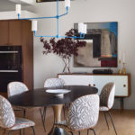
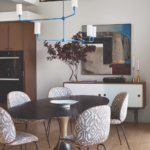
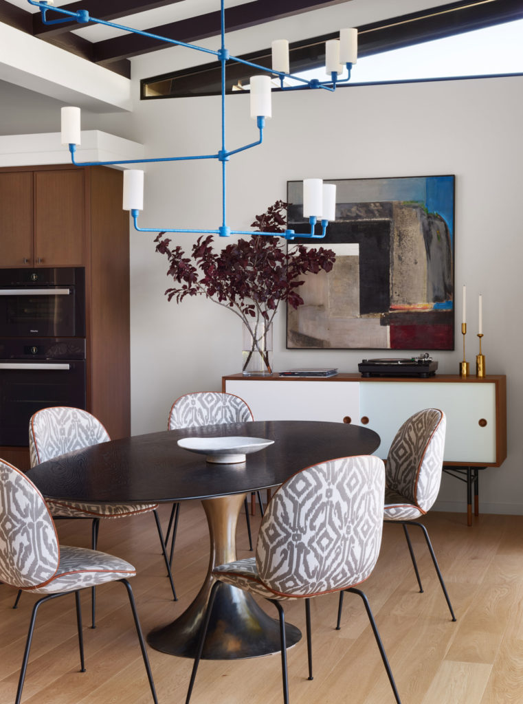
In the adjacent dining area—over a Julian Chichester pedestal table surrounded by Gubi’s Beetle chairs that have “mid-century lines,” says Anderson—a three-tiered, rope-wrapped chandelier in cobalt injects tex- ture and bold color. The blue is picked up in a nearby painting, Barbara Lewis’ Harrison Building—Flowering Cliffs, acquired from Lost Art Salon and hanging above a Finn Juhl credenza from DWR.
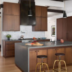
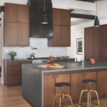
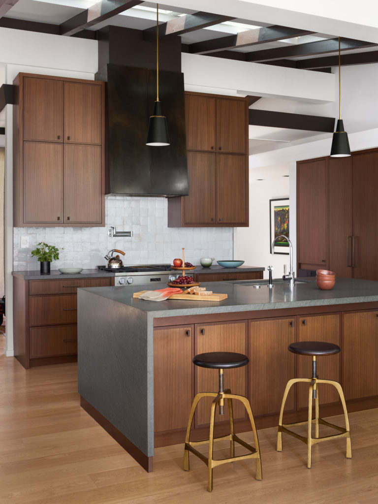
An open kitchen completes the great room; here, Anderson combined Menara Gray countertops and zellige tiles, both from Exquisite Surfaces. “It’s beautifully simple and has a handmade quality that makes it really timeless,” he says of the handmade Moroccan creations. The kitchen alsobenefited from new skylights that beckon natural light.
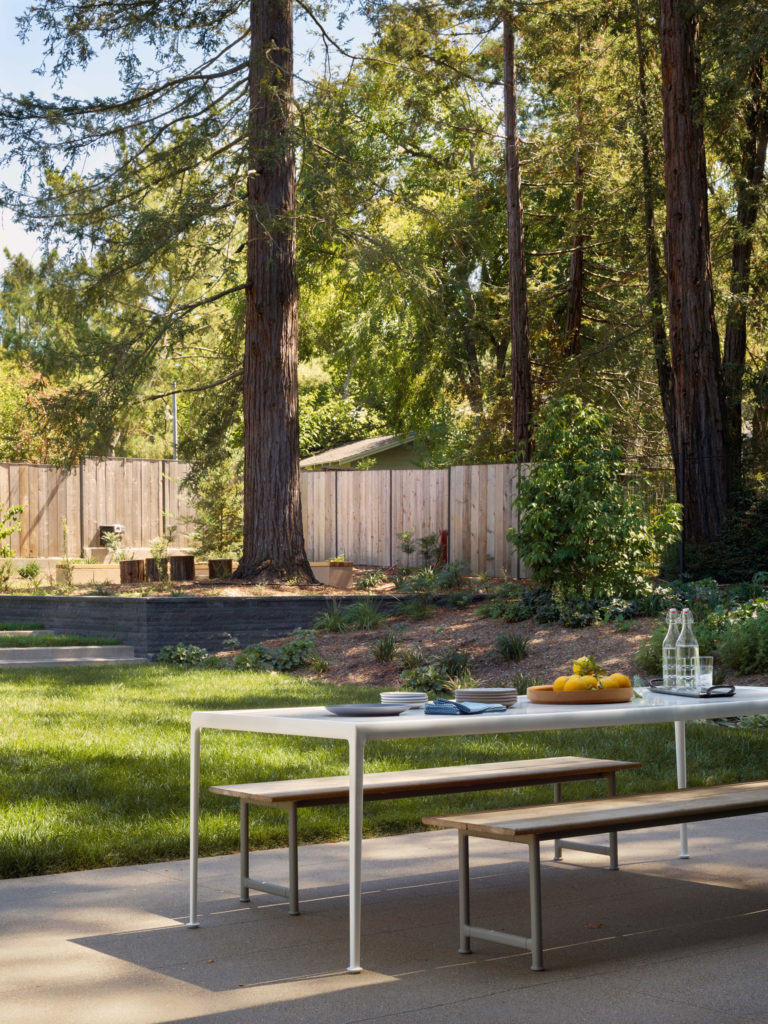
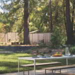
Reflecting on the three-year project, Anderson notes that the great room is a standout, enhanced by those windows that span an entire wall. Says the designer: “We took that classic, indoor/outdoor California living quality—which was so in the spirit of what Cliff May was about—to the next level.”
– Anh-Minh Le
