Living Out Loud
Author:Abigail StoneHouse of Honey transforms a generic space into a warm family home that welcomes the neighborhood
“We’re an all-female collective whose mission is to act as a guide for a life well-lived,” says House of Honey’s Tamara Kaye-Honey. “We design spaces that bring people together.” This credo was catnip to the couple—pregnant with their second child—who owned this Solana Beach house. “They’d experienced our work at Otium, the restaurant adjacent to The Broad in downtown Los Angeles,” she shares. “They were new to the area and had never worked with a designer before and they felt that we could make some bold moves with their home.” Handling both interior design and architectural duties, House of Honey transformed their generic property into a livable and contemporary home. The clients had fallen in love with the neighborhood and the expansiveness of the house but knew it needed some work. “It was very much a product of the ’90s,” says Kaye-Honey. “So very cold with some vague references to Spanish style.”
Photos by Langoworks.
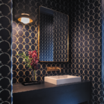
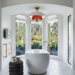
House of Honey’s vision retained the beamed ceilings and the arches that the clients loved while stripping away the dated moldings, the lighting and the overwrought finishes. “We kept the footprint but completely reworked the way it felt inside,” she says. The kitchen was opened up and every wall finished in decorative plaster. New wood flooring was introduced throughout and each bathroom was updated. A triptych of curved new windows now showcase the oversize bathtub in the primary suite’s bathroom.
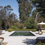
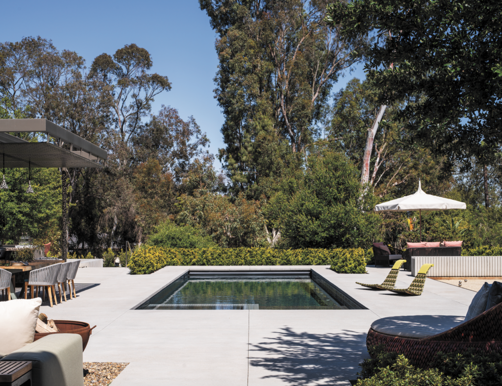
“The most significant challenge was updating the house within the existing conditions,” says Ryan Hill of Hill Construction Company, which handled the work. “With every major renovation we need to ‘peel the onion back’ to tie the existing structure together with the improvements to achieve a seamless look at completion.” The final result is modern, sculptural and inviting. A coherent flow undulates from room to room and from indoors-to-out. To complement House of Honey’s work, GroundLevel Landscape Architecture had reimagined the contemporary backyard, positioning exuberant foliage against a sleek concrete surface that would allow for easy and frequent entertaining. “The intention was to create their forever home,” says Kaye-Honey.
“They wanted a completely fresh start with all new furniture, art and accessories.” They also wanted the home to be a gathering space. “They were interested in being the hub for their family and friends,” she notes.“They wanted something stylish but not precious: a kitchen that could handle baby food spills by day and impromptu dance parties at night.” That meant strong shapes, durable fabrics and sturdy materials. It also meant arresting accessories and bold patterns.
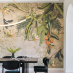
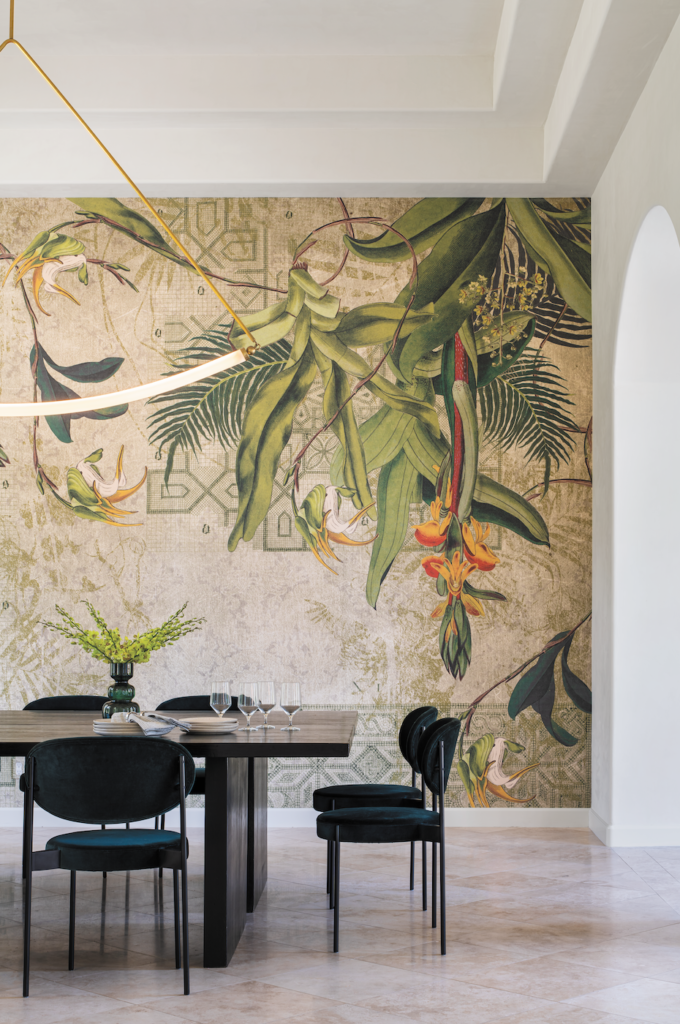
In the dining room, that directive is fulfilled by the Tres Tintas wallpaper that suffuses one wall. “We try to mix high and low,” says Kaye-Honey. “So the wallpaper, the lighting and the chairs are the moments where we need to spend our energy while the dining table can be an off-the-shelf piece.” House of Honey pushed two tables together to create a sprawling surface that, she points out, can be pulled apart and reconfigured as needed to accommodate the events the clients envisioned. “We’re creating a lot of spaces these days that have that kind of flexibility.”
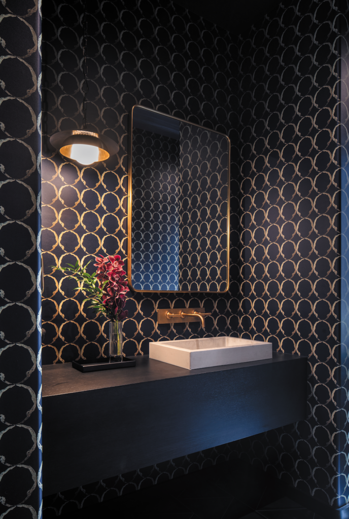
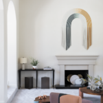
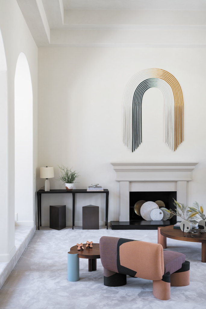
The sunken living room was also designed with multiple needs in mind. Its lush wall-to-wall carpet, its sturdy coffee table, the playful contours and colors of a squat chair and its accompanying side table and a long, minimal sofa make it kid-friendly. Yet there is also a strong sense of elegance, underscored by a reflective artwork that hangs over the fireplace and its white plaster walls. “At the holidays, it easily morphs into a more formal space,” says Kaye-Honey.
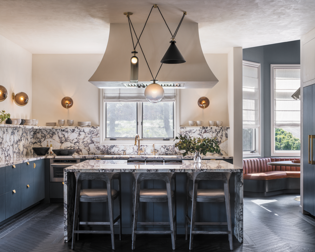
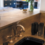
Fiddlehead sconces illuminate the working spaces. Photos by Langoworks.
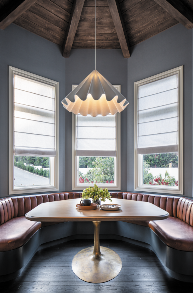
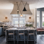
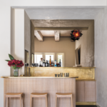
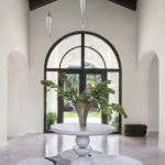
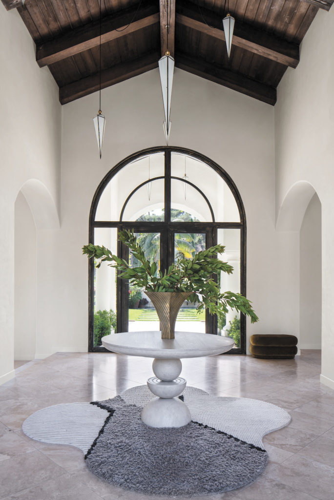
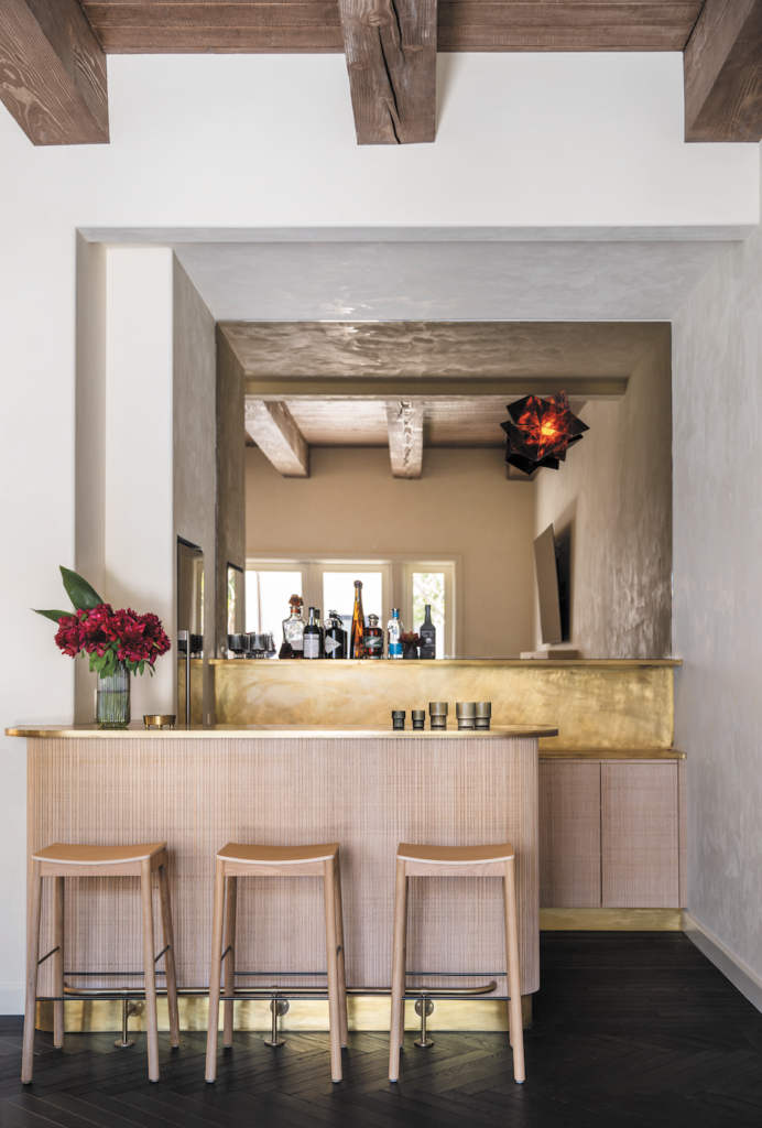
Dramatic lighting—the pendant that rocks over the dining room table, the handful of stalactite shape pieces that pepper the front entry hall, the blood red cubic glass sconce that surveys the bar area, the juxtaposition of shapes in the kitchen’s pendant—helps scale the home’s towering ceilings down to something more manageable while imbuing these spaces with an intriguing ethereal beauty.
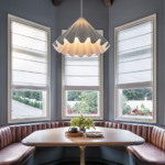
“Originally we weren’t going to do any construction in the kitchen,” Kaye-Honey remembers. “But once the clients spent some time in it, they realized that we were right: It didn’t function or flow the way that they would’ve liked.” An island with seating and a cozy breakfast nook with a built-in banquette invigorated the space. “To this day, they’ll text me to thank me for pushing them to go ahead with demoing it,” Kaye-Honey shares. “A big part of our job is to open our client’s eyes and help them understand that as much as spaces like kitchens need to look good, the important thing is that they also function really well.”
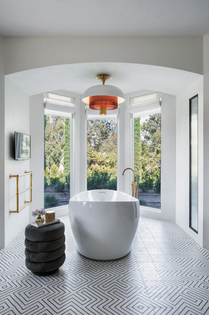
“Our whole team was bold and fearless and our clients gave us a lot of freedom,” Kaye-Honey shares. “They said, ‘You are the experts. We’re going to trust you to do it.’ And that always ends up being the best outcome.”
