Art & Soul
Author:Anh-Minh LeA home tailored to an active young family bursts with exuberance and individuality
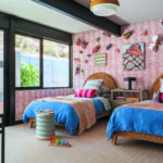
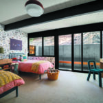
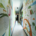
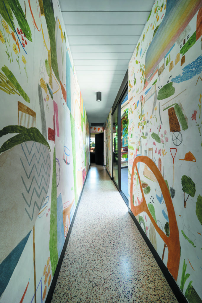
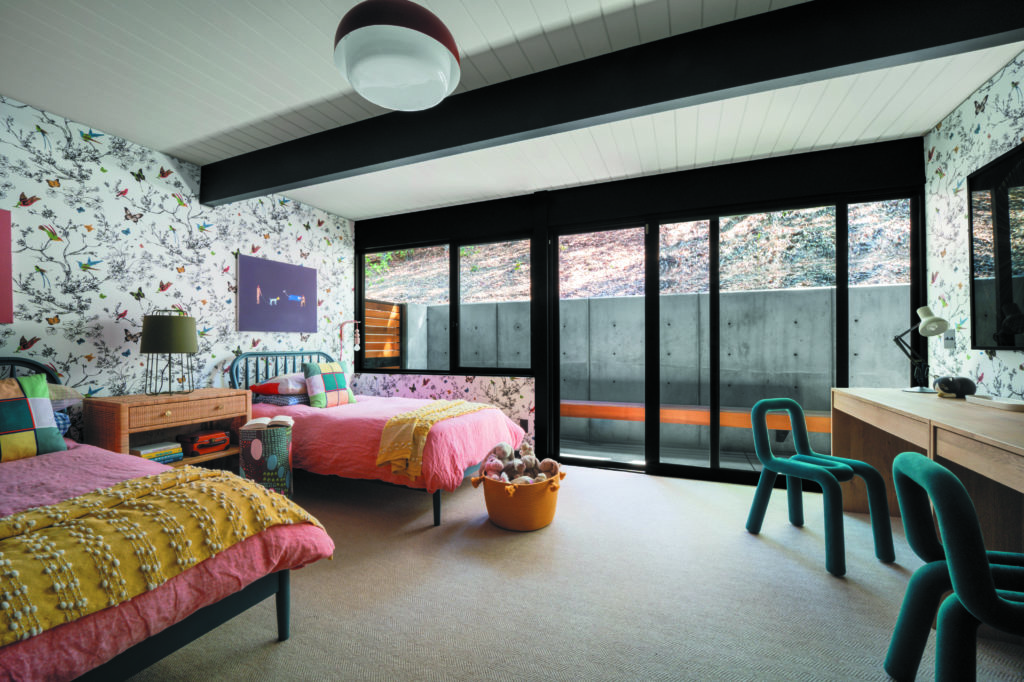
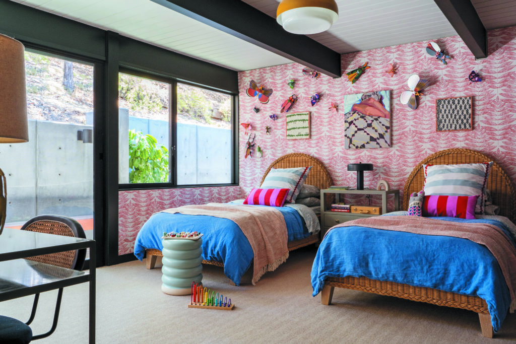
This is a home that literally and figuratively imparts the story of its inhabitants—an art-collecting couple and their four daughters, all ages 10 and under. In what has been dubbed the “girls’ wing,” a mural by Mariel Capanna depicts yellow cupcakes (baked by the kids for their mother’s birthday), gym mats (a nod to one of the daughters’ competitive pursuits) and cascading strawberries (which grow in the backyard). The canvas? The walls of the 21-foot-long corridor just outside the two bedrooms shared by the siblings.
“Mariel’s practice is so site-responsive that she wanted to get to know us, our rhythms, surroundings, environment and cadence of life firsthand,” says homeowner Florie Hutchinson. So the arts publicist essentially established an artist-in-residency for Capanna, who created her fresco over the course
of three stays in the family’s Palo Alto abode. “We watched her transform the main artery of our home into a walkable immersive painting, reflecting our life back at us,” Hutchinson adds.
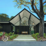
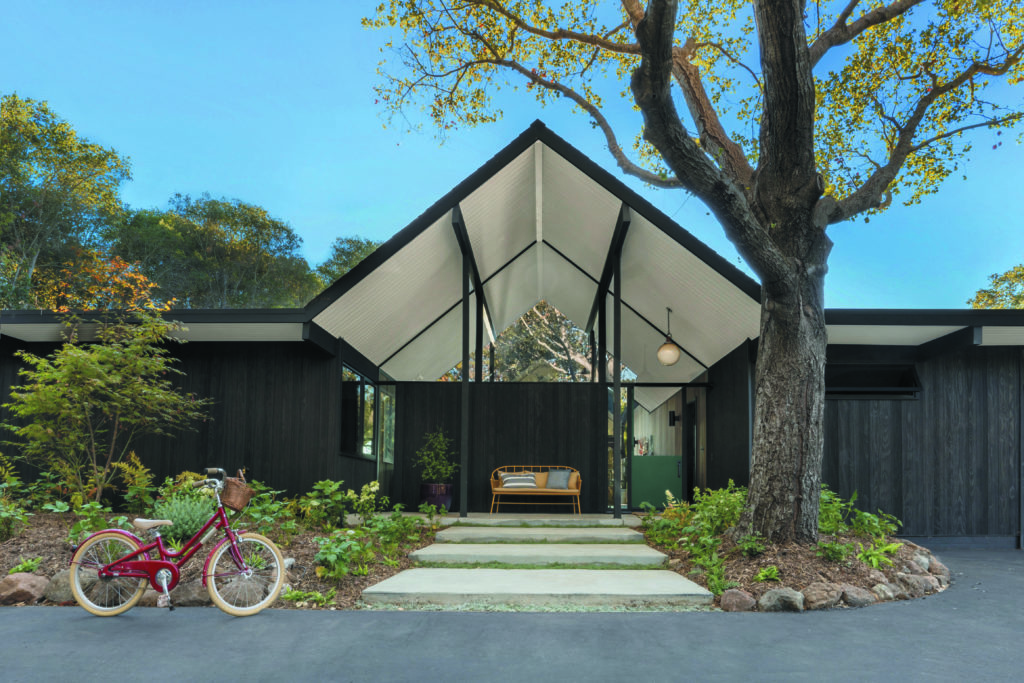
The work is part of an art collection that numbers about 100—and that greatly influenced the architectural and aesthetic vision for the house. Built by developer Joseph Eichler in 1971 for his friend, architect John Lynd, it exhibits many Eichler hallmarks (an atrium, a center spine flanked by
public and private wings) along with some departures (the floor-plan dimensions were larger than usual, including a generous primary bedroom). About a year after its completion, the atrium—initially a landscaped area, akin to a courtyard—was enclosed.
In 2018, Hutchinson and husband Ben, a tech entrepreneur, asked architect Gustave Carlson to come see the property when it was still on the market to assess whether it could be updated to suit their needs and wants. “It’s such an amazing location and piece of architecture,” recalls the founder of Berkeley-based Gustave Carlson Design. “It was remarkable. It had been pretty much untouched.” The structure was ultimately expanded by 600 square feet to nearly 4,600, containing five bedrooms and four bathrooms.
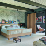
The exterior is clad in Accoya barn wood vertical siding, charred in the Japanese technique of shou sugi ban—its darkness punctuated by a Dutch door in teal. The interior now features walls lined in Western red cedar paneling. The flooring materials include terrazzo with mustard and terra-cotta specks, plus cork and porcelain tiles. The tongue-and-groove ceiling is painted in Farrow & Ball’s Pigeon, while the exposed beams, columns and doors are uniform in Benjamin Moore’s Black Ink.
For the interior design, Florie Hutchinson called on longtime friend Jessica Davis; the two were in the same a cappella group as undergrads at Princeton. Davis, founder of design firm Atelier Davis and hardware brand Nest Studio, currently lives in Atlanta, where she purchased and renovated a mid- century modern dwelling a few years ago.
Photos by David Duncan Livingston.
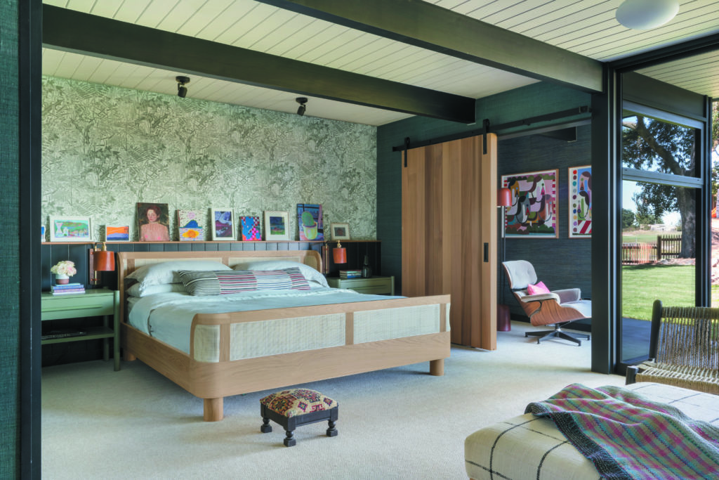
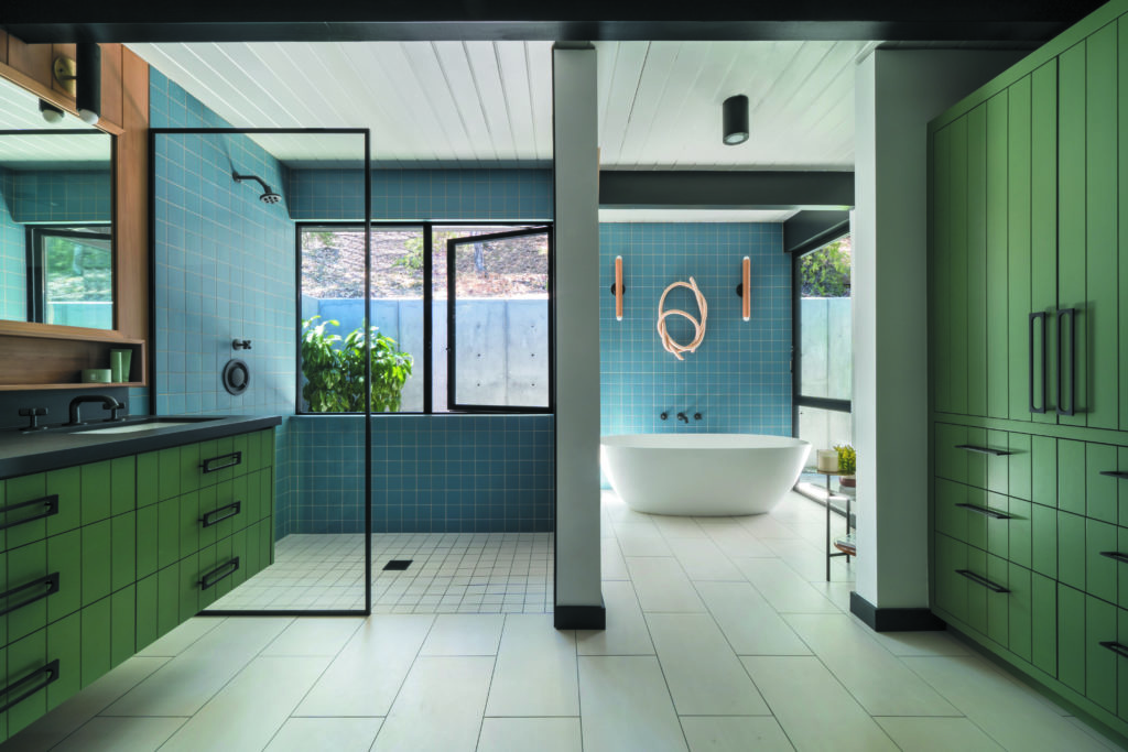
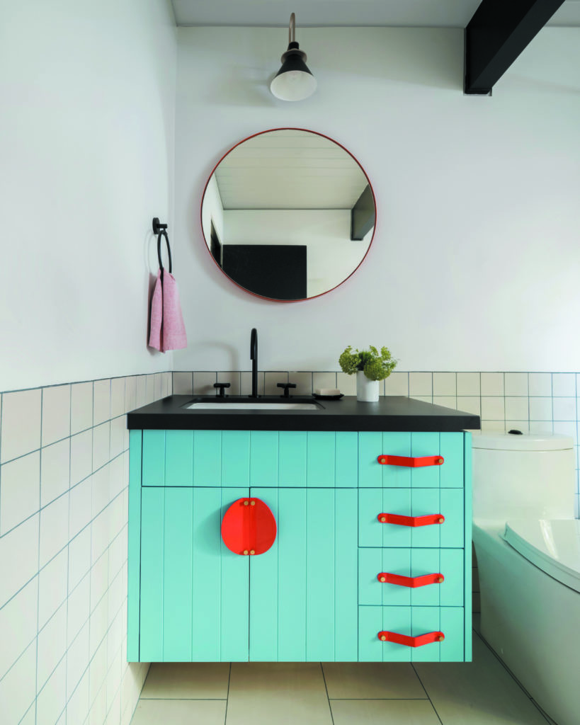
Carlson’s and Davis’s efforts yielded rooms bursting with vibrancy that complement the Hutchinsons’ art collection, which is composed of more than 80 percent women artists. “One of the things that Florie told me is that she and Ben love pattern and they love color,” says Carlson of the early conversations that informed the cabinetry, flooring and tile choices throughout the house.
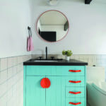
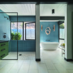
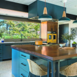
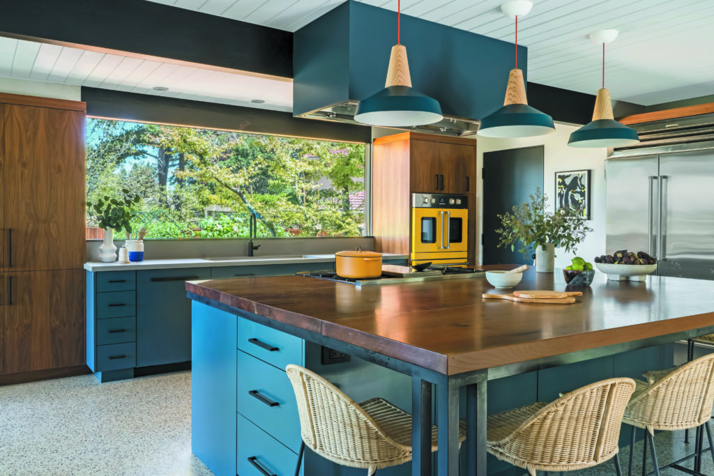
In some instances, colors were pulled from the art, with certain hues selected before the architect and clients knew how and where they would be incorporated. For example, the couple was drawn to Farrow & Ball’s Hague Blue, which was used in the mudroom and the kitchen. Another favorite, Farrow & Ball’s Calke Green, appears in the primary suite’s bathroom as well as in his and her closets.
Photos by David Duncan Livingston.
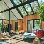
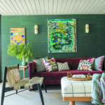
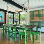
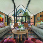
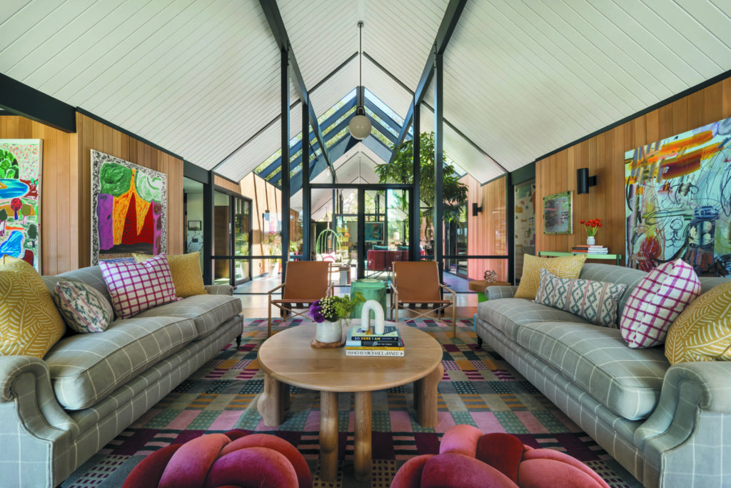
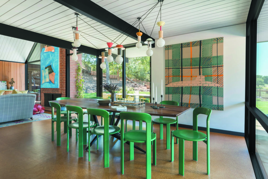
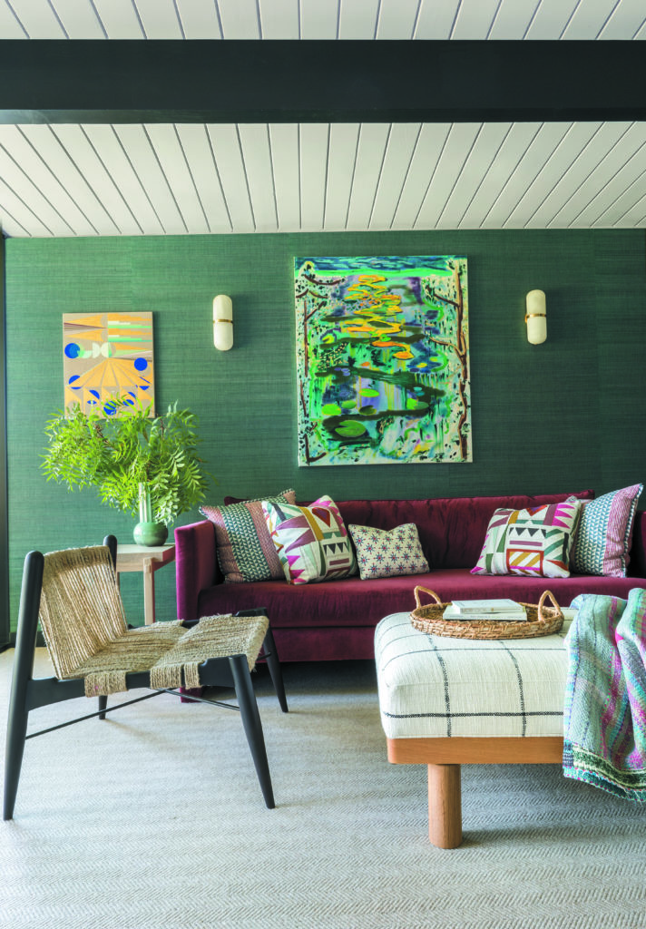
“Jess brought color into the fabric and furniture,” Carlson observes, “strengthening the backdrop, the architecture.” For Davis, “so much of the jumping-off point was the art collection because it’s so colorful,” she explains, noting that “a lot of the pieces of art even have pattern play going on within them.” (Case in point: the plaid in Caragh Thuring’s Check Side, which hangs in the dining room.) In addition to deftly combining prints—from ikats to florals—Davis harmonized different periods and styles. In the living room, a pair of traditional George Smith sofas join Gareth Neal’s leather Ease chairs for Italian brand Amura and blush pink knot-shaped poufs found on Etsy.
Of course, given the ages of two-thirds of the home’s occupants, fun and function were part of
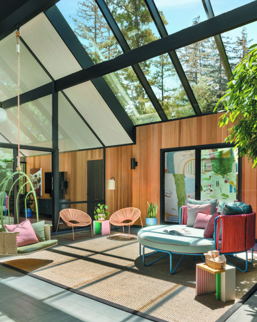
the programming. At the center of the house, the atrium—flooded with natural light thanks to skylights (designed by Carlson and manufactured by Royalite) that are so expansive, they had to be craned into place—serves as a play area, complete with a hanging chair by Mexa. “We used a lot of durable contract- grade indoor-outdoor fabrics and tried not to be too precious,” says Davis. The custom round daybed—which the girls refer to as “the trampoline”—was fabricated by Hancock Surface Studio and upholstered in Perennials fabrics. Davis chose the powder coat and rope colors, too.
Photos by David Duncan Livingston.
Along with her personal connection to the clients, this project stood out for Davis because a significant amount was done remotely, with only two site visits. Its success is a testament to the collaborative process between Davis, Carlson and contractor Scott Flegel of Flegel’s Construction. For Carlson, this was his most colorful undertaking to date. “The more pattern and the more color that you bring to the table, the better,” he says. “That was kind of the adage, and it never seemed to stop.”
