Ain’t Nothing Like the Real Thing
Author:Lindsey ShookBetsy Burnham paints a Santa Monica bungalow in shades of bright and beautiful
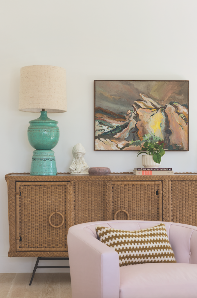
AFTER BEING LONGTIME fans of interior designer Betsy Burnham’s work and having a bulging folder of clippings to prove it, a cool L.A. couple wasted time rifling through a slew of less experienced designers who didn’t work out for one reason or another. Finally, they picked up the phone and called Burnham, who told them, “If you’re collecting their tear sheets, that’s the designer you should hire.”
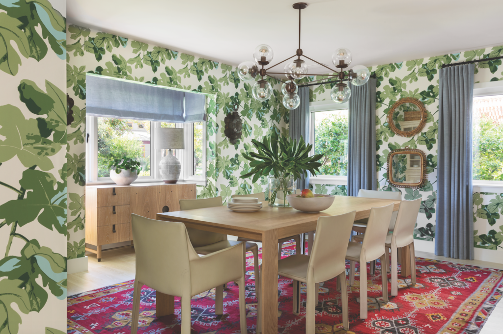
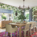
in Peter Dunham’s classic Fig Leaf wallpaper and featuring a vintage rug discovered at Woven, is centered by Hive Modern’s Extenso table, around which Cassina’s Cab dining chairs are clustered. Photography by Laura Hull.
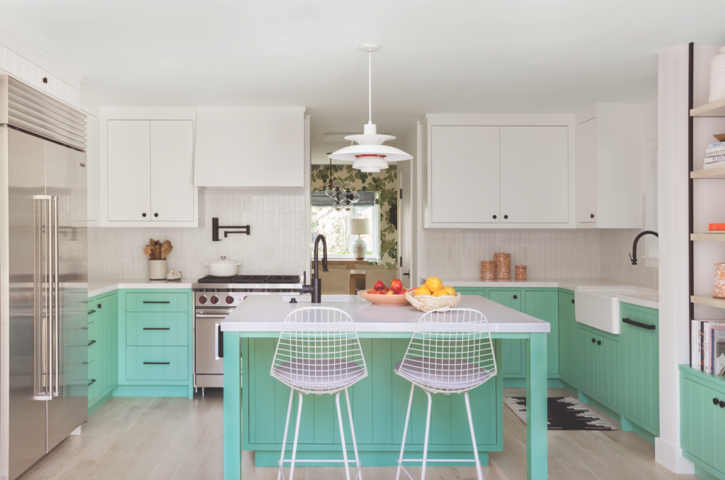
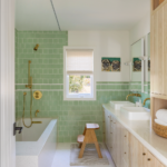
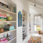
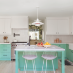
balance the lively mint green. Photography by Laura Hull.

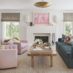
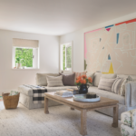
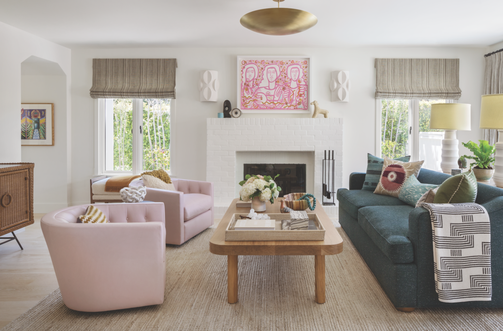
area rug from International Flooring and the 1573 chair from Lee Industries covered in Colefax & Fowler’s Boxwood Union play supporting roles in the family room, which is dominated by a painting by America Martin, via Joanne Artman Gallery. Photography by Laura Hull.
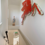
From the first meeting, sparks flew and it was clear this would be a successful partnership. “Our tastes were very similar,” Burnham recalls. The clients had already hired architect Hervé Daridan to reorganize the second floor, shrinking the master suite to accommodate two junior bedrooms and a bathroom for the couple’s young children. “He’d created this nice long hallway that embraced all the bedrooms with windows on one side to bring in lots of light,” Burnham explains.“While they had to downsize their closet, they still got a nice big master bath.” The two downstairs bedrooms were transformed into a playroom and a home office. “Then we decided to remodel the kitchen,” says Burnham, “so almost every room in the house got touched. All the windows got changed, the interior doors changed, the baseboards—everything.”
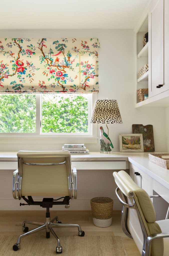
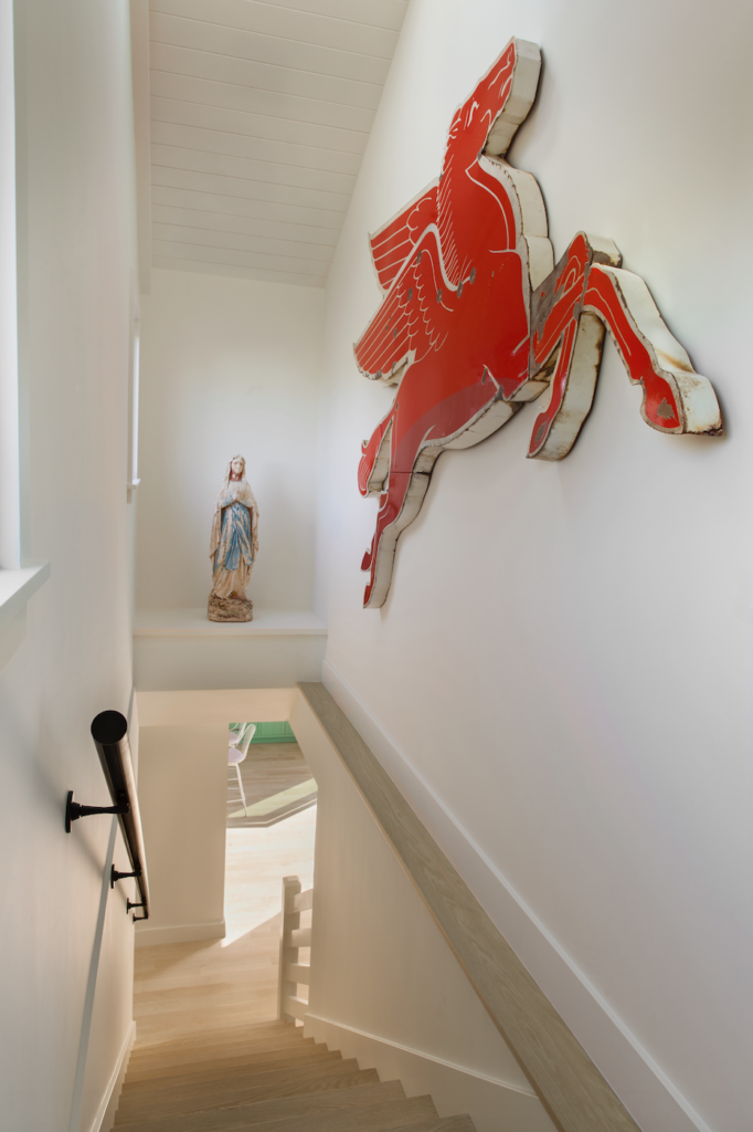
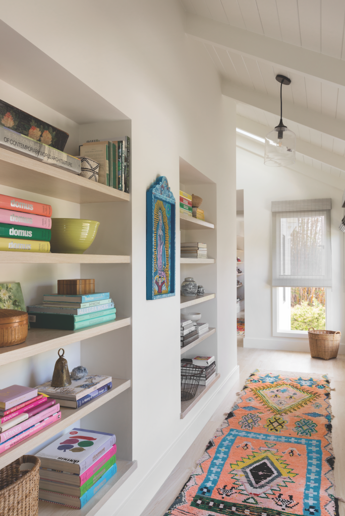
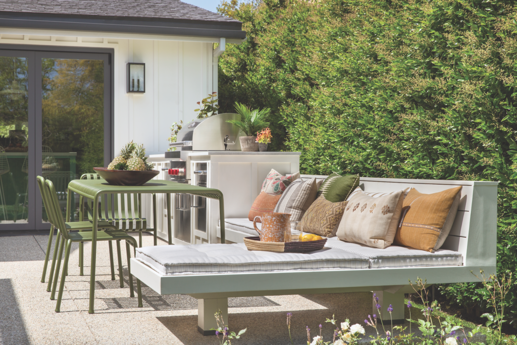
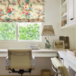
“There were traditional details in the house that my team and I felt didn’t belong,” Burnham remembers, “so our job was to strip out all the detailing and bring it back to a funky bungalow.” Out went the traditional fireplace, the Carrera marble kitchen and the dark wood floor. “We dubbed it the Art Barn with the idea of it being happy and colorful and open,” notes Burnham. In came bleached oak floors, new tongue and groove doors with levers instead of knobs and vivid colors and patterns.
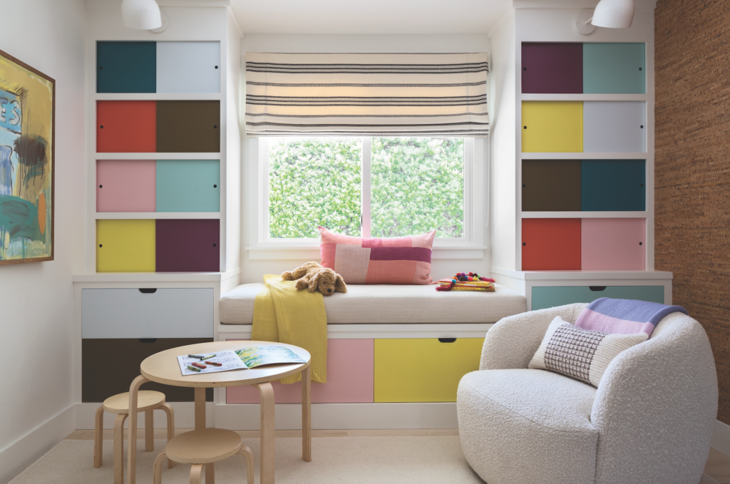
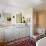
To give the compact home an expansive feel, Burnham kept the details, like the cabinet styles in the kitchen and the bathrooms, consistent throughout the house. With the framework in place, Burnham’s ideas took flight.
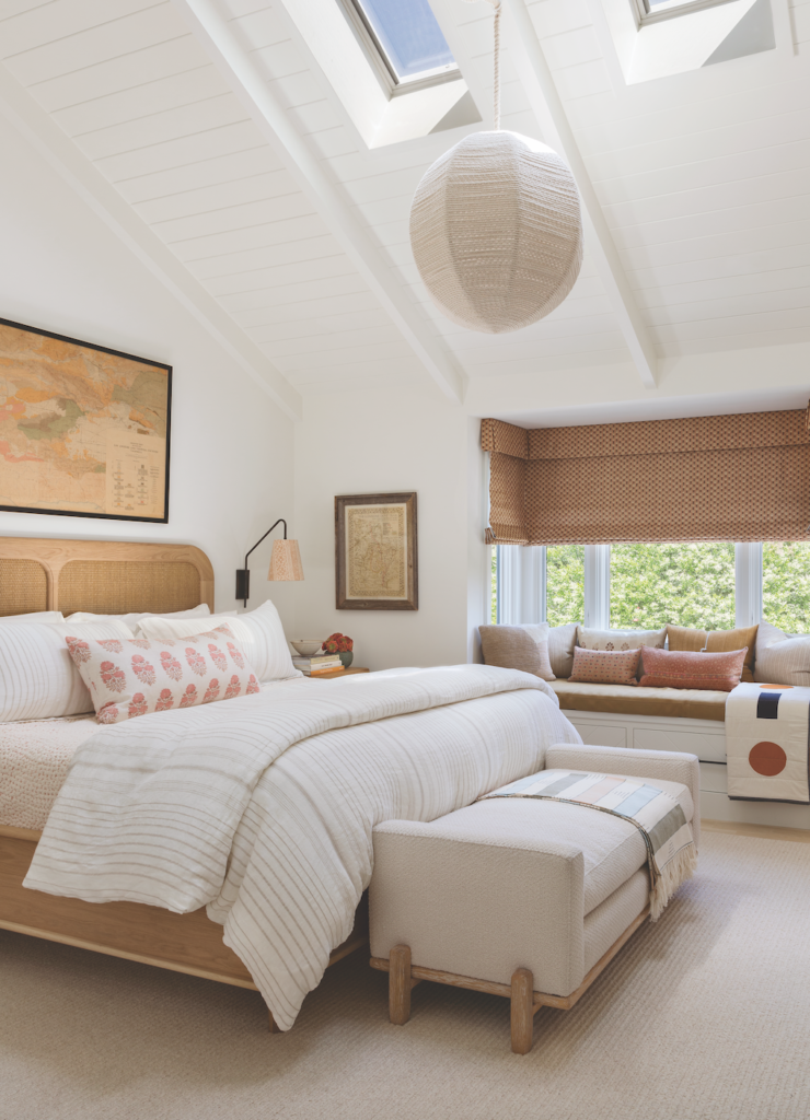
“I love color and pattern and I love clean palettes. I’m not an all-neutrals person and neither were the clients,” she shares, “They didn’t want it to be muddy and industrial. They wanted to introduce color and I love that.”
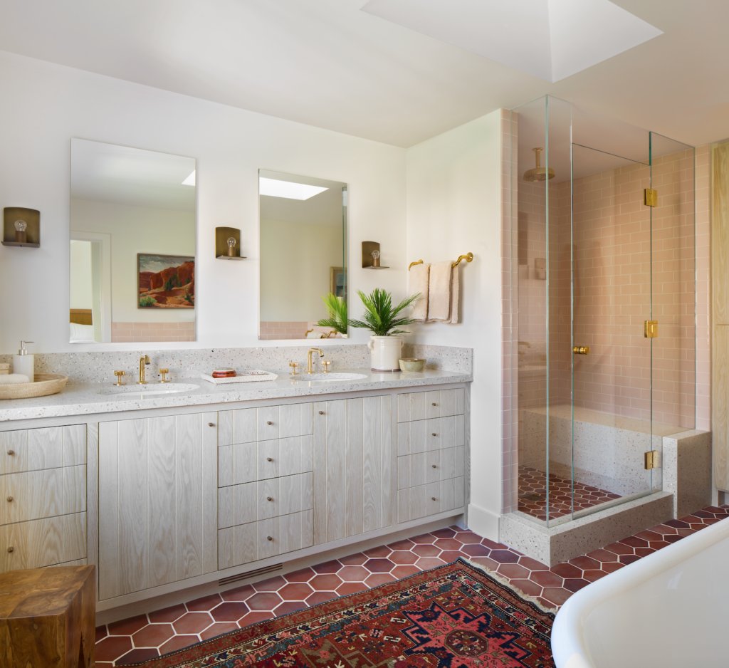
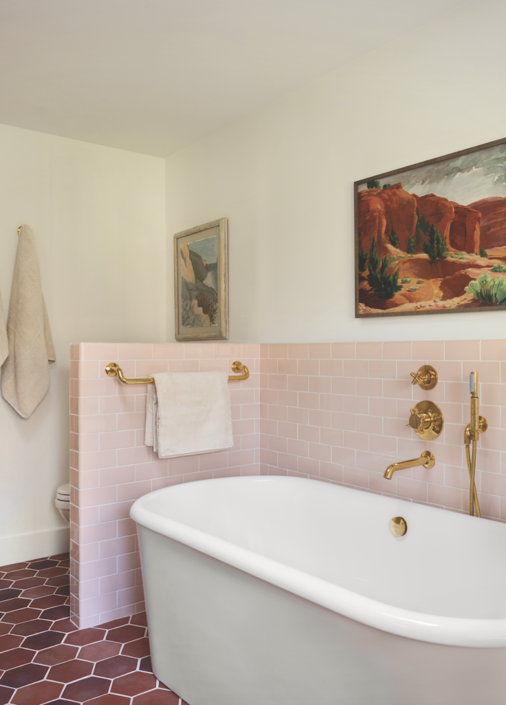
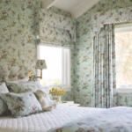
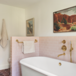
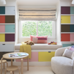
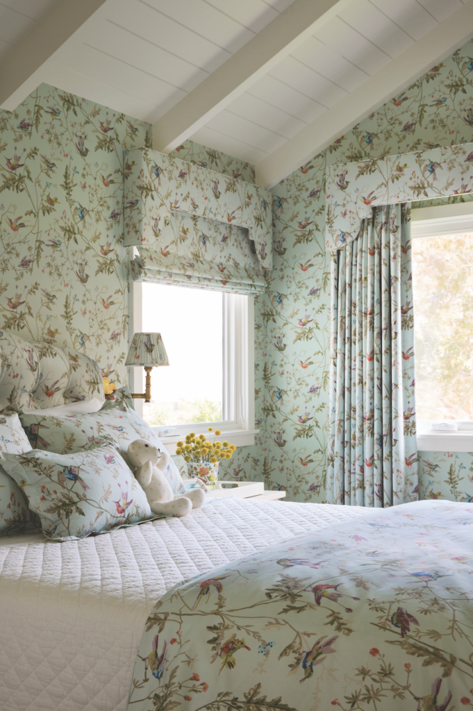
A thread of green and pink runs through the house. “She picked it,” enthuses Burnham. “It was very exciting. I love that about them.” In the sitting room, that translates into orchid leather chairs from A. Rudin paired with the Bridget sofa from Wardrobe by Burnham Design, which is covered in a teal tweed by Kirkby. In the kitchen, lower cabinets were washed in Farrow & Ball’s Arsenic. Paired with Whisperby Dunn Edwards on the upper cabinets and glossy tiles from Heath Ceramics, the result is bright and playful. Subtle copper accents, like the canisters on the countertop and the interior of the hanging light, evoke rosy hues. In the dining room, the mood turns dramatic courtesy of Peter Dunham Textiles’ Fig Leaf wallpaper paired with a vibrant red kilim. In the playroom, a checkerboard spectrum of the multiple colors is high-spirited. Upstairs, in the bedrooms, the hues dance to the tunes of their occupants: green and red make cameos in a classic little boy’s room; floral pastels create a dream room for a little girl; and in the master suite, rich terra-cotta and pink tiles in the bath are subdued into cameo pink and brown in the bedroom for an appropriately sophisticated adult retreat.
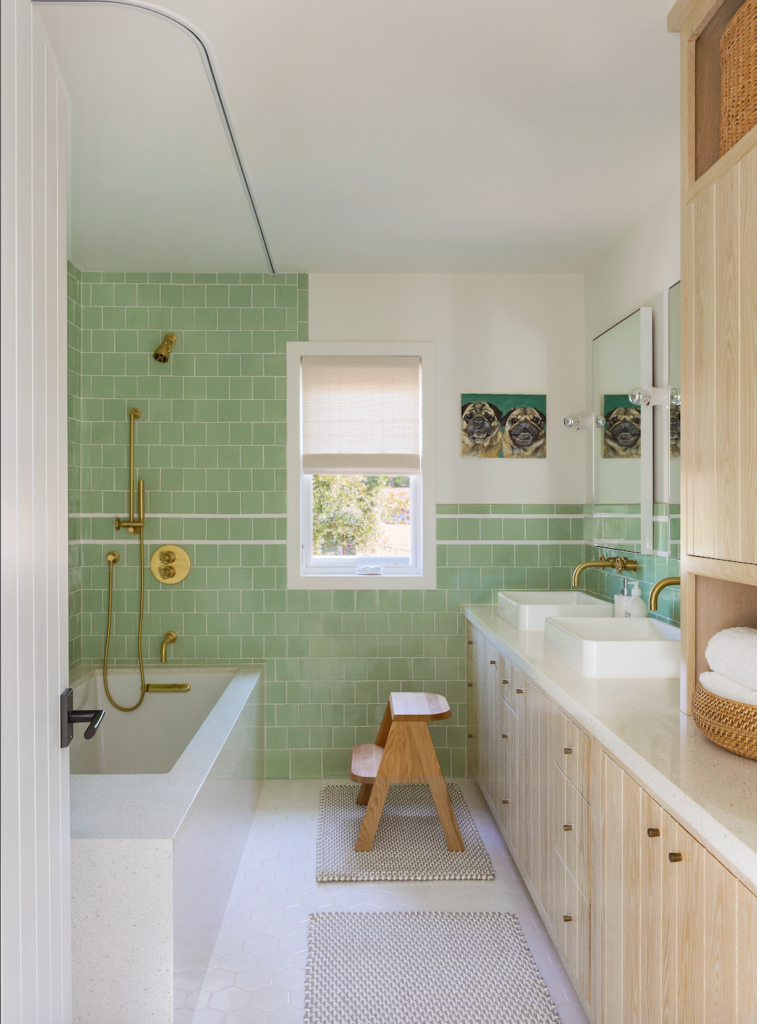
“There’s always that moment when a lightbulb goes off with a client,” says Burnham “and you can feel that they trust you. Sometimes I have to earn it. But this was one of those wonderful occasions when it was there from the beginning.” That’s the real deal that renders happily ever after.
