After, Ever Happily
Author:Abigail StoneStudio Schicketanz tweaks a midcentury modern home for a Carmel couple.
A happy home is one that conforms to its homeowner’s unique needs. Sometimes, an architect or interior designer can start from scratch. More often, they need to take an existing space and reimagine it for the current occupants.
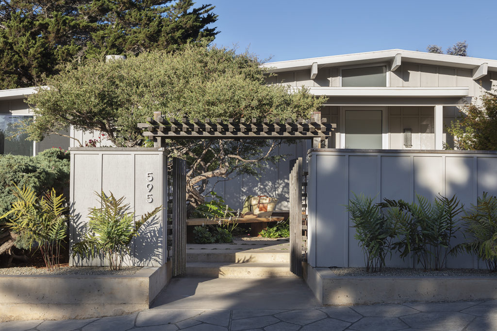
The owners of this Carmel Knoll residence came to Studio Schicketanz after realizing it would need work to functionally address their needs. A classic midcentury home, it had undergone multiple renovations over the years: ceilings had been lowered to accommodate a new HVAC system; an existing garage had been converted into a studio; a second story and a garage had been built on the opposite side of the house. Under the weight of these modernizations, little of the original “good core” of the home was still visible.
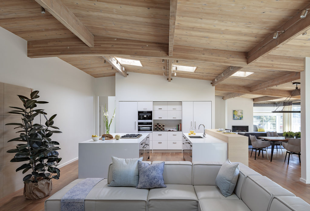
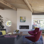
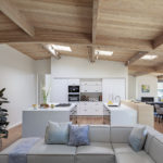
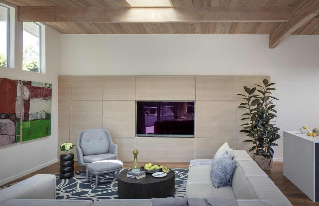
“The clients pleasantly surprised us,” says Mary Ann Schicketanz of Studio Schicketanz, who was both the architect and the interior designer on this project. “Specifically, the unassuming retired couple surprised us by requesting very welcomed, but unusual, requests – like substantially reducing kitchen storage in favor of openness in order to showcase the architecture; reducing the deck space in favor of a green roof; moving the fire place to get the direction of the seating right for the space; and replacing a hallway wall with glass to give clarity to the additions to the original house.”
Schicketanz greeted these challenges with glee. “We love to create places that bring pleasure and comfort to our clients,” she says, “It is our goal to provide spaces that are practical, beautiful and integrate into their particular environment.”

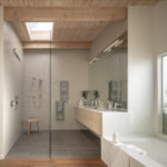
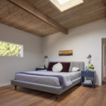
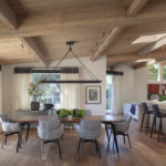
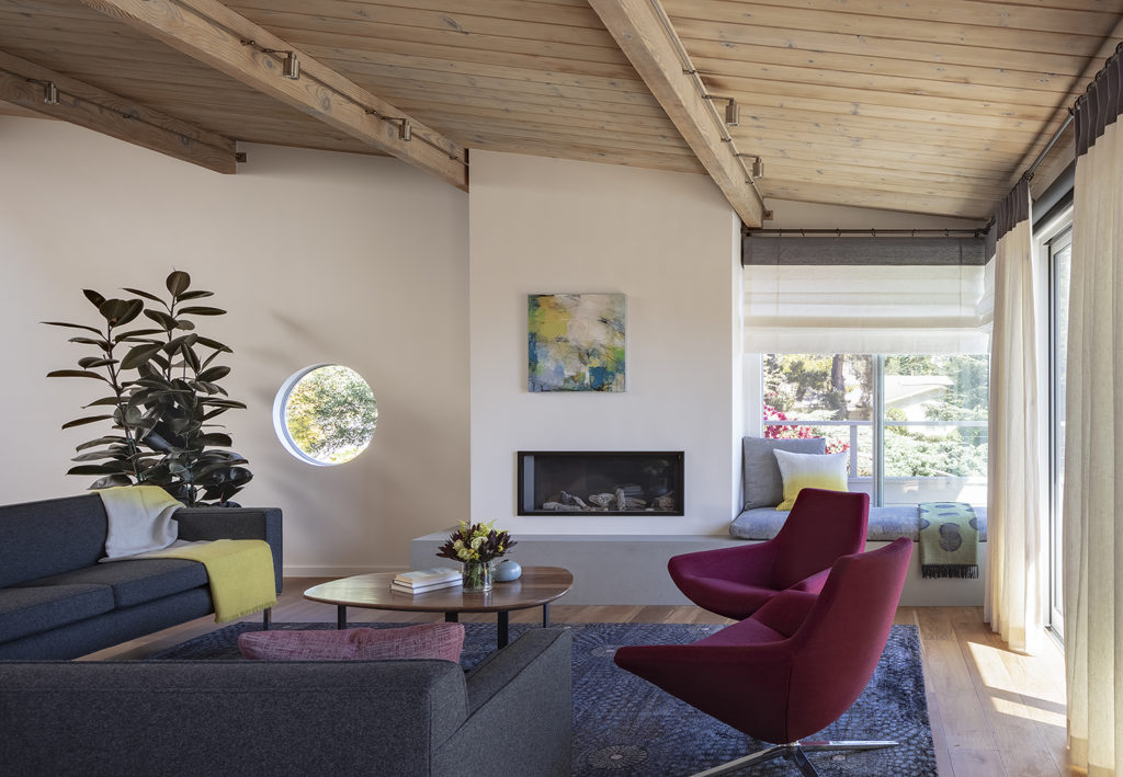
But how to clarify the design without sacrificing the home’s square footage? Because the home was on corner lot on a hillside and felt very exposed, the first move was to make both the entry and the small master bedroom’s courtyard spaces private and unique. Schicketanz added a hallway to the entry court that defined and separated the original structure from the addition. By switching to hydronic heat, an energy-efficient radiant heat system that relies on hot liquid (in this case the home’s hot water pipes placed under the floorboards) to warm the home, the firm was able to remove the ceiling, exposing the gently sloping roof and showcasing the home’s original wood decking and skylights.
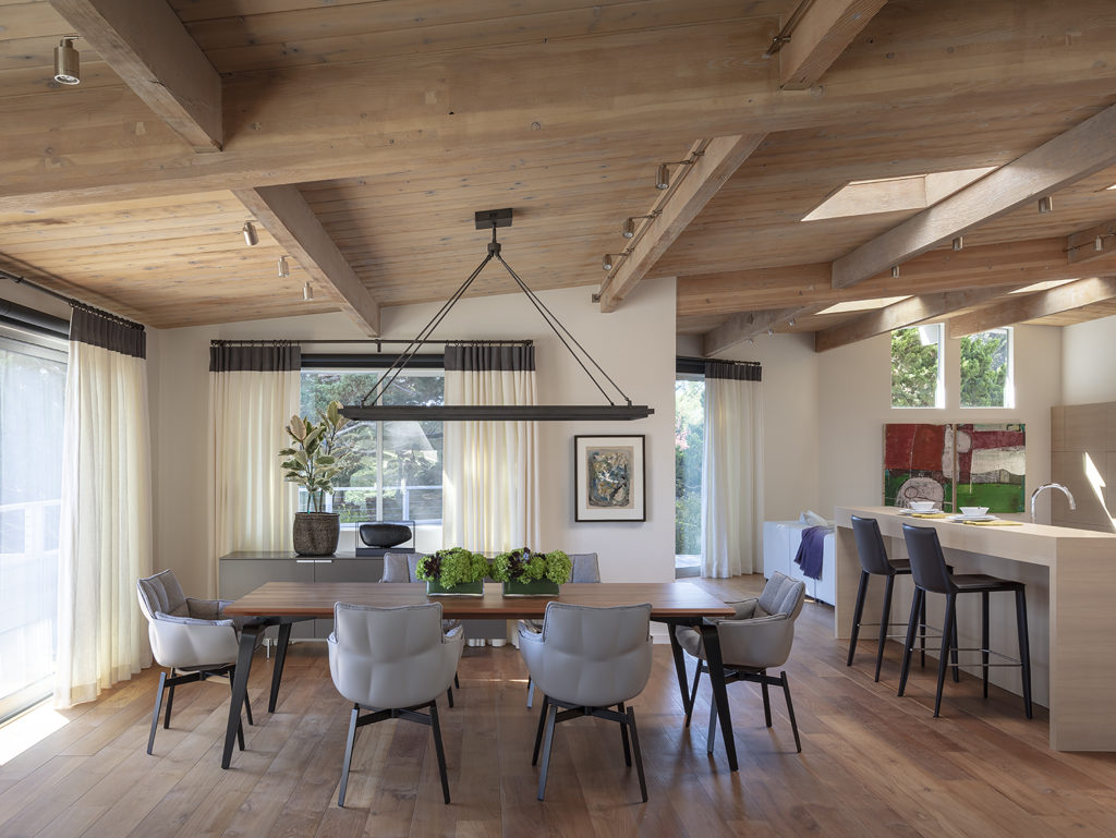
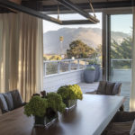
To create a great room and adjacent open-plan kitchen, non load-bearing walls were removed. With the entire ground floor now open to the surrounding deck, reclaimed teak floors were used for the interior and the exterior, blurring the line between the indoors and out. New windows and doors and the addition of a green roof above the garage were also part of the home’s makeover program.
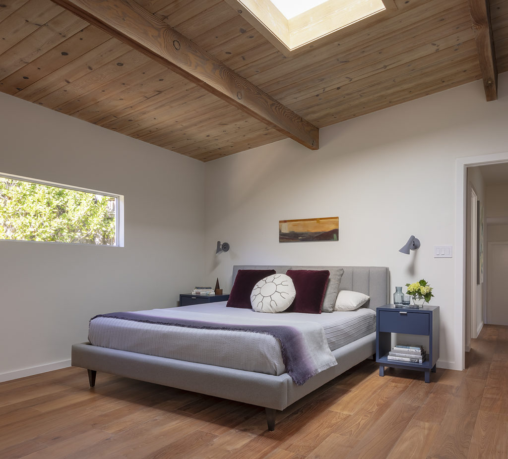
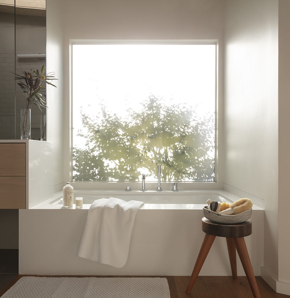
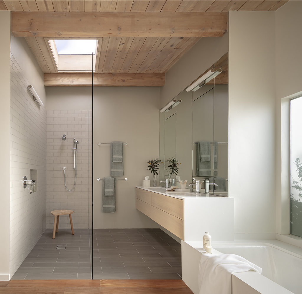
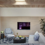
The final touch: “We furnished the house from scratch…another surprising aspect for clients in their sixties!,” says Schicketanz. The result was a happily ever after home. “It has been a pleasure to give an “abused” midcentury home new life!”
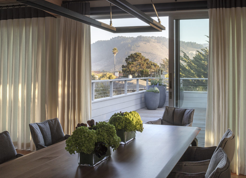
Photo: Eric Rorer Photography

