A Woodsy Wonderland
Author:Anh-Minh LeAt once enchanting and eerie, this forest retreat has a style all its own
How do you follow up a project playfully dubbed “Little Women on Acid”? For the same client’s vacation home in the Sonoma County town of Occidental, you conjure “Twin Peaks on Prozac.” “The clients are just so creative and open and cool,” says interior designer Chloe Redmond Warner of the couple, who reside full-time in Piedmont with their two school-age children. Both concepts that Warner devised for the family deftly mix colors, prints and eras. In the case of the weekend retreat, nestled in a region with redwood groves, “we felt very lucky to collaborate on such a beautiful and spooky brief,” she adds.
Warner notes that “the wife has a huge imagination and is capable of being super evocative. Whereas another client might name a style or a color that they like…this one gets really specific about her inspirations. She and I build on each other’s references and then come up with a brief. And it’s like, ‘Oh yeah, this is going to be so much fun.’”
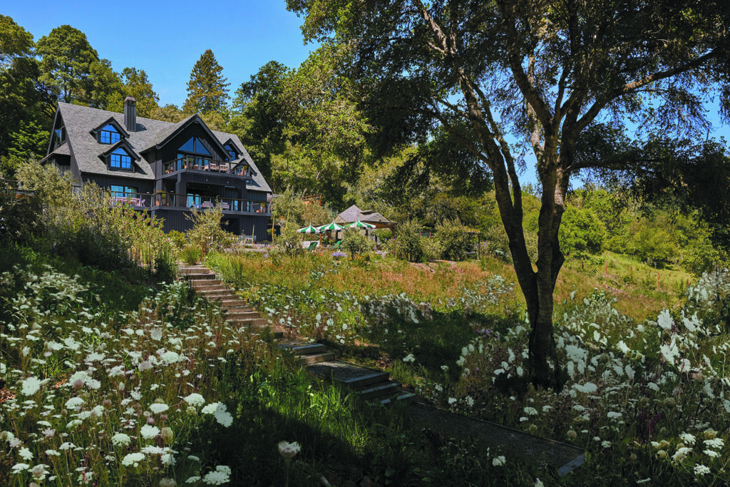
Working with Andy Brucker of Brucker Building Company, Warner, the founder of Berkeley-based Redmond Aldrich Design, reimagined the residence’s 3,600 square feet. To start, its previously white exterior—a decidedly more farmhouse aesthetic—was transformed with coats of Farrow & Ball’s Off-Black. “It was such a dramatic change and perfect to go with this woodsy, Twin Peaks idea,” Warner observes. “Our client wanted to take it to a more magical place.”
While wood-paneled walls frequently appeared in the filming locations for David Lynch’s 1990s television program, which was set in a fictitious Pacific Northwest logging town, Warner’s Northern California interpretation has timber overhead and underfoot. The wood beams and ceilings throughout the house were existing, as were the oak floors that she had refinished.
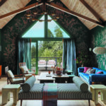
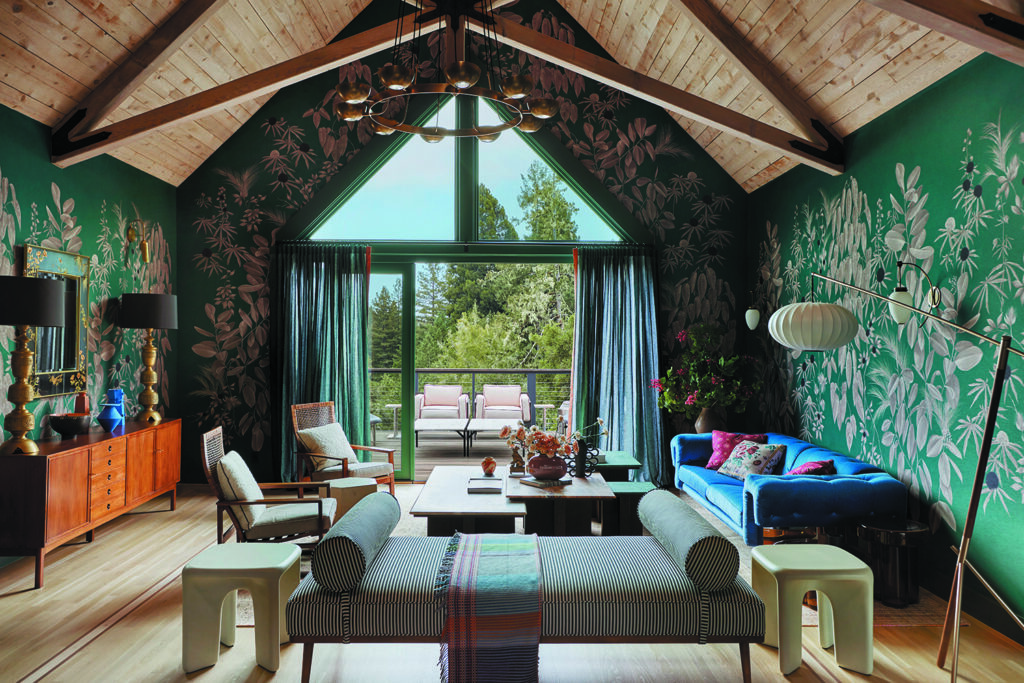
Upon entering the three-story dwelling, the double-height living room comes into view. Anna Glover’s Garden of Serica silk wallcovering, custom designed for the space—taking into account its peaked ceiling and triangular windows—immediately captivates. “I had been sitting on a swatch of it for a year or more, just waiting for the perfect place to use it,” Warner recalls. “We decided our key words [for this project] were spooky, beautiful and magical—that pattern embodies all of those things.”

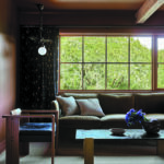
The living room, which serves as the main gathering area, offers ample seating. A vintage Milo Baughman sofa is covered in a cobalt blue mohair velvet, while a daybed from Anthropologie has been updated with a black-and-white stripe; both fabrics are by Schumacher. In signature Warner style, vintage (like the Gino Sarfatti brass chandelier and La Barge reverse-painted glass mirror) and contemporary (the coffee table of her own design and a Bzippy double-tiered side table) harmonize.
Photos by Laure Joilet.
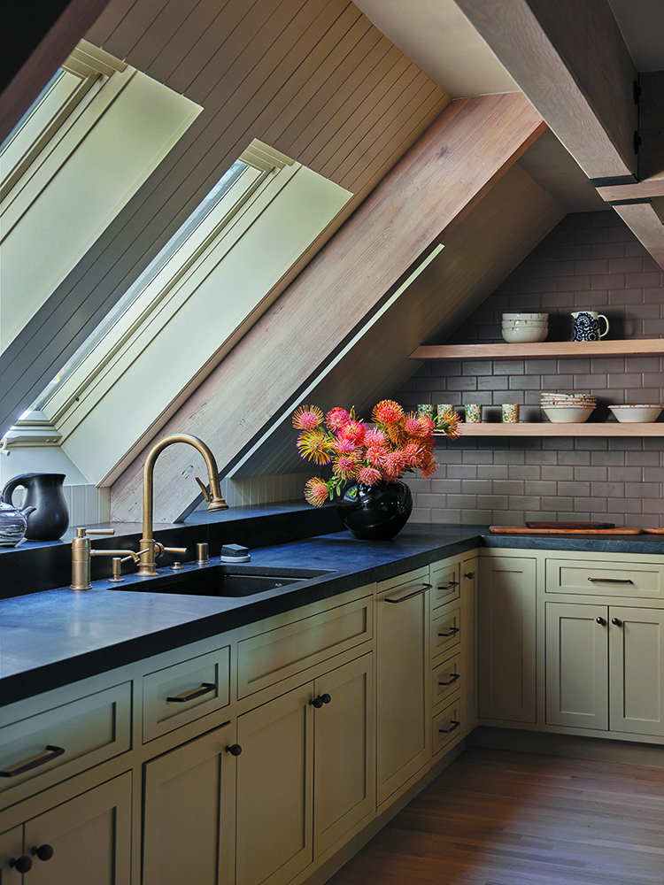
Warner describes the nearby kitchen as “one of the most successful refreshes we’ve ever done. It was basic before—very simple and straightforward.” She kept the layout but altered the surfaces, introducing soothing neutrals. The backsplash consists of Fireclay subway tiles in a color called Sandstone. Farrow & Ball’s Old White was selected for the walls and cabinetry; the latter benefits from Van Cronenburg hardware and soapstone slabs from Integrated Resources Group as well.
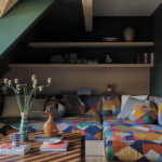
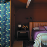
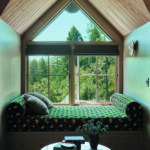
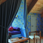
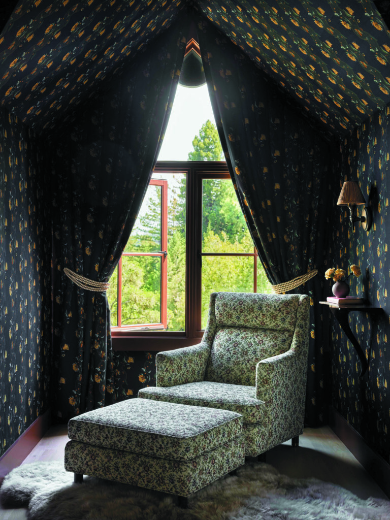
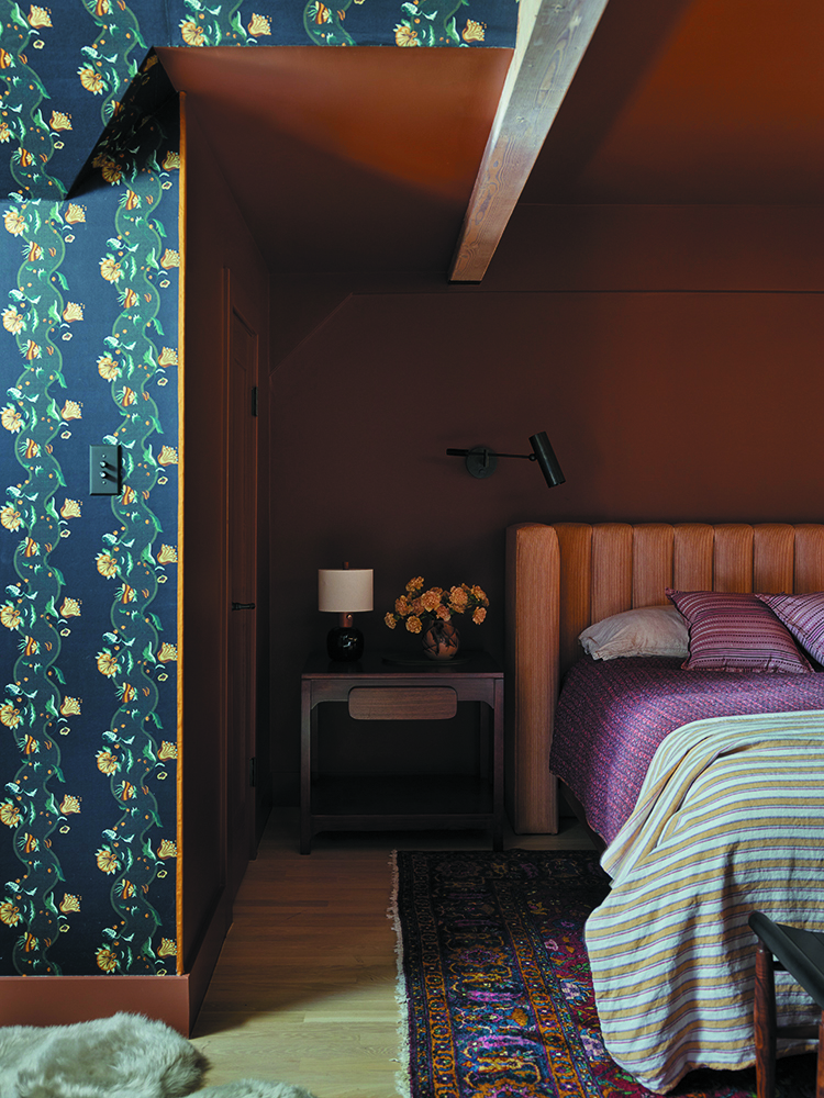
The design team was also tasked with coming up with distinct ideas for the dormer windows in four rooms. In the main bedroom, amid walls painted a rich chocolate hue—Benjamin Moore’s Marsh Brown—the alcove is upholstered in a Zak+Fox fabric with trails of leafy blossoms. The same pattern, Incanto, was used for the curtains that cascade from the dormer’s apex.
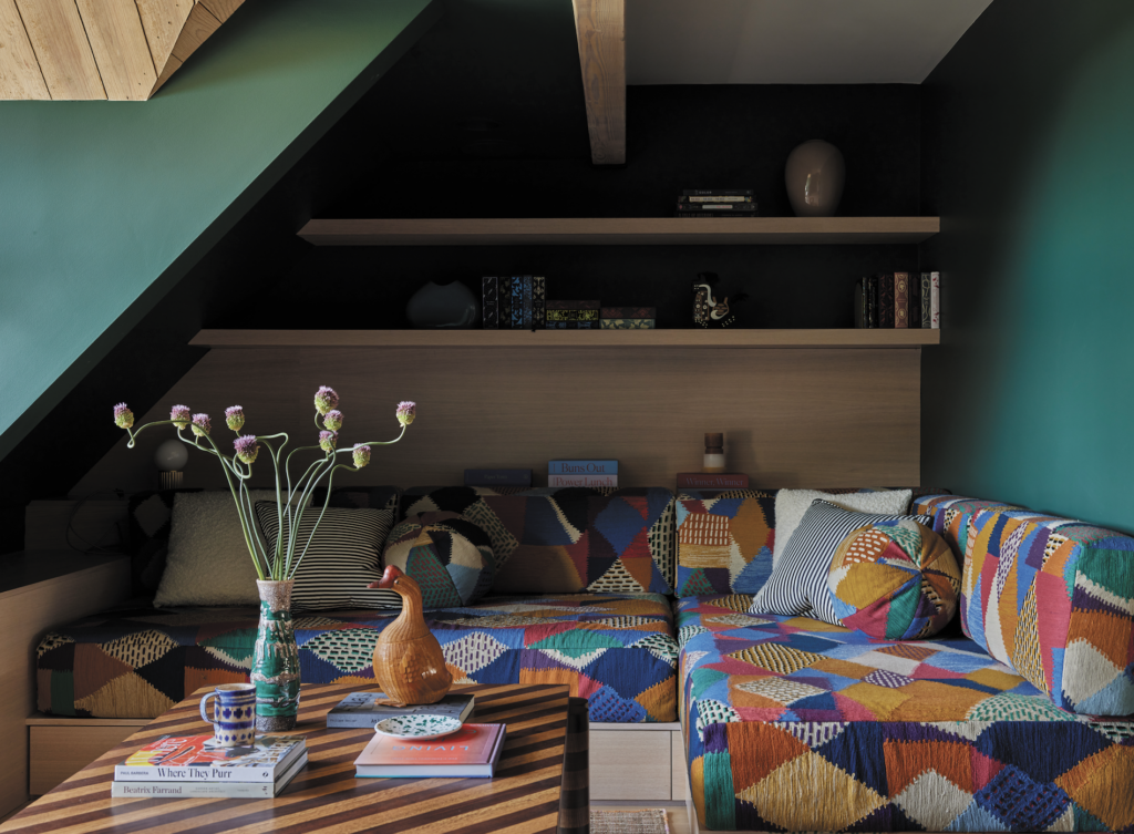
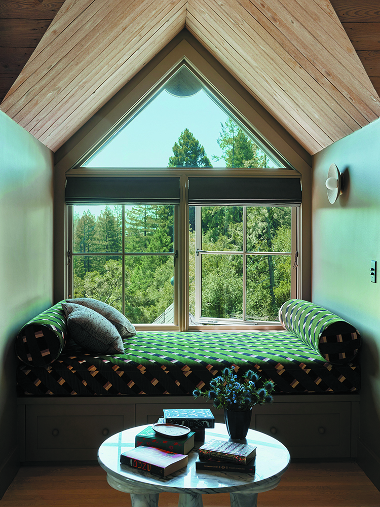
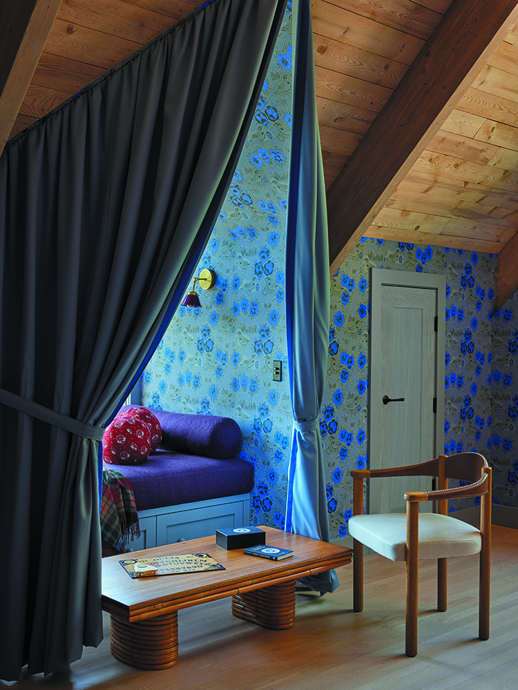
Elsewhere on the entry level, the nook in the library is furnished with an early 20th-century Thonet rocking chair. In the children’s bedrooms upstairs the dormers are outfitted with daybeds with sleepovers in mind. The girls’ room, Warner says, “got lavished with the most charm. We did a special tented feature. The boy’s room is functional, but it doesn’t have the pageantry of the drapery.”
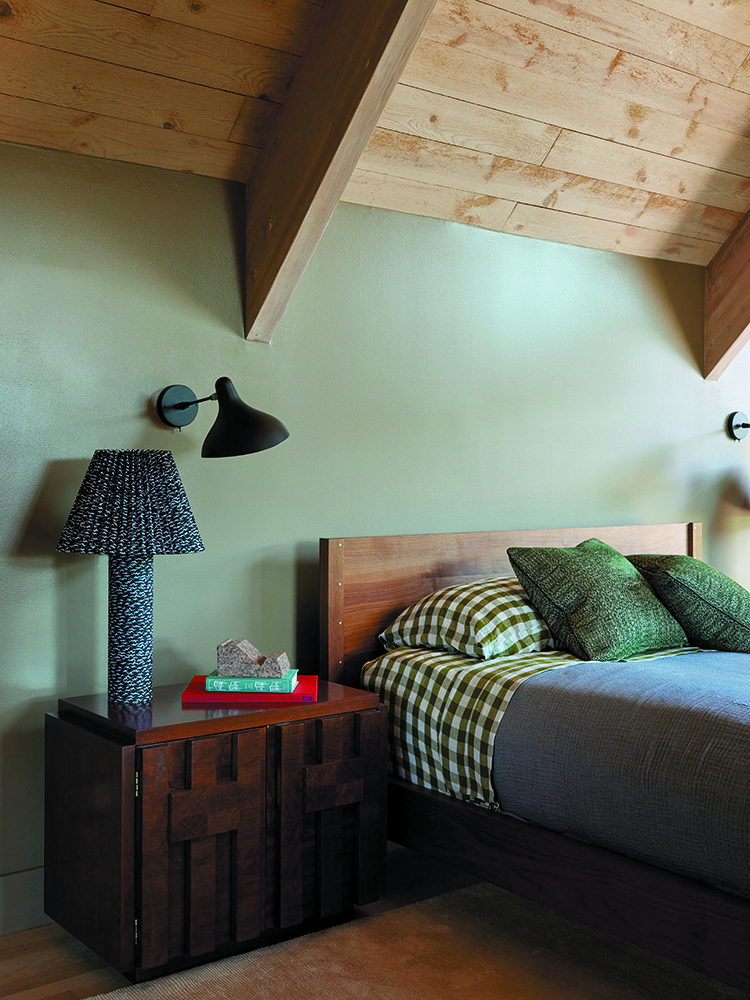
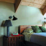
Indeed, in the son’s sleeping quarters, she continues, “I had to put my instincts on hold: Don’t use florals or lots of colors.” Hence, the palette relies on shades of green; for example, the daybed’s cushion and bolsters that are wrapped in a Pierre Frey striped velvet, and the Serena & Lily gingham linen bedding. (Warner has a well-known affinity for florals; her fabric and wallpaper collections, which launched earlier this year, include several such motifs.)
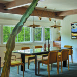
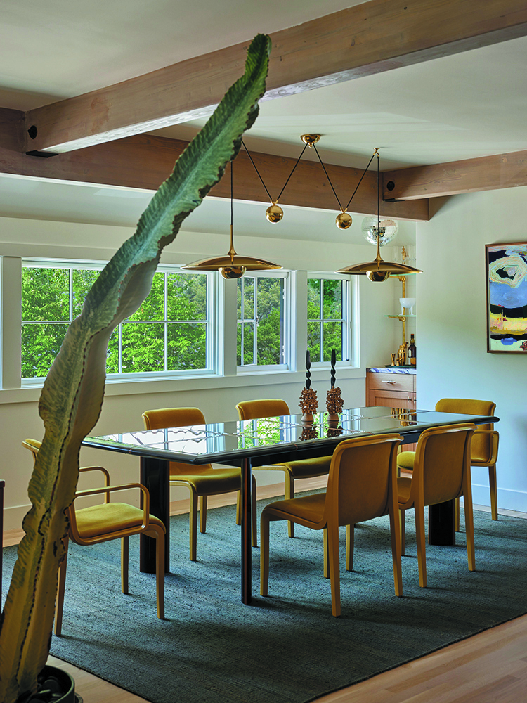
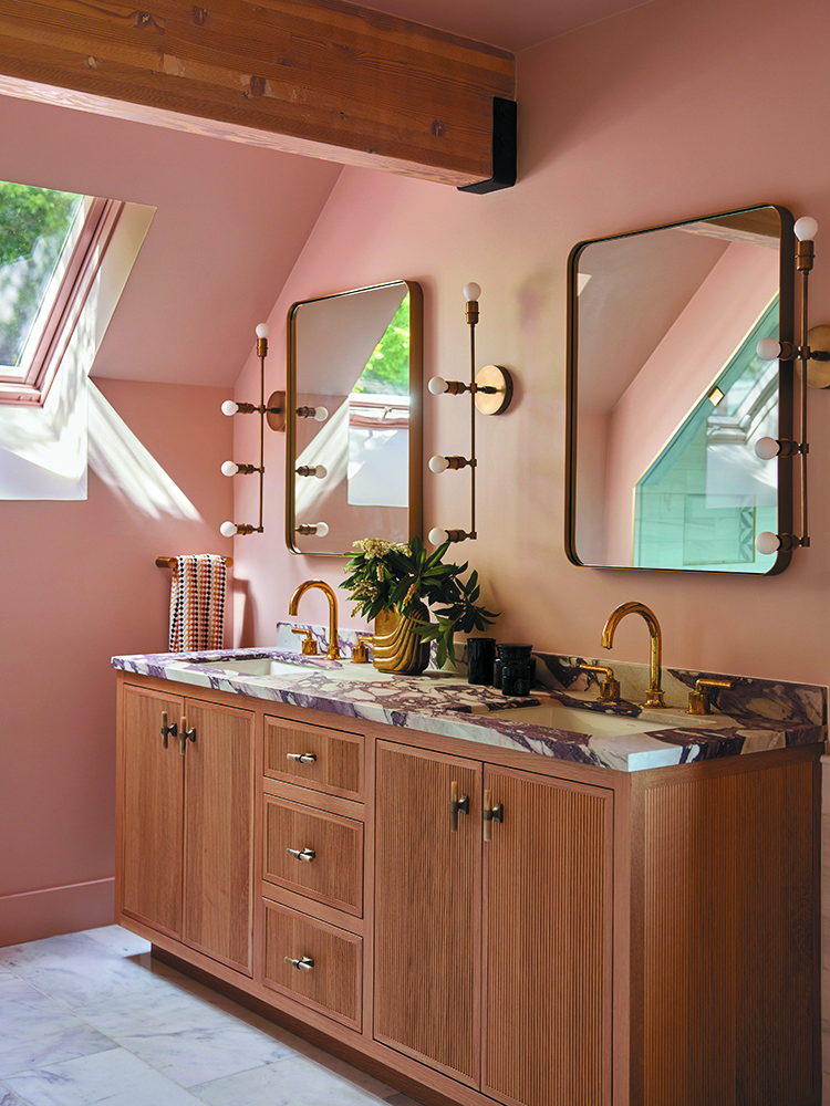
For this project, no walls were torn down, but one was added to the dining room to conceal the staircase—a modification that yielded a niche for a bar. Along with a Calacatta Viola-topped cabinet and an Urban Archaeology brass shelving system, a disco ball that belonged to the client further draws you to the spot. It’s one of various elements that contributes to the property’s eccentric aura. See also: the main bedroom’s pendant lamp with a bat clutching an opal glass globe. As Warner puts it, “We wanted the home to look moody but live happy.”

