A Fresh Yet Timeless Take
Author:Anh-Minh LeA successful redesign can call for not only recognizing what goes, but also what stays
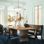
While mirrored walls are often used in diminutive dwellings to give the illusion of more space, in a 4,400-square-foot house, the strategy can give off outdated vibes. That was the case in a project that Katie Martinez Design completed in San Francisco’s Pacific Heights neighborhood. The mirrored kitchen backsplash and mirrors that lined an entire powder room wall were among the reflective surfaces that had to go, as Katie Martinez embarked on creating a home that is “classic and timeless, but relevant to the clients as a young family in California,” she says, noting that a relaxed atmosphere was a priority.
When the husband and wife purchased the 100-year-old three-story residence in 2019, it was likely last updated in the 1990s—and was ready for another refresh. Martinez was mindful of what could be retained and revived, often relying on color and pattern to achieve remarkable transformations. “What was really successful about this project is that we did not gut this project,” says Martinez, who worked with contractor Colindres & Associates. “We didn’t do a full remodel, but we remodeled some important elements. As a whole, the project feels cohesive; it doesn’t feel like there were some things not done.”
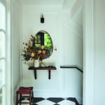
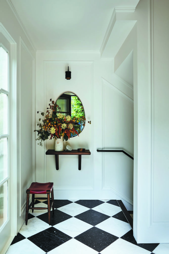
Throughout the house, wood floors were stained darker and walls painted in Benjamin Moore’s Simply White. Martinez set the tone in the entry, where she opted for 16-inch square floor tiles in black-and-white marble, a fresh coat of white paint, a custom wall-mounted walnut console by Christian Hummler of Giuntoli Woodworking and steel handrails by Kyle Reicher of Ferrous Studios. “We really cleaned it up,” she says of the pared-back aesthetic that she describes as “graphic yet classic.”
In the kitchen, Martinez replaced the mirrored backsplash with white tiles and swapped out the hardware. She kept nearly everything else: the countertops, appliances, plumbing and cabinets. Paint is the hero in here. The upper cabinets are now Simply White (matching the walls), while the lower are also a Benjamin Moore hue, Day’s End, whose blue and purple undertones draw on the granite countertops. “It’s a nice example of a light remodel that really works,” says Martinez.
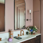
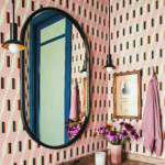
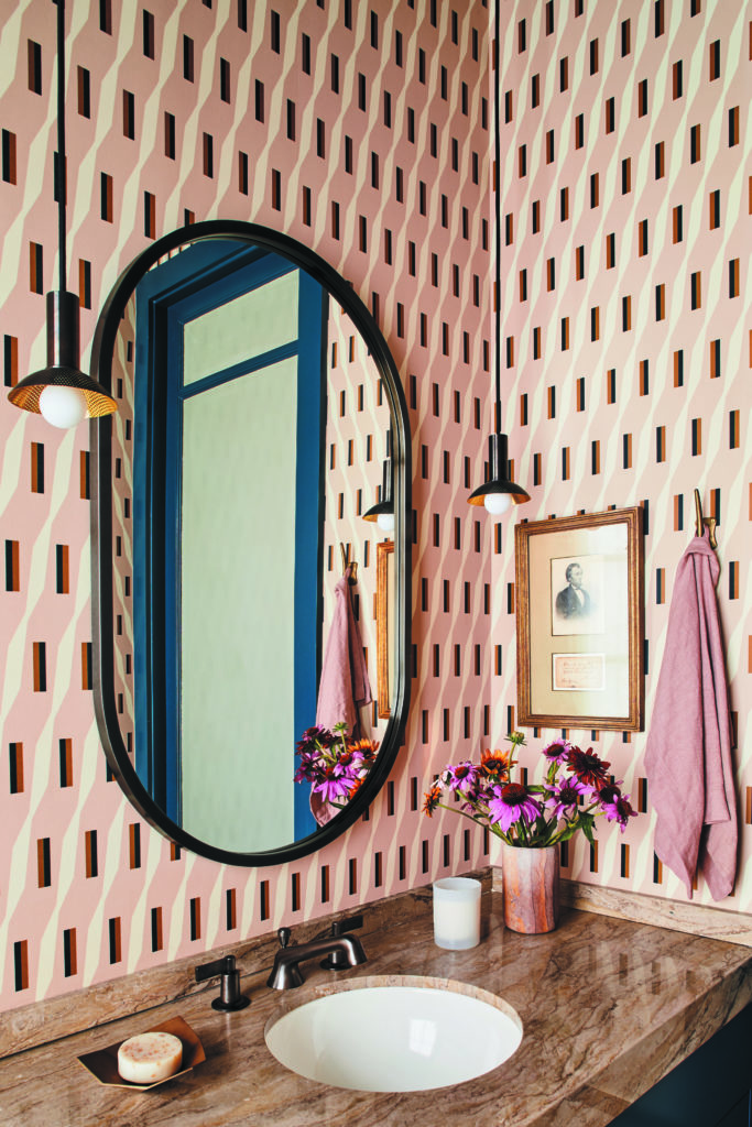
A powder room vanity was made over with Farrow & Ball’s Hague Blue, which appears on the trim around the door, too. (Martinez left the granite countertop intact again.) The once-mirrored wall is covered in a Jupiter 10 wallpaper—the modernist Amman pattern in pink. A pair of Allied Maker pendant lamps, a McGee & Co. mirror and Watermark faucets round out the revamp.
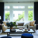
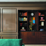
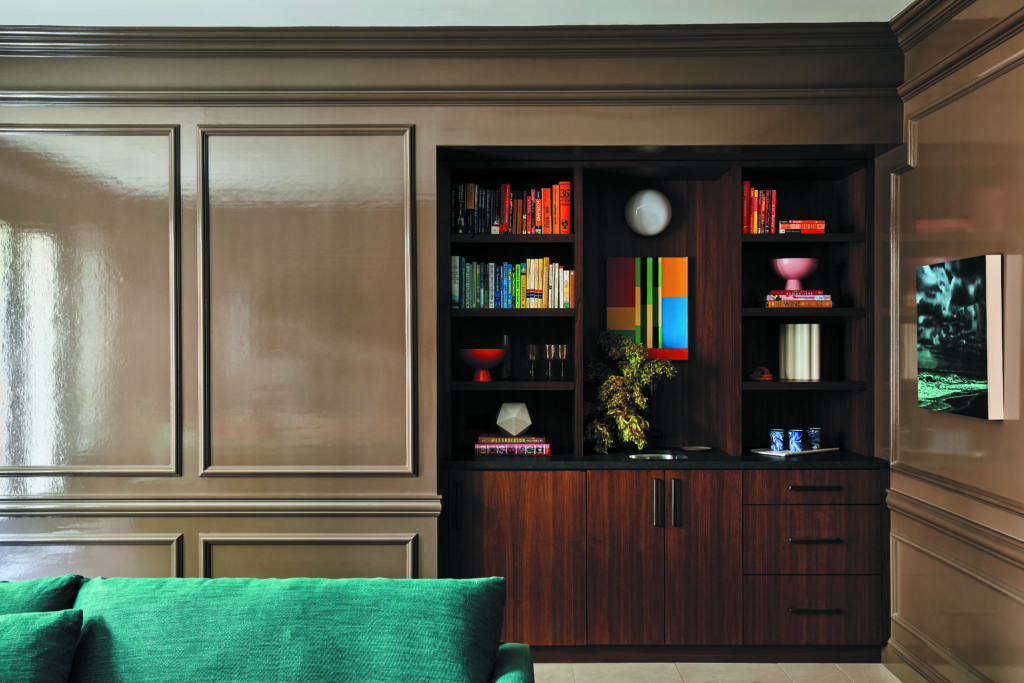
The ground floor contains a media room; its walls and trim, in a shade reminiscent of a café au lait, are also holdovers. “We didn’t want to touch them because they were lacquered,” Martinez explains. “It was expensive and a big deal, so we worked with that color, because you can’t always do everything.” She succeeded in overhauling the bar area by removing the mirrors behind it—yes, there were more mirrors—and installing a built-in by Hummler in walnut. The room is anchored by a sofa upholstered in a Fabricut linen in emerald green, a color picked up in a nearby photograph by Andy Mister. The room’s “fun palette” continues with a yellow credenza, a burgundy rug and a red leather ottoman.
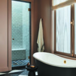
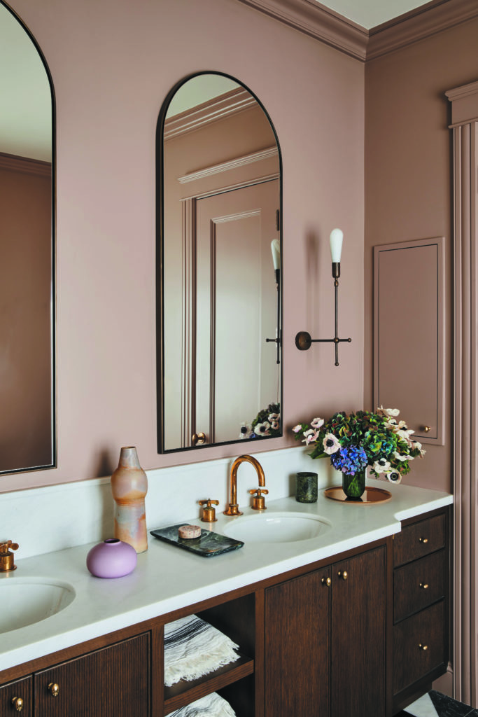
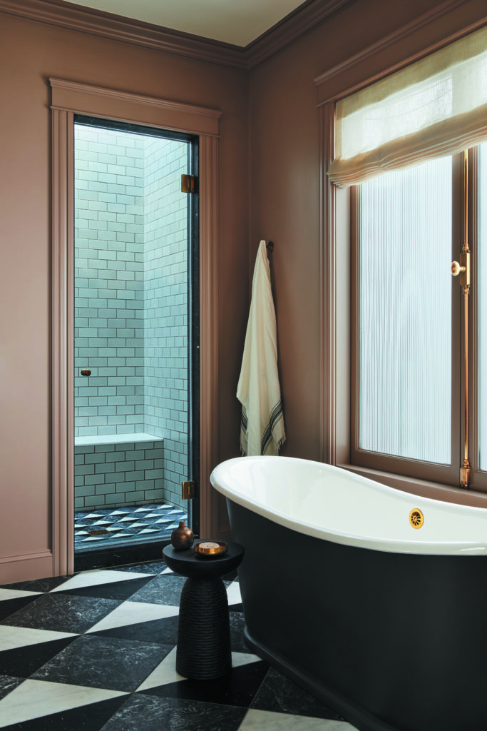
The only room that Martinez totally gutted was the primary bathroom, which had odd angles and frosted glass. “We straightened everything out, put some symmetry into it and added cased openings for the WC and shower,” she says, noting of the end result: “It relates to the architecture and feels like it’s always been like this.” The wall color, Farrow & Ball’s Dead Salmon, and introduction of molding further brings out the room’s traditional sensibility.
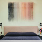
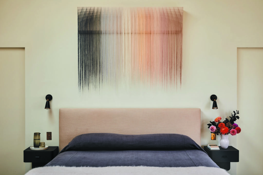
In the sleeping quarters, the sole wall that could accommodate the bed has two closet doors. This configuration prompted Martinez to devise custom pieces: a bed, covered in a Cowtan & Tout linen in bone, and ebonized oak bedside tables by Hummler. Nike Schroeder was commissioned for the textile art above the bed, which includes rosy hues that echo the adjoining bathroom’s palette. “When [the client] gave me initial concepts that were super sophisticated, with some designers that I really love, I knew from the beginning that we were going to be a good fit and I was excited about the project,” recalls Martinez. “Nothing was a hard sell. She was great and really let us do what we do.”
