2023 Residential Architecture Award: McGriff Architects
Author:Anh-Minh Le“Home needs work,” So stipulated the real estate listing for a three-story property dating back to the early 1900s, situated in San Francisco’s Dogpatch neighborhood. And did it ever need work. Although there had only been a few owners, its age and some mid-century-era changes—including a rear addition likely constructed in the 1950s—meant that major updates were necessary to accommodate modern living.
Enter Benjamin McGriff, who was tapped by the residence’s latest occupants, a real estate developer and a fashion designer, for the overhaul. Along with reimagining the original main house, McGriff Architects demolished and replaced the addition; combined, they total about 2,200 square feet. (The firm also tackled a separate structure, a guest cottage, on the lot.)
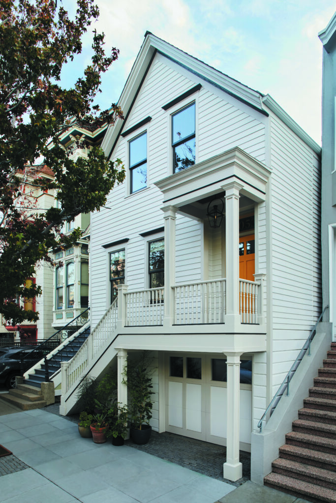
McGriff’s impact is significant, even from the sidewalk. The stucco that previously clad the exterior as well as the concrete steps and metal railings is no longer. The cool cream façade, accented with dark ash, now hews closer to what might have originally been there: wood siding, spindles, newel posts and columns. The windows and garage door were reconfigured in favor of more period-compatible styles, too. And a new covered porch with a copper ceiling, combined with a retro-yellow front door, completes the warm welcome, creating “a little more of an entry narrative,” says McGriff, while setting the tone for what’s to come.
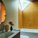
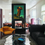
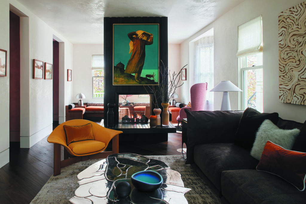
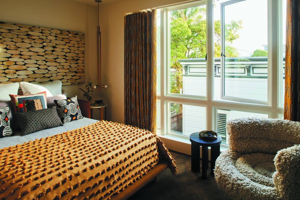
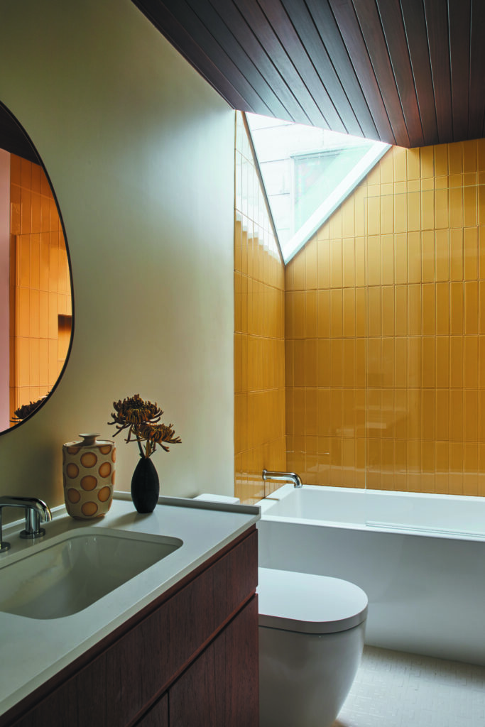
Studio Becky Carter’s namesake was enlisted for the interior design. The clients’ art collection and affinity for color guided her schemes. Take the guest bedroom, where an ocher upholstered bed by De La Espada complements a large-scale piece by Rex Ray. The earthy yellow hue also appears in the living room and a guest bathroom, in the form of an Orior chair and Fireclay tiles, respectively.
The “programmatic ambitions,” says McGriff, called for emphasizing daylight, plus addressing the compartmentalized nature of the spaces and the circulation throughout. Regarding the latter, given the home’s small footprint, it was important that “hallways serve some sort of function,” the architect elaborates. “One of the tricks to getting the most out of a house, functionally and spatially, is to reduce circulation moments that only serve as circulation.” Hence, outside the principal suite, the hallway doubles as a dressing corridor, and, next to the guest bedroom, the hallway is a laundry corridor.
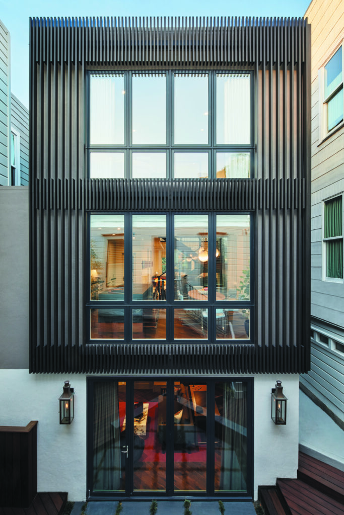
The contemporary addition that McGriff devised is entirely behind the original house, minimizing its visibility from the street. The rear exterior’s upper two levels are sheathed with aluminum louvers that have aesthetic and practical value. “You get the daylight, enjoy a little bit of view, but also protect [the back rooms] from line-of-sight intrusion due to the slat depth and offset,” McGriff explains.
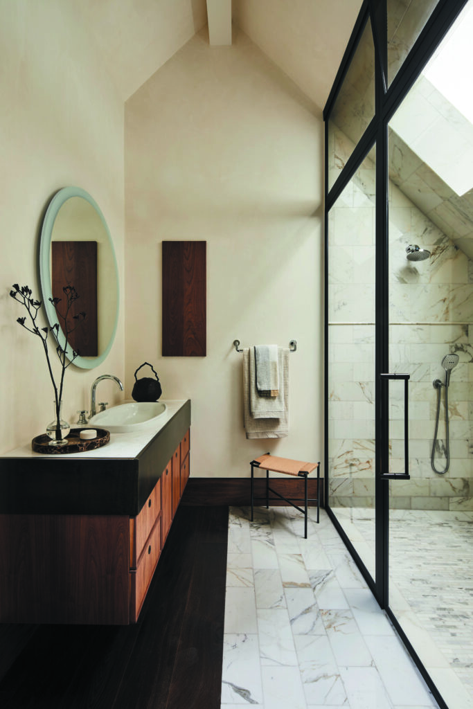
While the old and new are architecturally distinguishable, there are elements that unite them, like the plaster finish on the interior walls and ceilings. On the top floor of the addition, a guest bathroom features a corner skylight window that establishes “a subtle relationship between this new modernist volume and the traditional gabled shape of the original home,” says McGriff, noting that the angle of this “fun and unexpected” detail is “parallel to the rear gable of the front house.”
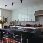
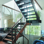
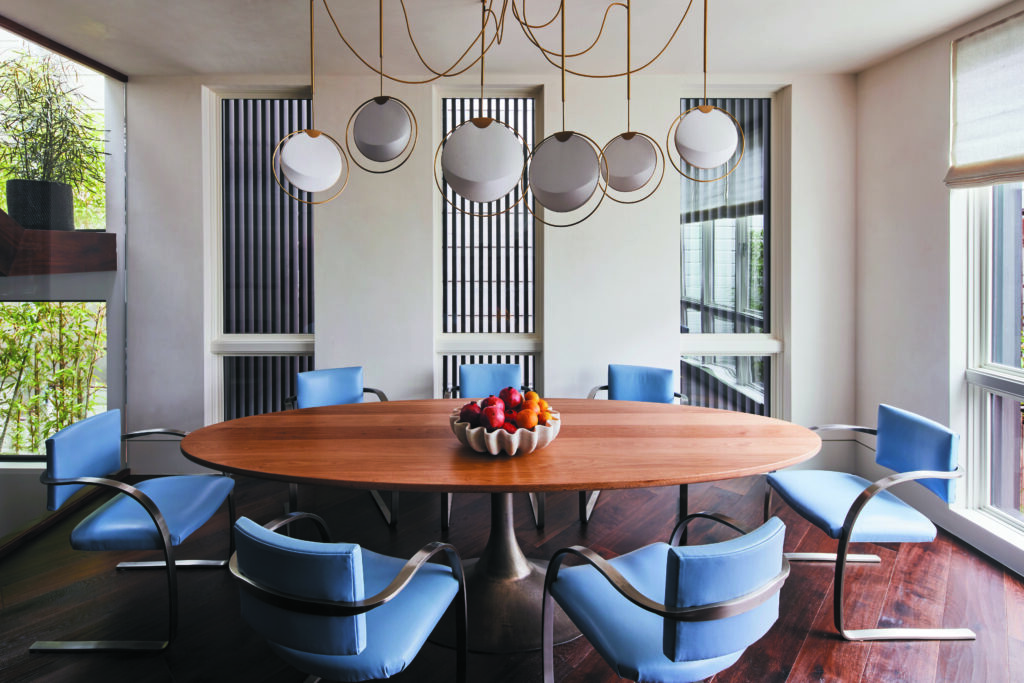
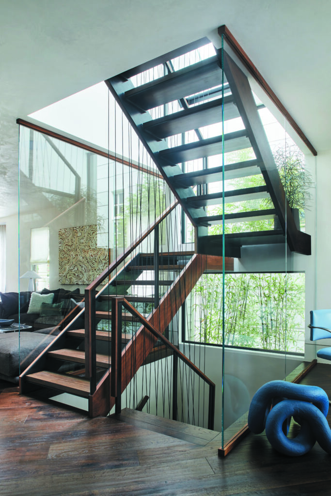
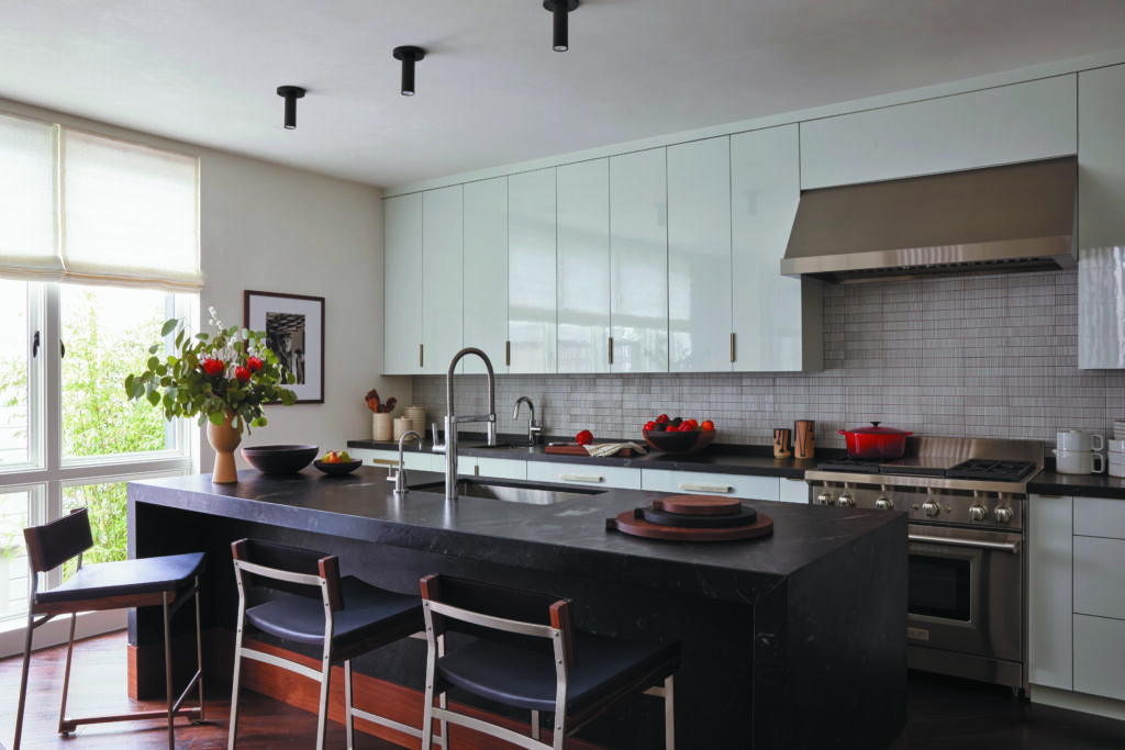
The original building’s entry level includes the living and sitting rooms, delineated by a double-sided floor-to-ceiling fireplace. On the same floor—separated by a glass, walnut and steel custom staircase that spans the home’s three stories and essentially marks the transition to the addition—are the open- plan kitchen and dining room. Sleeping quarters, for both inhabitants and guests, are on the top floor.
According to McGriff, the interior stairs encapsulate his firm’s calling card: “We embrace and encourage design collaborations from the jump,” he says of the undertaking that heavily involved Studio Becky Carter, Quake City Metal and the homeowners. For example, initially, the stairs were conceived as all steel; conversations with Carter led to wood in the composition. “There’s just so much talent in the Bay Area,” McGriff continues. “We think it’s a missed opportunity to not welcome in additional voices—from designers, clients and, of course, the craftsmen who are part of these projects.”
