2022 Kitchen Design Award: Oliver M. Furth Design & Decoration
Author:Lindsey Shook“This is definitely a ‘family home.’ Kids, dogs, people, occasions—all factor into their active lifestyle, and the home we created together was to be the center of it all. There were great bones, but the house had been bastardized over the years with several unfortunate remodels,” says designer Oliver M. Furth about the recent transformation of a 1929 Regency-style home in Beverly Hills. The clients, who are recent transplants from New York City, were returning to California and needed a home that suited their energetic family and love of colorful design. Furth notes, “This was a homecoming of sorts. They were excited to put down some roots and create a new home for their family.”
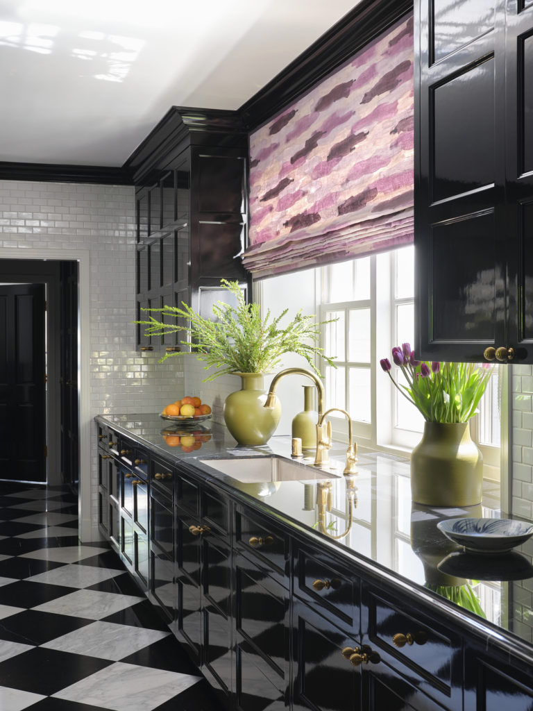
With a goal of reshaping the disjointed spaces into a more family- friendly unit, the homeowners also wanted hints of glamour and joy, even in the kitchen. “My clients wanted a family kitchen—approachable, but not sloppy,” he notes. “They weren’t interested in that early-2000s trope of a great room. They are intelligent, sophisticated, pulled-together people, and this new house conveys that.”
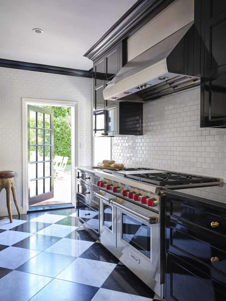
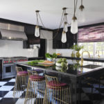
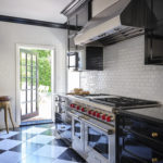
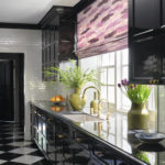
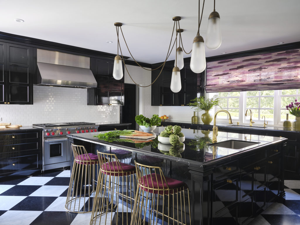
The existing kitchen was dark, enclosed by surrounding rooms and an unnecessary staircase that Furth removed to create more usable space, and he also used color to pull in more light. “We lined the kitchen with glazed white ceramic tile, to reflect light, and opted to paint the cabinetry in a shiny black lacquer,” he says. “Black and white is timeless, from Robert Adam’s Syon House in the 1760s to Andrée Putman’s Morgans Hotel in the 1980s; it’s a winning look and is the right vibe for this space.”
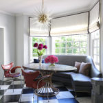
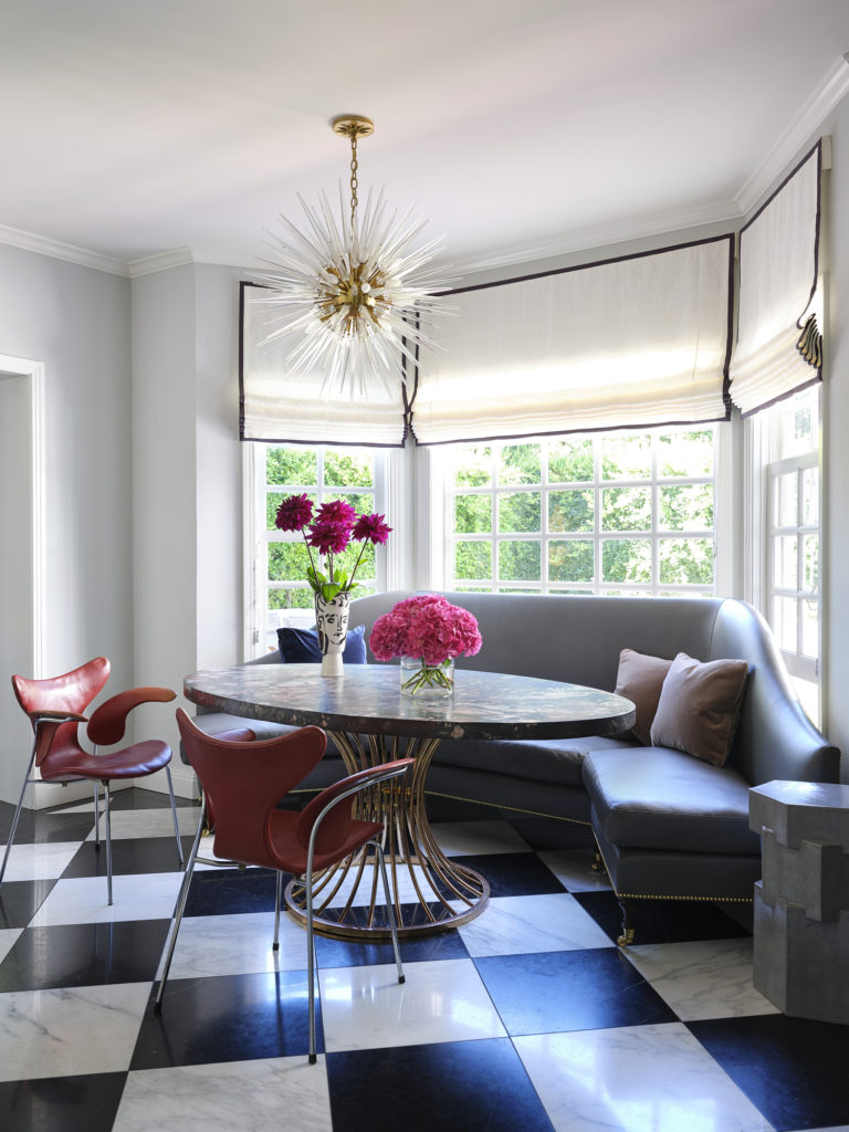
Highly organized by nature, Furth recognized the need for an orderly balance throughout that made the clients’ daily life feel harmonious. “They are type-A folks who work in finance, so we used a lot of geometry in our detailing,” he notes. “There’s the rhythm of rows and rows of perfect tile; the black-and-white marble floor, which is glamorous in an Old Hollywood way, but also disciplined.” However, he was able to add moments of delightful discord in the marble countertops with free-floating veins, the hand-painted fabric window shades by Porter Teleo and the dramatic lighting installation by Apparatus, which he custom-commissioned for the room.
Photos by Roger Davies.
The final result is a sophisticated yet not stuffy kitchen that is full of personality and still family functional. “Thanks to Oliver, our kitchen is the hub of our home and also the sexiest and chicest room,” says the wife. “Not a person comes into our home who doesn’t comment on it—it’s not often you see a black lacquer kitchen, especially in L.A.!”
