Beauty & The Eats: Tamarindo
Author:Abigail StoneStayner Architects designs a vibrant brick-and-mortar for Tamarindo, a popular taco truck setting down roots in San Clemente.
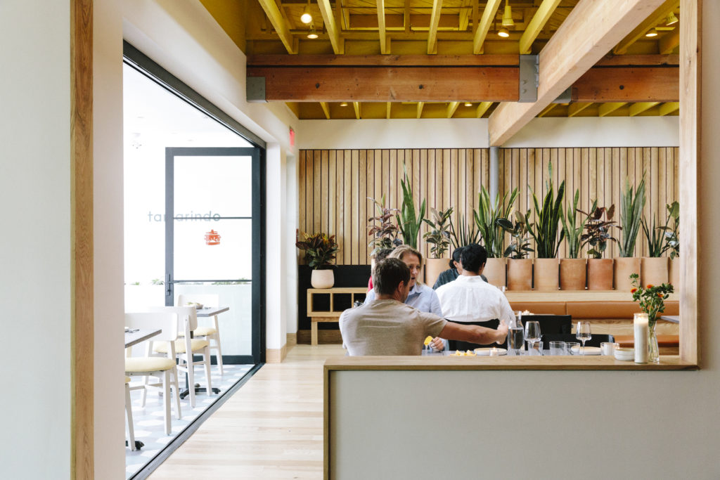
After a few hours on the road, a meal is as good a reason for a detour as any. And Tamarindo, designed by Stayner Architects, is as beautiful as it is tasty. Located in San Clemente, almost halfway between Los Angeles and San Diego, the town alone is worth a pitstop. Similar to better-known Santa Barbara, it was built in the late 1920s and early 1930s in the Spanish Colonial Revival style that was made popular by the Panama-California Exposition of 1915.
Tamarindo’s Streamline Moderne building, built in the 40s, was originally a men’s haberdashery. Later it was a water bed store, a short-lived gluten free grocery and then a second hand store. Now Sarah and Pedro Resendiz have turned it into the permanent home of their highly successful food truck which showcases home-made cuisine that has it roots in the tradition of the Mexican state of Querétaro, north of Mexico City.
“Pedro and Sarah wanted to work with us not only for our design philosophy and approach, which focuses on connecting with the material of building and construction as both architects and craftspeople, but also for our ability to navigate complex, sometimes onerous, code requirements,” says Stayner Architects principal Christian Stayner.
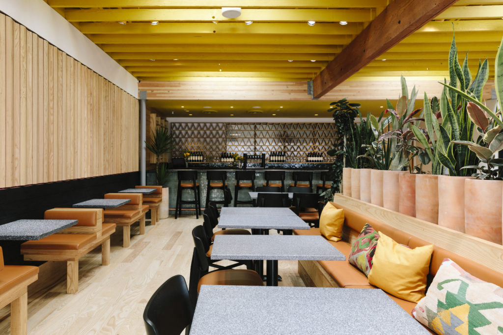
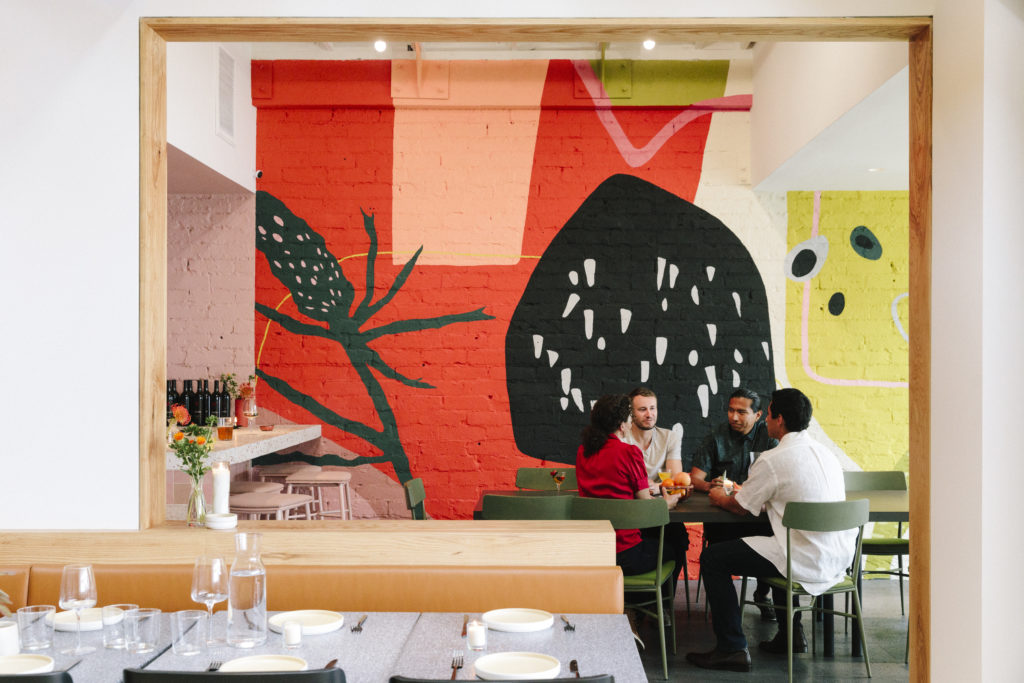
The Resendiz’s wanted the restaurant’s design to celebrate Mexico…but in unexpected ways. “We didn’t want to resort to the standard Mexican restaurant cliches of sombreros and pinatas,” says Sarah. Stayner chimes in, “We took cues from chef and owner Pedro Resendiz’s childhood in a small, rural village outside of the city of Quetero, Mexico, reflected in the colors, materials, tactile qualities, and smell of the restaurant’s interiors.”
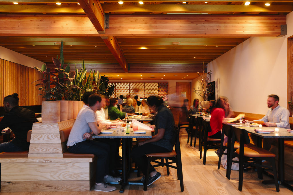
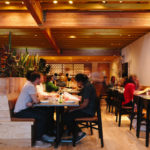
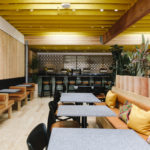
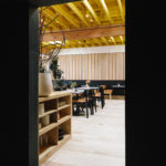
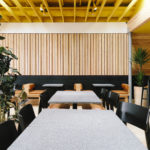
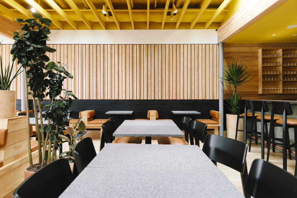
Tamarindo’s interiors are saturated with color, illuminated by natural light during the day that transitions into amber and caramel lighting in the evening. The transparency of the food truck’s inherent design also played a part in influencing the design; a “celosia,” a traditional Mexican lattice divider, here rendered in white ash, separates the kitchen from the main dining room, allowing that same visual communication between patron and chef. ““We took really modest, low-cost and un-hip materials such as white ash, lava stone, and cement, and used them in novel, sophisticated ways. For this project, it was all about the details.” says Project Designer Jon Anthony.

“We elevated the experience of eating outdoors by designing a space that feels more outside than inside, and translated the exceptional, hand-made quality of the food into the construction materials and architectural details,” explains Stayner, “American white ash millwork defines views and controls sound, while tactile, raw materials such as rough-hewn lava, handmade tiles, and natural leather are designed to patina and change over time.”
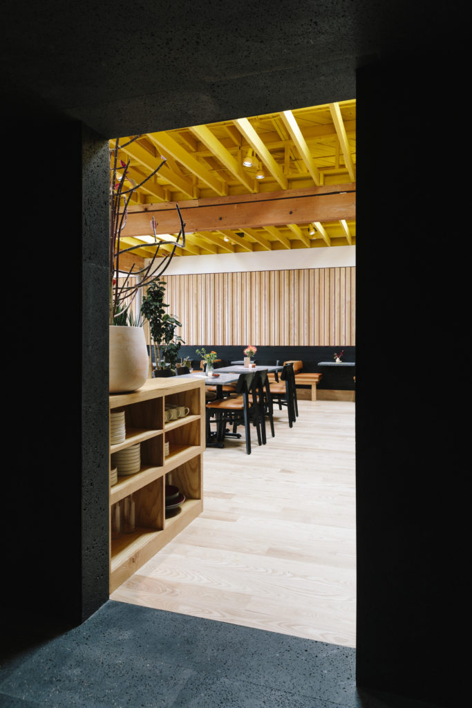
The biggest challenge was the dictates of the city of San Clemente itself which demands a homogeneity in the design — “the city govenment literally requires that everythign be painted brown or beige,” says Stayner — thus the interior’s jolts of color. “Color is a simple way to change the quality of a space,” explains Stayner.

“We took really modest, low-cost and un-hip materials such as white ash, lava stone, and cement, and used them in novel, sophisticated ways. For this project, it was all about the details.” says Stayner’s project designer Jon Anthony. Notes Sarah Resendiz, “A lot of people have commented on how vibrant and colorful the space is, and how impactful the interior is in the context of San Clemente’s existing restaurant scene.”
Tamarindo, 110 S El Camino Real, San Clemente, CA 92672, (714) 640-9371
