New Attitude
Author:Abigail StoneHolly A. Kopman steers a San Francisco family’s home through a decade of change via strong design choices and a timeless sense of style
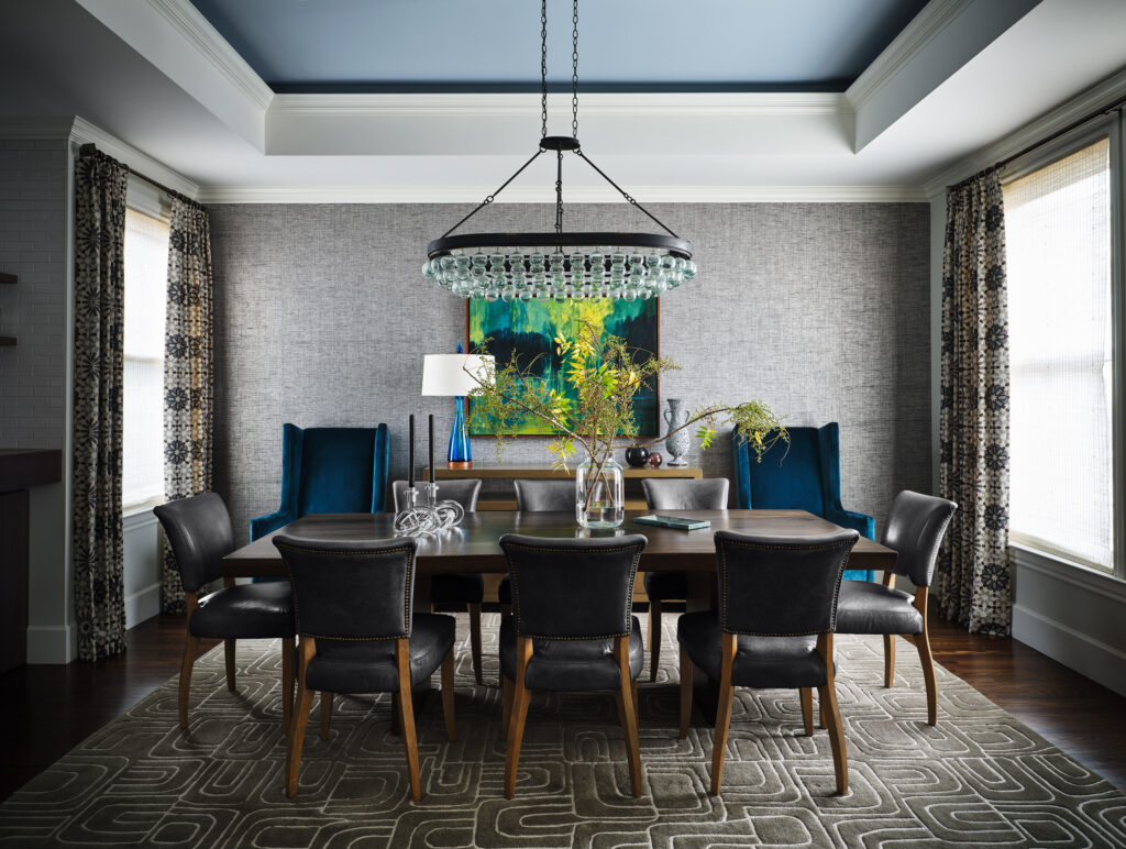
The wingback chairs, upholstered in a blue velvet, are from Lee. A chandelier from Arteriors dangles over a custom live edge teak dining table surrounded by chairs from Restoration Hardware. The wallcovering was found at Philip Jeffries.
What’s the secret to creating a space that feels timeless yet also feels fresh? That’s the dilemma that interior designer Holly A. Kopman faced in her work on this three bedroom, three bath apartment in San Francisco. Her challenge was further magnified by the fact that the work took place over an extended period. “I started working with the clients over a decade ago, before they had kids,” Kopman shares. The initial goal was to create a good foundation from which to eventually tackle all of the projects on their list. “They were young and were just finding their style,” she acknowledges. “Given that there are always new design trends and people’s taste change over time, it was a little bit of an education process.”
Because the husband had worked in construction during his college years, he understood the importance of starting with an upgrade of the home’s finishes. The doors received new hardware. The windows were replaced. The floors were refinished and their “basketball yellow” stain swapped out for a rich dark walnut.
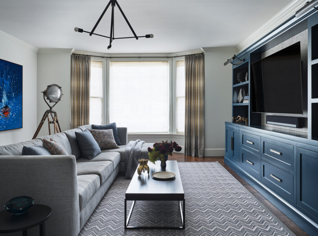
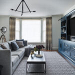
A custom sofa is by A. Rudin sits on a Stark carpet. A grasscloth from Philip Jeffries lines a custom media unit washed in a cobalt blue.
Kopman grounded her vision for the couple’s home in a rich cobalt blue that appears in various forms — upholstery, millwork, art, tiling and paint. “It’s sophisticated, playful and a bit unexpected,” says Kopman who’s known for her rebellious yet glamorous style. “While opening up the kitchen and dining room and reconfiguring the primary suite’s bathroom and closet had always been on our bucket list, we weren’t able to tackle those projects until recently,” Kopman notes. “We really took advantage of changing the layout during the last remodel.”
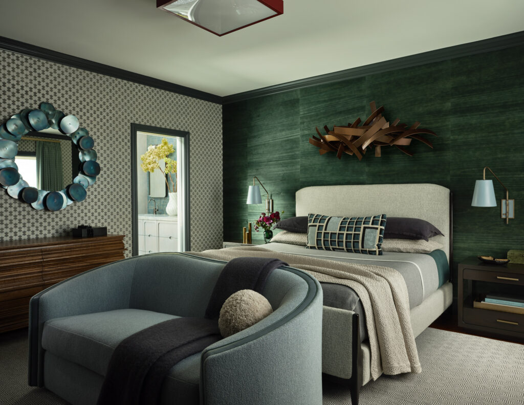
The bed features a pillow covered in Dedar.
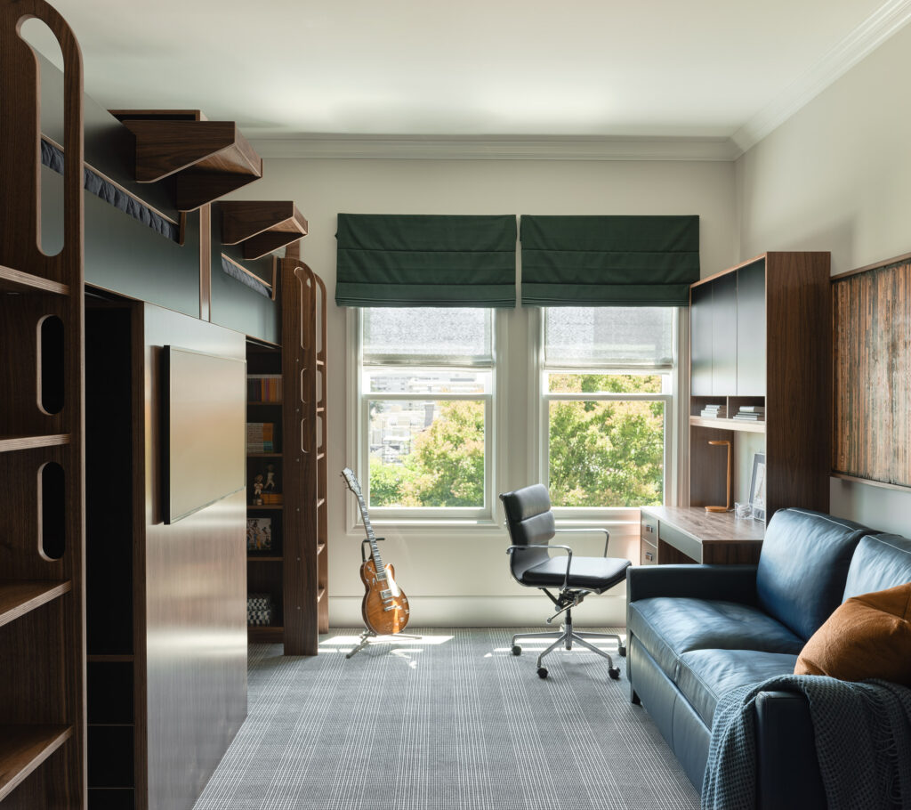
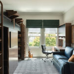
The couple’s sons, now tweens, shared a room that puzzles together spaces for sleeping, storage, studying and hanging out
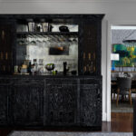
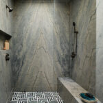
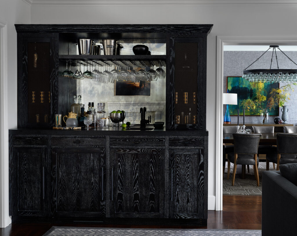
That phase reimagined a small hallway laundry closet, a full bath at the front of the house, a series of small closets and the primary suite’s bathroom. “We took those spaces and created a full size laundry room with linen storage, a guest powder room, a walk-in closet and a gracious primary bathroom that includes a shower with a skylight,” she says. Adding a wet bar to the living room was another significant addition. “Because the living room is open to both the dining room and the entry, it ended up really marrying the two spaces together, creating a large area focused on entertaining guests,” Kopman shares.
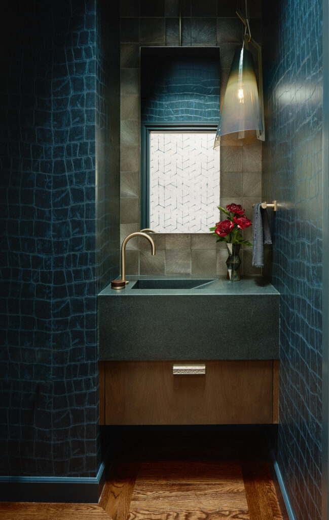
The new powder room, carved out of a full bath, highlights sexy, snakeskin inspired tiles
The couple’s two boys, now tweens, have always shared a room. “I designed loft beds with storage underneath and created built-in desks with a pull-out sofa for sleepovers in between them,” Kopman explains. “We puzzled together the room, maximizing its height to find space for storage, hanging out and studying.”
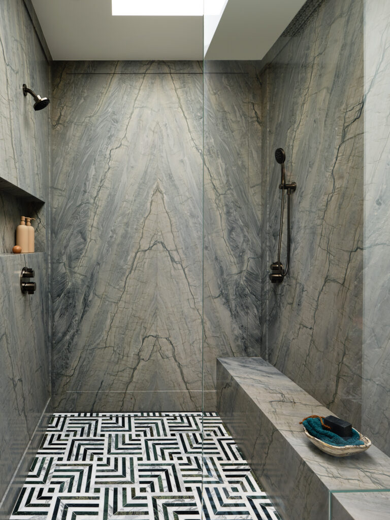
The new primary bathroom, part of the latest phase of the remodel, showcases a shower with a skylight
After many years, the clients are relieved that their home is finally done. “The result is a more functional and more spacious layout,” Kopman says. “They’re over the moon with the improvements and the reconfigured central layout. We have really dialed this house out to its fullest potential to provide them a wonderful place in which to welcome the future.”
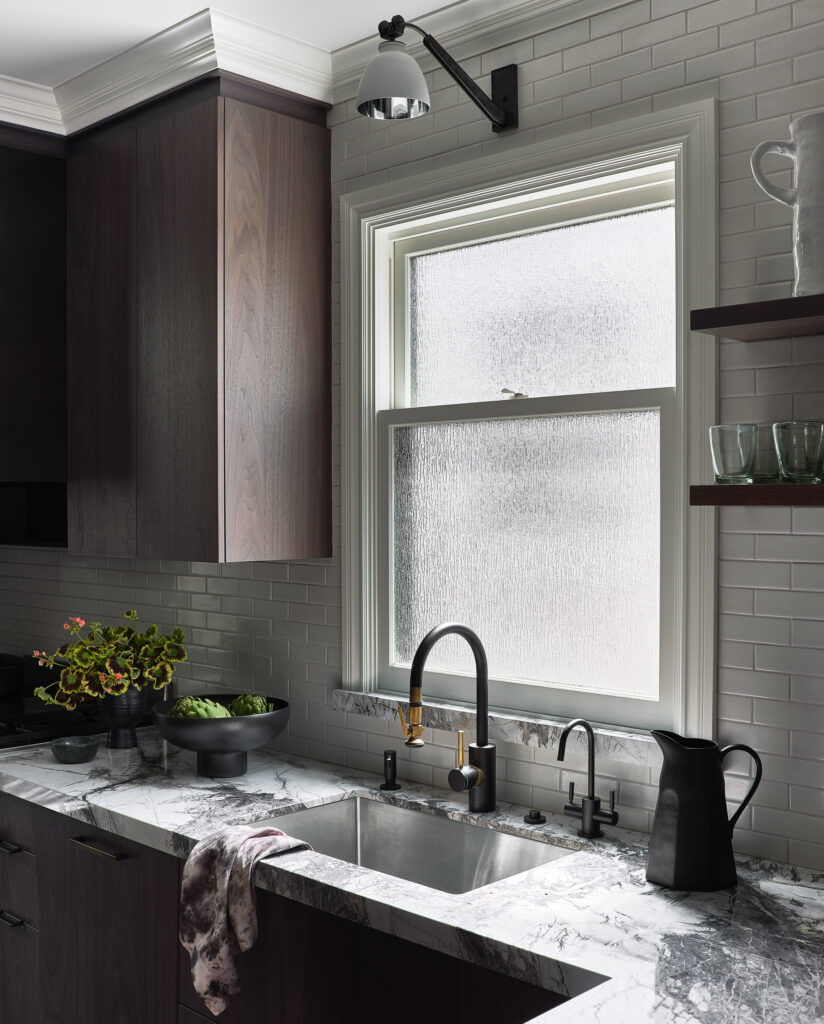
The sleek HenryBuilt kitchen includes a myriad of organizational features, like toe kick drawers, that maximize storage and functionality. The tiles are from Fireclay. The sconces are from Urban Electric.
