A Classic Revisited
Author:Lindsey ShookOffice of Matter founder Carolyn de Agosto finds comfort in a mid-century, wood-clad home
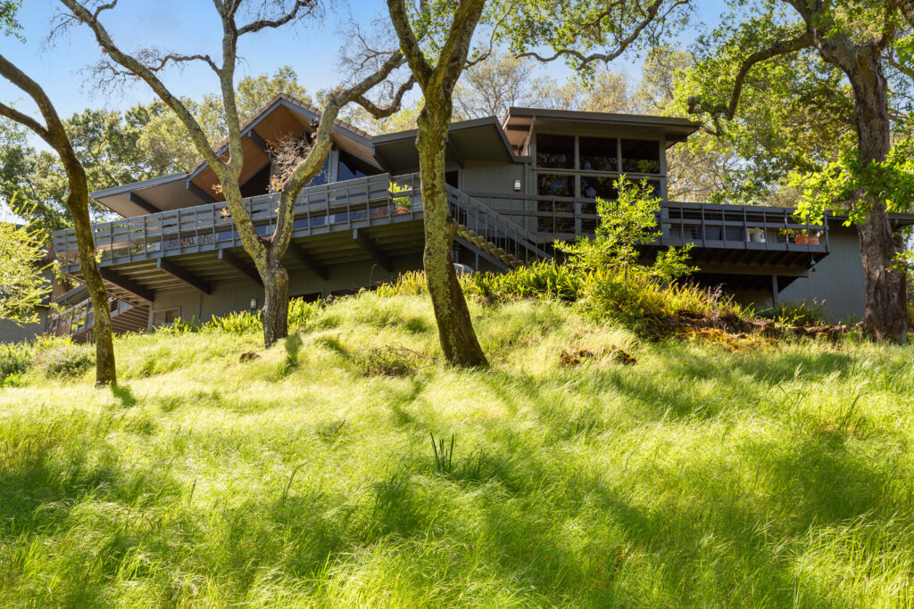
“When we first walk into a space, we take into account the location, the history and style of the structure, the people who will be living there, and how we can improve and modernize it while staying true to it’s roots,” says designer Carolyn de Agosto, founder of California design firm Office of Matter. Their approach to reshaping spaces is evident when stepping inside her family’s mid-century, ranch-style home designed in 1972 located in Green Valley, that still had most of the original finishes and features. “As much as I appreciate mid-century design, nobody wants to feel like they are living in a time capsule, so it’s important to weigh out the options and decide on what is worth keeping and what must go,” she notes.
She and her family purchased the home as a response to needing more space while working at home during the pandemic with two children under the age of three. They found the 4,500-square-foot residence online that has a wrap-around deck, surrounded by nature that sits on a golf course. “I had never even heard of Green Valley,” de Agosto recalls. “The minute we arrived, I knew it was the one. And once I discovered that we could have a golf cart to drive down to the pool at the country club, I was sold! The location is truly a hidden treasure and we are surrounded by wine country and nature.”
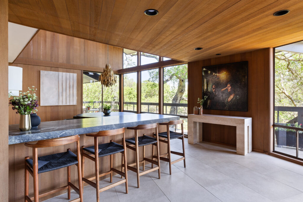
The home featured all of the original finishes and while de Agosto loved mid-century design, she was prepared to add updates that wouldn’t require too much work. “Ultimately, the home needed to be simplified,” she recalls. “There were too many materials being used together, like wood floors, carpeting, tile, flagstone, etc. I wanted an earthy palette that complimented our surrounding and think we achieved that with our selections.” They also needed each room to have more kid-friendly corners, durable materials and storage.
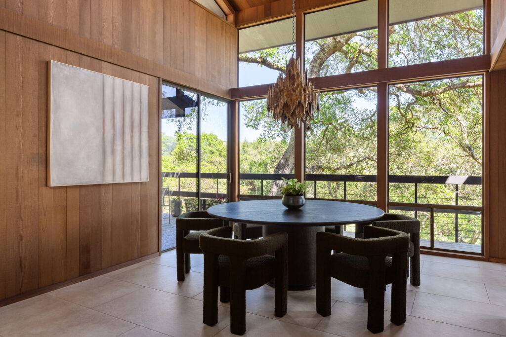
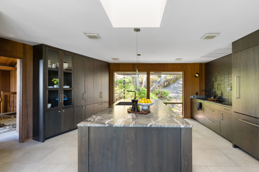
“The interior cabinetry throughout was the same color and tone as the cedar walls and felt very heavy and closed in and the kitchen had cabinetry hanging from the ceiling that blocked the view to the dining room so you’d couldn’t admire the amazing windows and views of the trees,” she says. “That was the first thing to go.” de Agosto actually began her career as a kitchen designer so she wanted to spend time in the existing kitchen to gain a better understanding of how she wanted it to function. “The result allowed for us to create distinct zones for prep, cooking and cleaning,” says de Agosto. “The kitchen had ample storage and as a cooking enthusiast and perfectionist, I was so pleased that we never ran out of room and everything had a place of its own.”
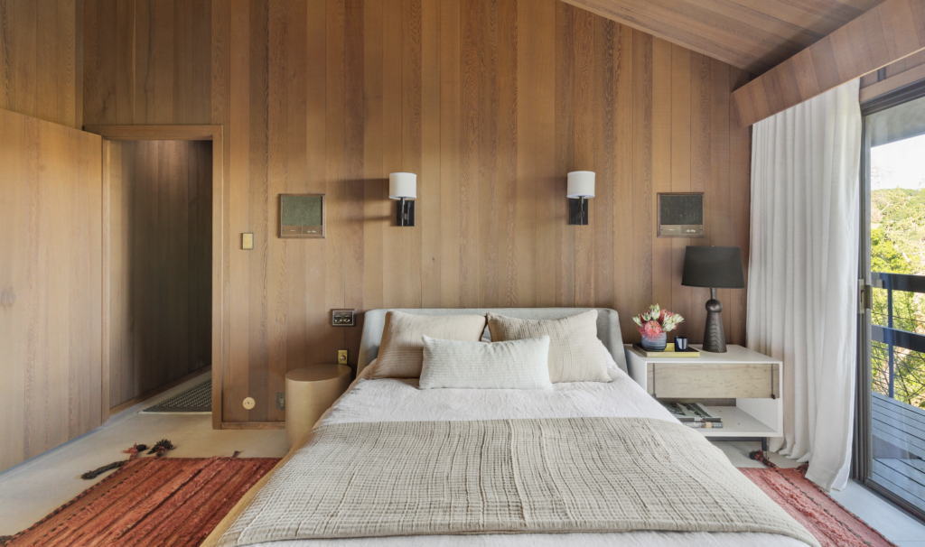
Photos by Marcus Hanschen.
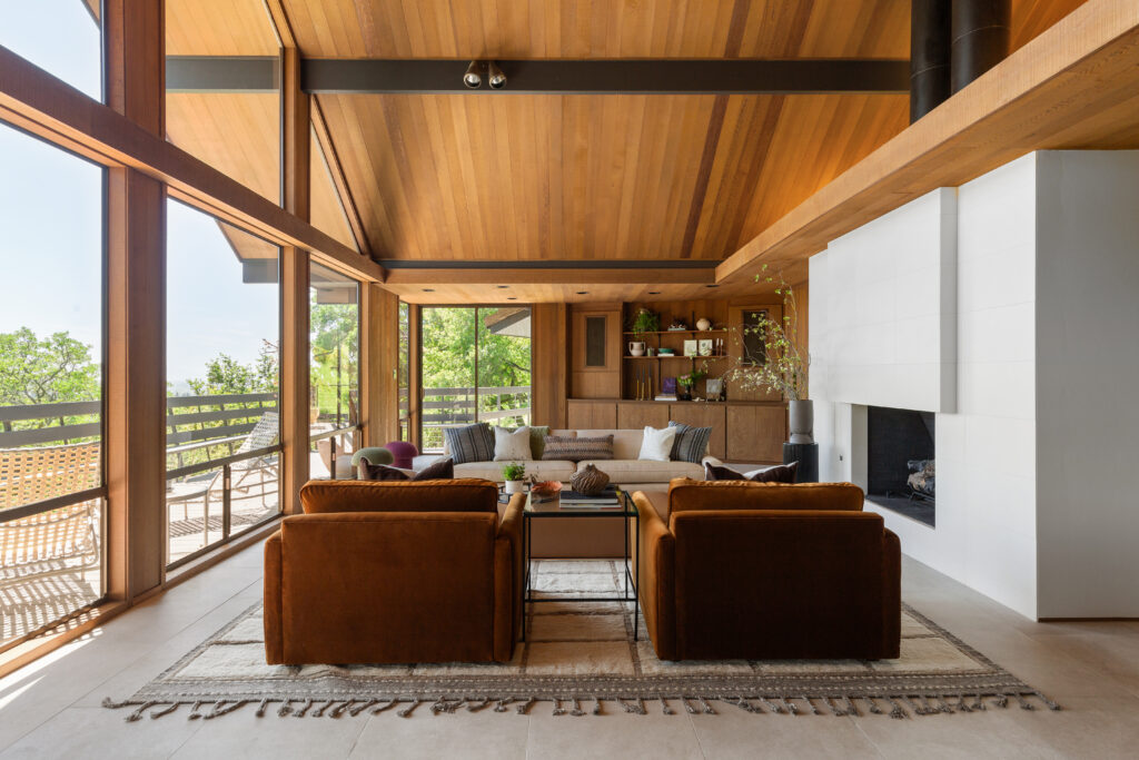
While the kitchen is one of her favorite spaces to spend time and prepare for their endless entertainment, de Agosto often finds solace in staring at the breathtaking views from either the dining room or living room that also features an impressive fireplace. “The home has such an elegant structure, but the freestanding fireplace was covered in thick flagstone and when you walked in through the front door, all you could see was a wall of that and not the beautiful windows beyond it,” she notes. “It also had a very deep, elevated hearth on the opposite side and once my daughter hit her head on it, I knew it had to go. We ended up removing about two feet of length from either side, so now when you enter the home, you get a peek of the windows and more flight fills in.”
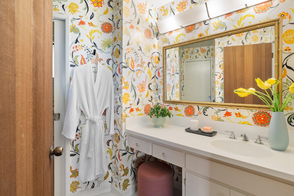
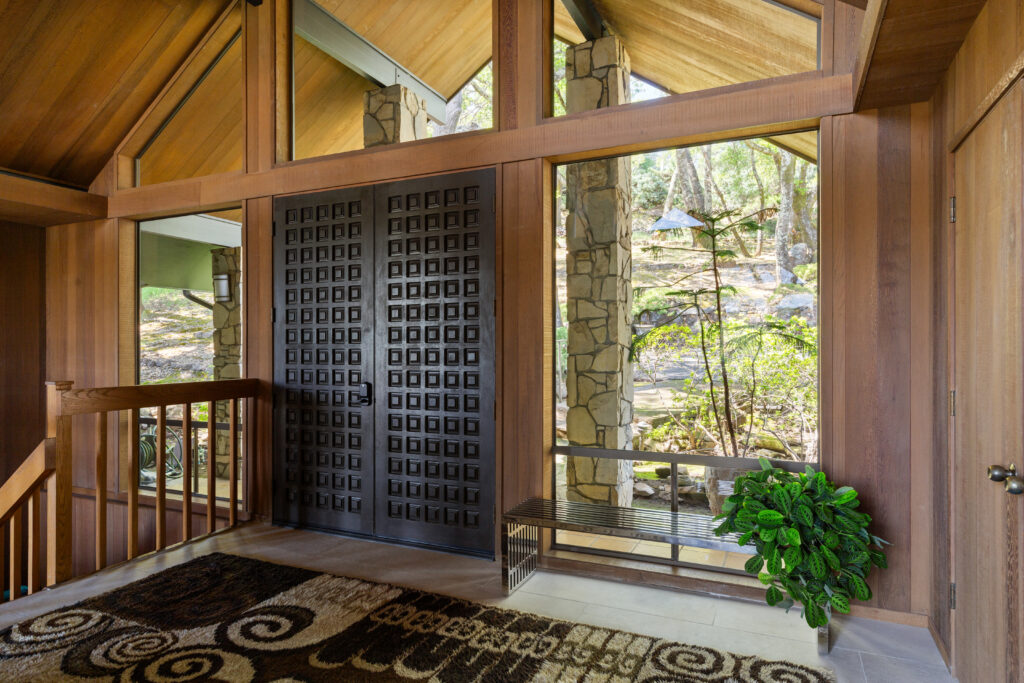
What makes this vacation home so special is how much of the original Cedar-clad walls and de Agosto retained. You feel immersed in a piece of history while comforted by current finishes and decor that welcome their friends and family. “Waking up each morning, raising our children here, cooking in the kitchen with my daughter, celebrating holidays and birthdays, getting to know the community made me feel really happy,” she remarks. “As a designer, I’ve designed many amazing homes for clients that felt so adult, this house was that for me. Like I finally made it.”

