Setting the Tones
Author:Anh-Minh LeA home is transformed with layers of color—and implicit trust in the designer
It was only supposed to be a few rooms. But after Sindhu Peruri presented the clients with her concepts for their foyer, living room and family room, they immediately canceled the furniture they had ordered for their dining room and asked her to tackle that space as well.
She agreed and thus expanded the scope of the Hillsborough project. On the heels of the additional presentation, the husband and wife requested that Sindhu’s eponymous design firm work its magic on the primary bedroom too. “We ended up furnishing their entire house, adding one room at a time,” she recalls. “They definitely trusted the vision.”
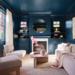
That trust is perhaps most evident in a living room that is, in Peruri’s words, “all-encompassing of one color.” She proposed painting the walls, ceiling, casings and built-in cabinetry in Farrow & Ball’s Hague Blue. “[The clients] didn’t even flinch,” says Peruri, who kept the furniture “neutral, light and fresh.” A sofa of her own design and BassamFellows chairs join a coffee table from The Future Perfect—all featuring gentle curves that balance the lines of the Craftsman-style architecture.
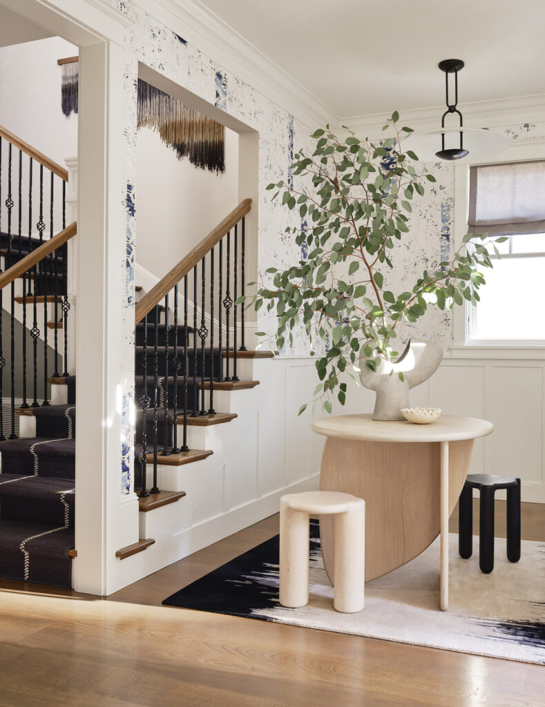
According to Peruri, the living room is “very much its own space. It doesn’t lead into other rooms, so it made sense to treat it differently.” Since the aptly dubbed “blue room” is situated toward the front of
the house, in the nearby foyer, she chose an Élitis wallpaper in a blue colorway. Peruri removed a half-wall to better accommodate a bleached ash table that she designed, plus a pair of Radnor stools, which rest atop a custom gradient rug from Art + Loom.
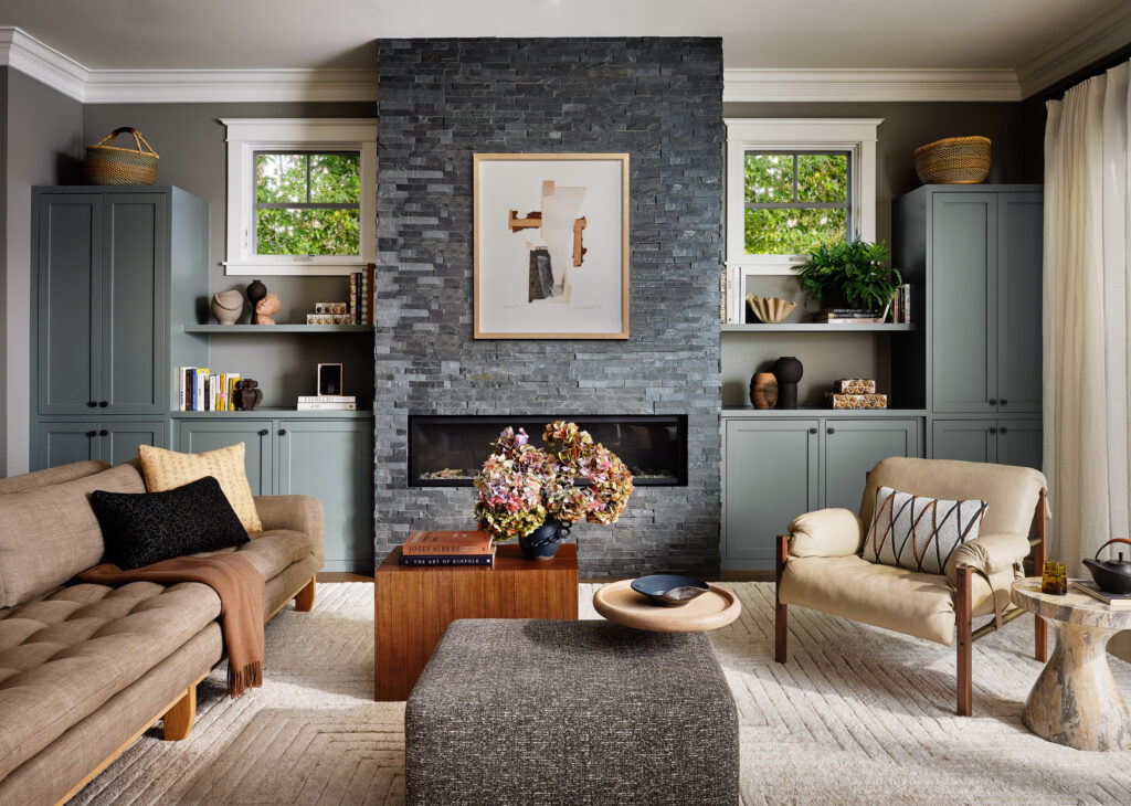
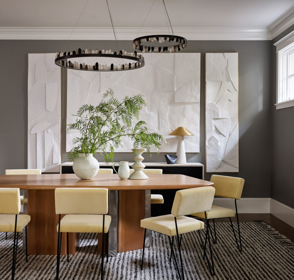
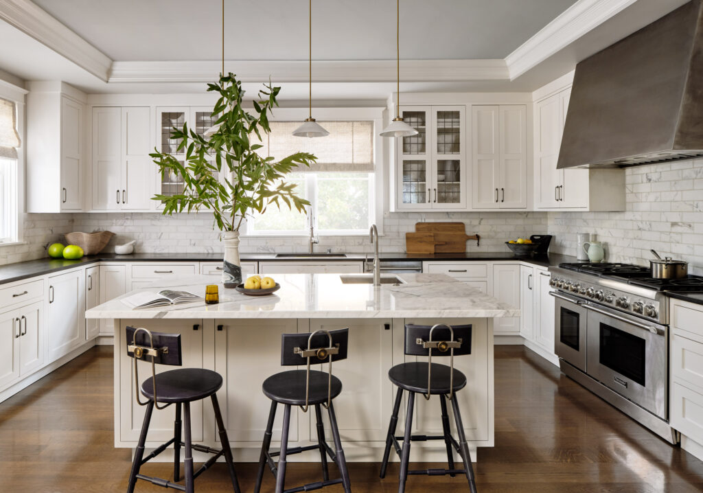
Since the kitchen, family room and dining room open onto each other, a cohesive design strategy was in order. White crown molding and baseboards unify the spaces, as does a palette that includes varying degrees of gray. The kitchen was a “light remodel,” with the marble backsplash and countertops unchanged, while the island was painted in Farrow & Ball’s Pavilion Gray. Photos by R. Brad Knipstein.
In the dining room, Peruri commissioned local artist Anthony Fahden for a trio of large-scale sculptural plaster works that contrast Benjamin Moore’s Vintage Pewter on the walls. The custom dining chairs are upholstered in what Peruri describes as a “perky yellow velvet.” The Christopher Boots light fixtures, encircled in raw quartz crystals, were procured from Coup D’Etat, which the homeowners identified as one of their favorite showrooms.
The existing floor-to-ceiling basalt fireplace in the family room is now complemented by Benjamin Moore’s Duxbury Gray on the flanking cabinetry. BassamFellows’ Sling club chair, also from Coup D’Etat, was high on the husband’s wish list. The couple delighted in custom furniture as well. “They loved every time I came up with a design just for them,” Peruri says. She devised a coffee table arrangement consisting of three pieces: an upholstered gray ottoman, a walnut table and an oak-and-metal C-table.
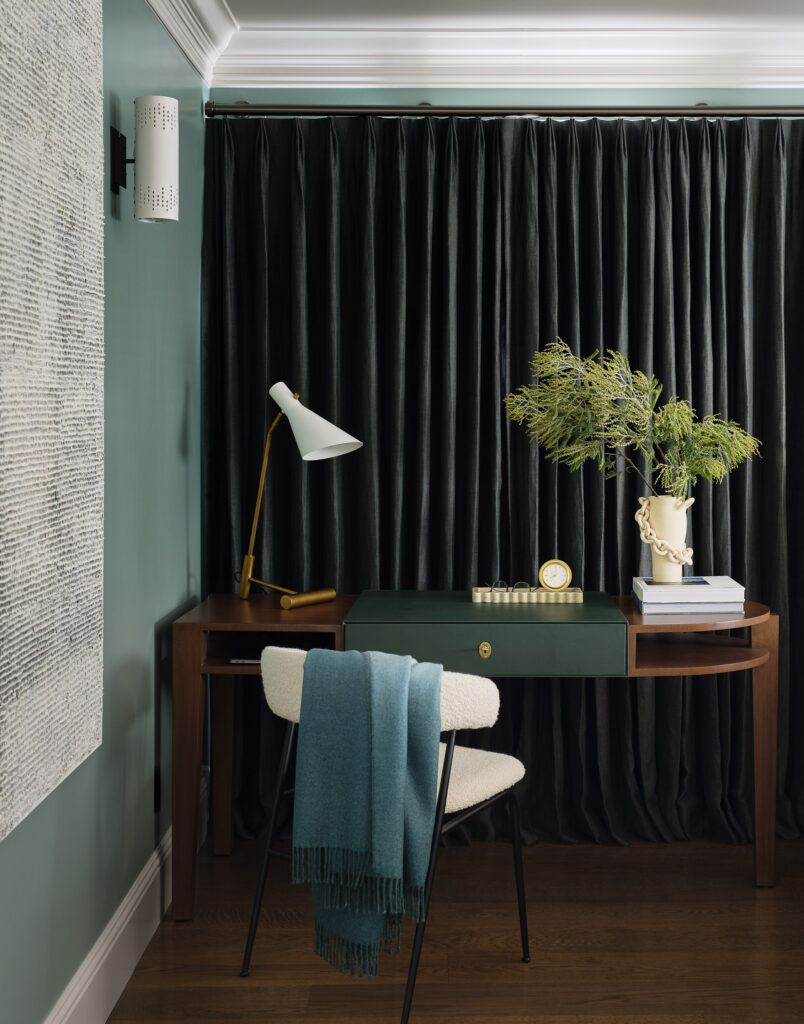
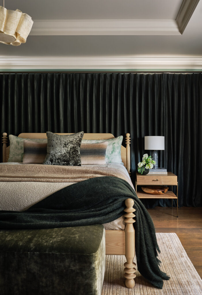
Throughout the house, Peruri notes, “we’re playing with the tones—different shades of the same color, in different textures.” The primary bedroom exemplifies this approach. Against a backdrop of Benjamin Moore’s Sea Glass, she layered in a Natasha Baradaran desk, whose center is wrapped in green leather; a bench upholstered in sage velvet; and wall-to-wall drapery composed of forest green wool. The latter cleverly disguises the fact that the headboard wall has two small asymmetrical windows. In addition to solving a design dilemma, “it’s very cozy,” Peruri says.
Early on in the process, the Los Altos-based interior designer posed a question to the clients: “Are you afraid of some bold color if I throw that at you?” They responded by encouraging her to “throw it at us,” Peruri recounts. “We hit it off right away. We were very much in sync.”
