A Non-Traditional Approach
Author:Lindsey ShookMercantile and Merchant and Perella Architecture rethink modern spec development
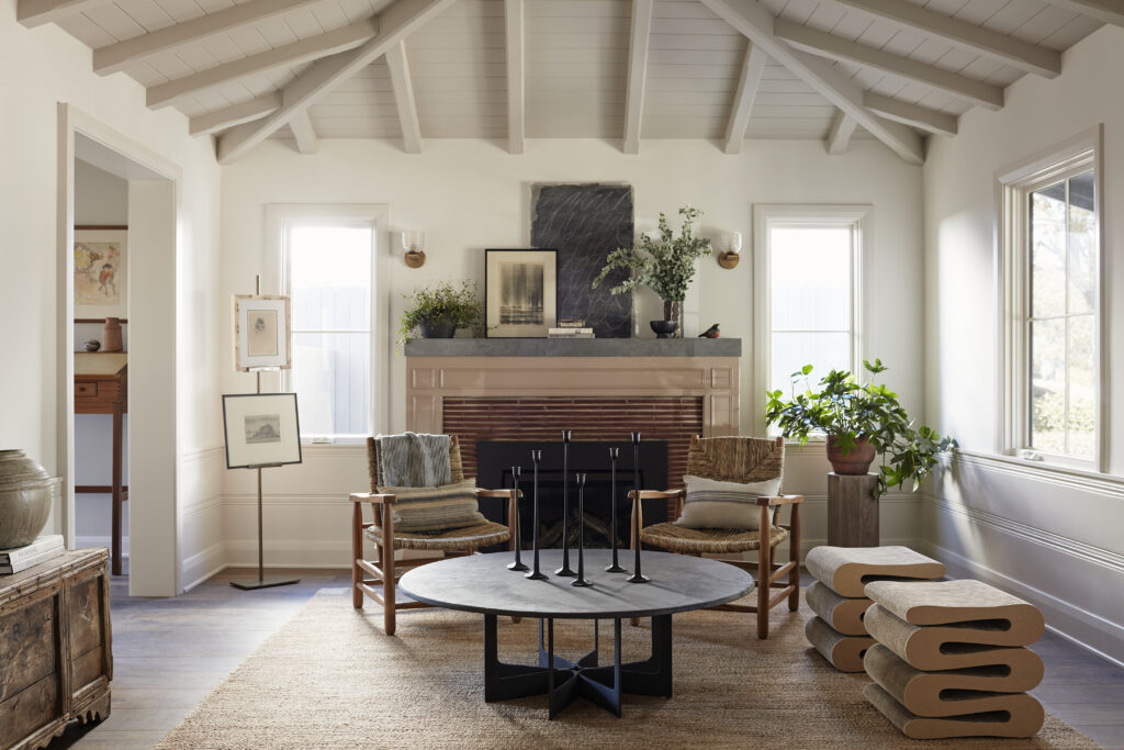
Photo by Joe Schmelzer.
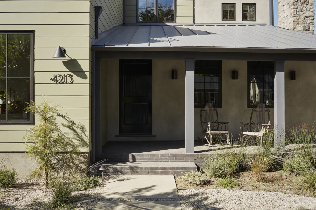
“The Kraft Avenue project was born out of a joint desire to bring development houses to the marketplace that are the antithesis of the bland ‘modern farmhouse’ trend that has dominated the LA Valley for so many years,” says Sam Donnelly, founder and principal at Mercantile and Merchant about this spec home she designed in collaboration with Perella Architecture. The two firms started the project over their shared goal to develop renovated and new turn-key Southern California properties with old soul. “For many neighborhoods the sale of a smaller traditional home brought with it a sense of loss as the community felt the newer construction homes were too often eroding the character of the street.”
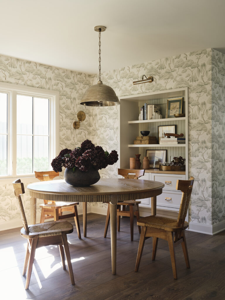
Photo by Joe Schmelzer.
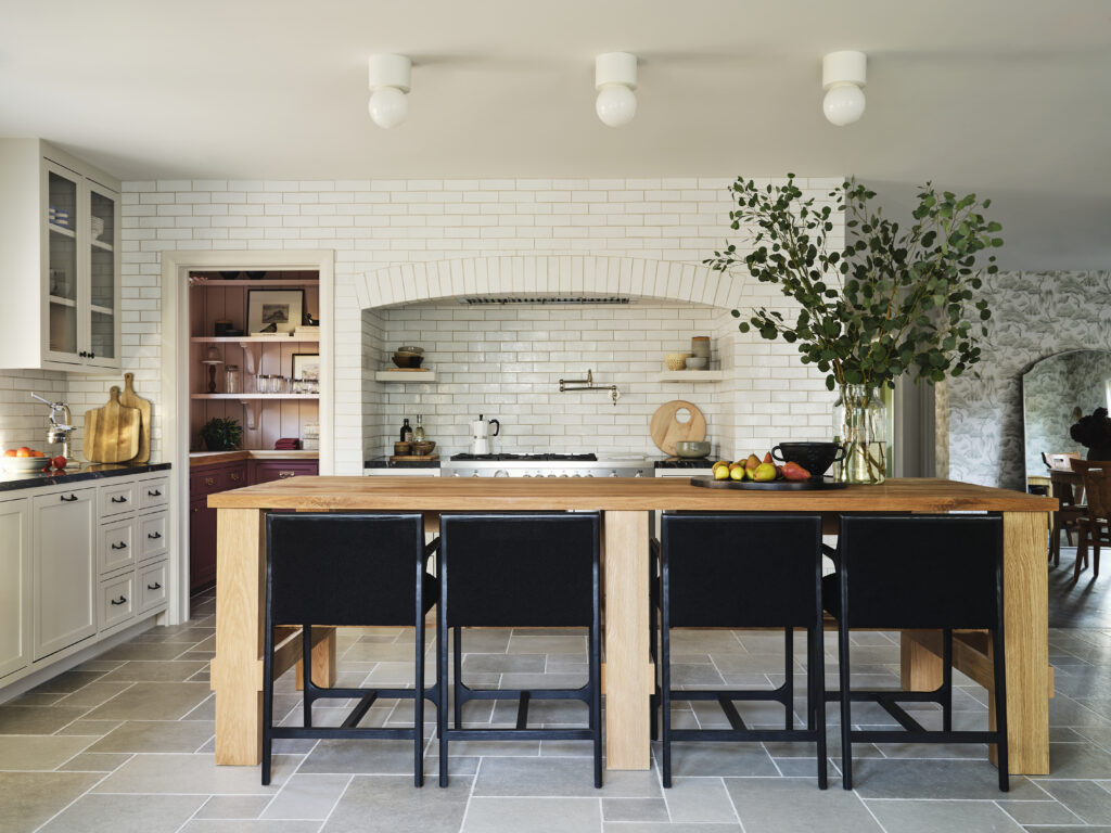
Photo by Joe Schmelzer.
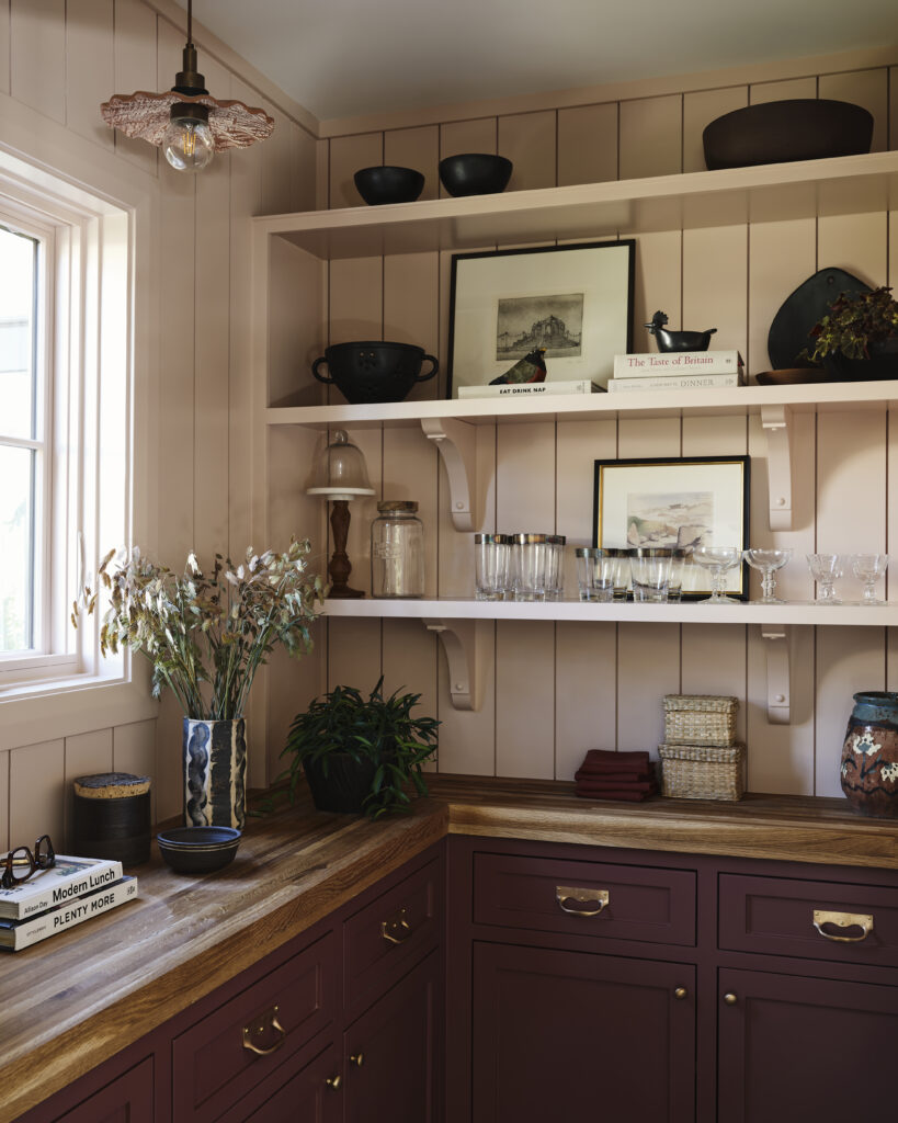
Photo by Joe Schmelzer.
Together, they transformed a 1936 traditional home adding 1,900 square feet that Donnelly found while walking her dog in the neighborhood one day. “Well aware of the local animosity to the bland, modern farmhouse trend, I called up Ryan, founder of Perella Architecture—who I have collaborated with on two previous projects—and knew he shared my vision for what a contemporary development should be in itself, as well as what it should bring to a neighborhood,” she recalls.
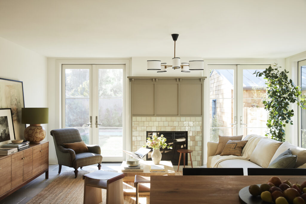
Photo by Joe Schmelzer.
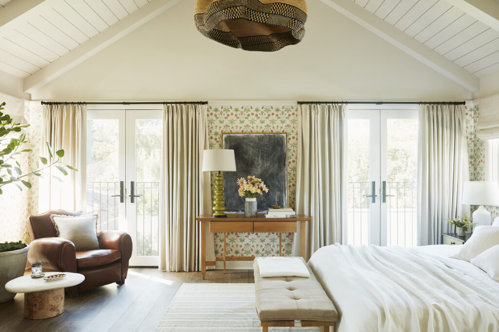
Photo by Joe Schmelzer.
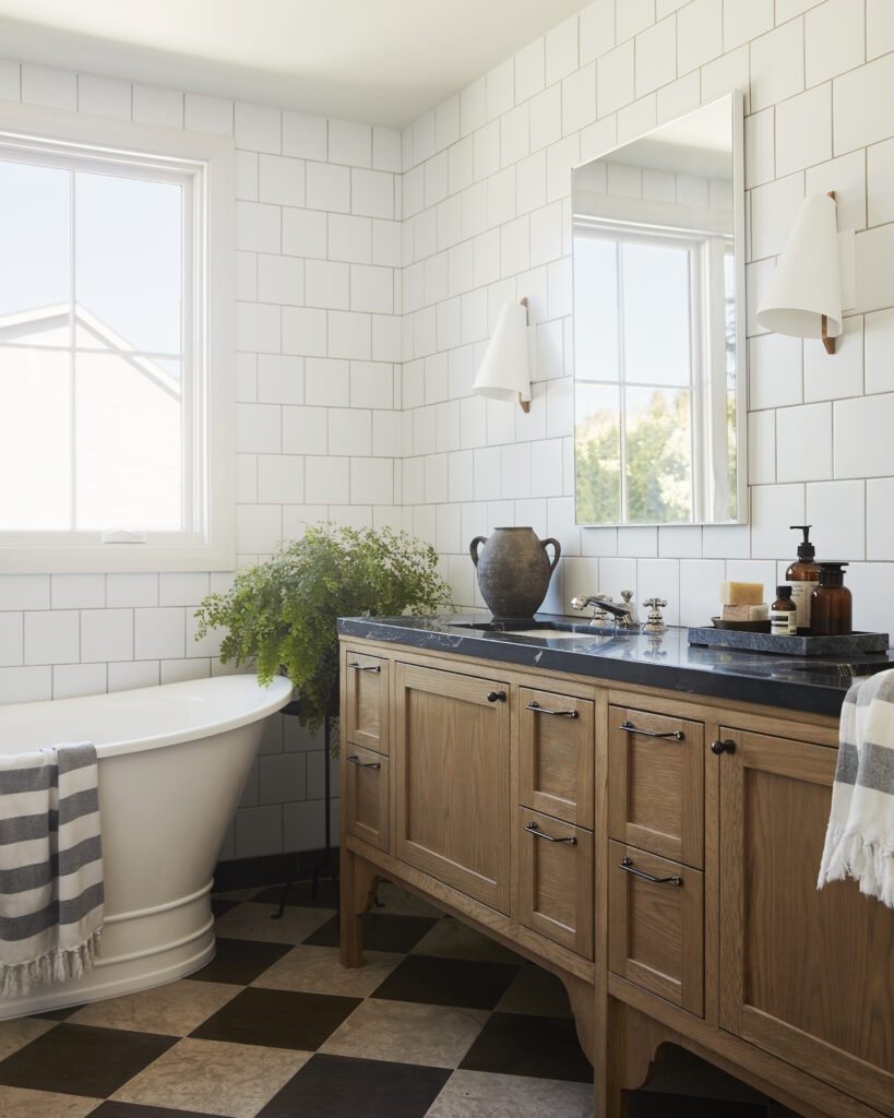
Photo by Joe Schmelzer.
In an effort to retain the traditional charm that is escaping modern development, they kept the original front section of the home and additional details including the fireplace, paneling and a vaulted ceiling in the living room. “I personally love the main bedroom suite at the back of the house, it’s a beautiful tranquil space with a vaulted ceiling that riffs on the original formal living area and two Juliette balconies that bring copious extra light and a sense of airiness to the space,” she says. “Additionally, Ryan created an interior layout that created multiple charming reveals and quirky moments that once again felt like a refreshing counter to the vast open spaces that modern houses favor.”
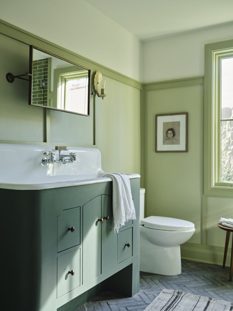
Photo by Joe Schmelzer.
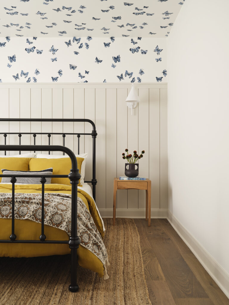
Photo by Joe Schmelzer.
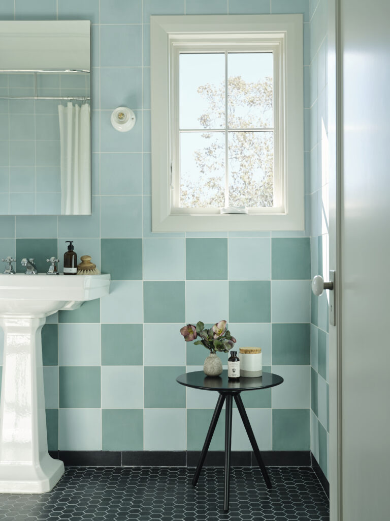
Photo by Joe Schmelzer.
Nervous for the response once the property hit the market, Donnelly and Perella said once it was listed they were flooded by calls before the open house. “When it was finally finished we had an exceptionally busy open house and the very first people that viewed it made an offer and loved the house,” says Donnelly. “It was a dream come true in terms of process and response and it validated our belief that whilst this property would not be for everyone, there was a desire for this approach to development. The new owners told me only the other day that people still stop them and talk about how much they love the house. It was a labor of love for us and I cannot wait to do it again.”
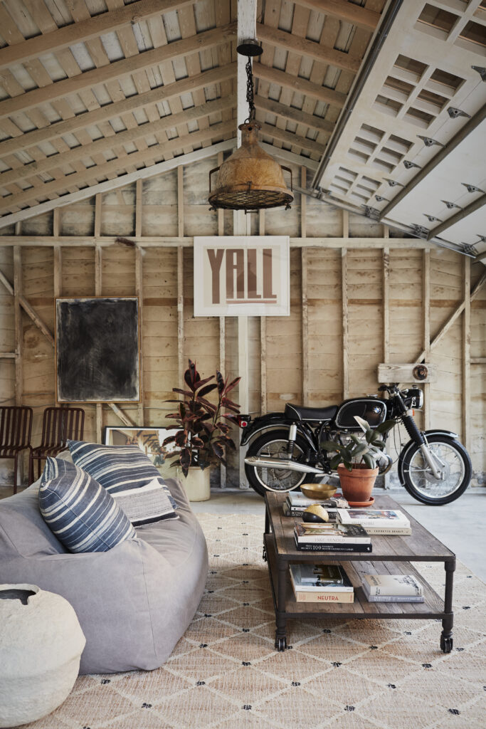
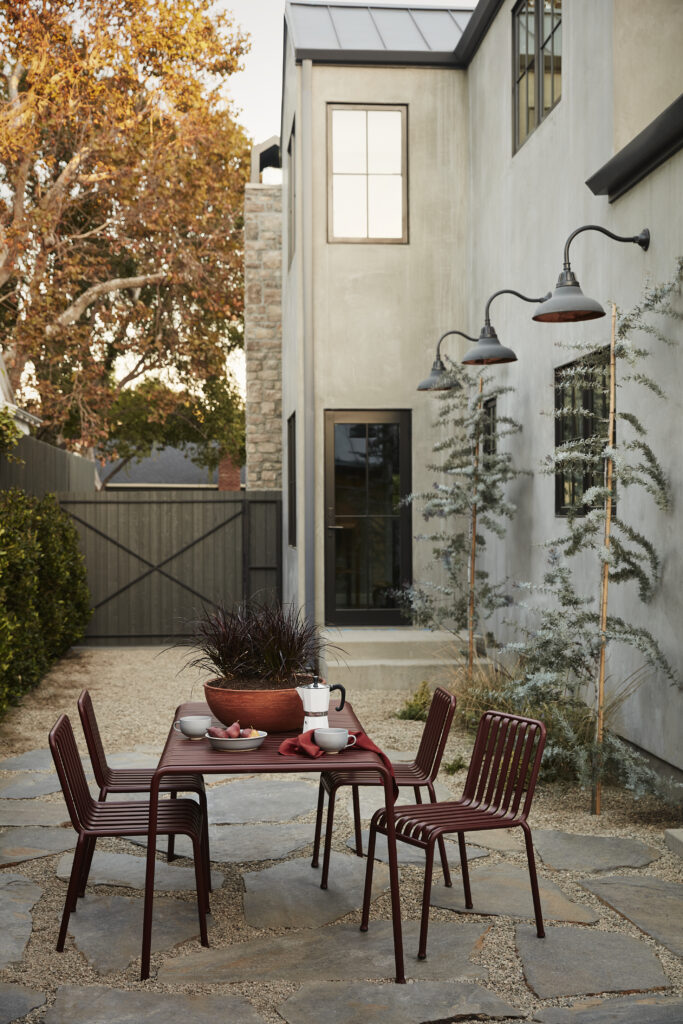
Photo by Joe Schmelzer.
