Best in Class
Author:Abigail StoneKirsten Blazek of A1000xBetter reimagines a worn bungalow in Eagle Rock as a welcoming contemporary home that plays well with its neighbors
The discovery that Kirsten Blazek was a nurse before transitioning into interior design makes perfect sense. The Scottish-born A1000xBetter founder brings that career’s reputation for compassion and efficiency to her current profession. Witness the thoughtful space in Eagle Rock that she rehabilitated for developer Waleed Delwari of Pacifica Ventures Group.
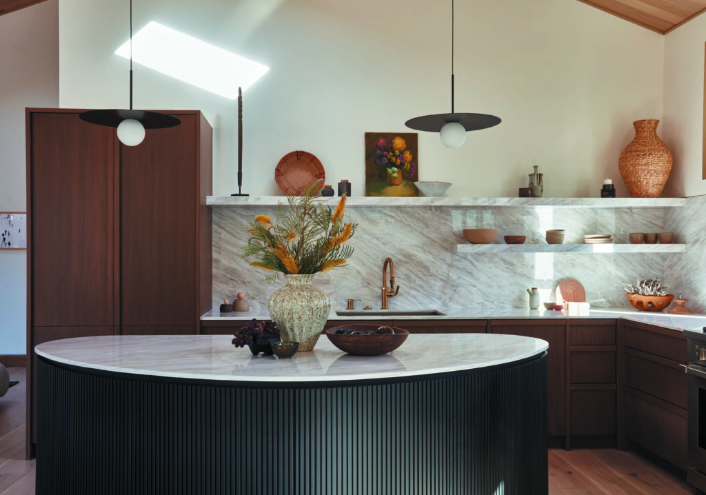
Photo by Michael Clifford.
“It was in awful condition, completely run down,” says Blazek of the original structure. “And it was very tiny—maybe 900 square feet in total—with tow bedrooms and a terrible layout.” Though Blazek saw potential in the long, narrow lot, her expansive proposal meant the existing structure would need to come down. Delwari gave her the go-ahead, but his only stipulation was that Blazek and her team maximize the home’s square footage and include an accessory dwelling unit on the property in addition to the main house.
“We didn’t want to do something that just felt like another generic new build seen commonly in L.A.,” Blazek says. “Even when we’re working with developers, we really try to elevate the design to a higher level.” She sketched out a three-bedroom home with an open-plan kitchen, dining and family room that extends to a patio shaded by an angled slatted pergola, which echoes the roofline. To accommodate a spacious primary suite with a generous walk-in closet and a luxurious bathroom, she built a second level on the street side of the home. “The space feels very private because everything else is downstairs,” Blazek notes. “And, because you just see greenery from the bed, it feels like you’re in a treehouse.” The exterior of the home is clad in smooth plaster painted dark warm olive green and cedar strips. Coupled with the restrained landscaping, the home’s first impression is one of peace and serenity.
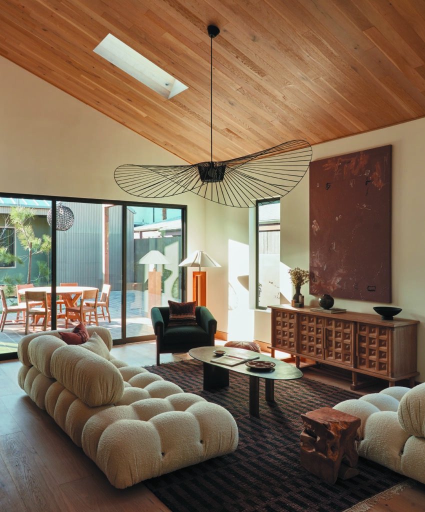
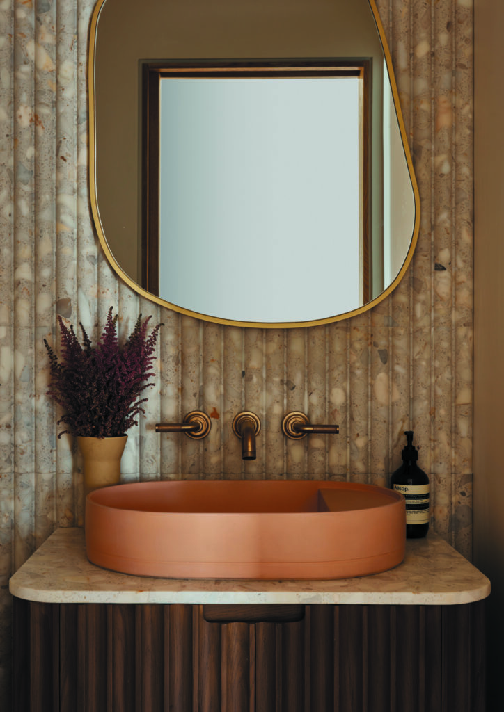
That mood is carried inside. “We could have gone for the typical white-walled box, but we decided we wanted to do something organic and natural, giving it a kind of Japandi vibe,” Blazek explains. The aesthetic, which merges Scandinavian and Japanese design, celebrates simplicity, rusticity, craftsmanship and patina. “We incorporated a lot of wood, stained in different tones,” she says. In its natural state, white oak was used for the floors, the baseboards, the trim on the doors and the steeply angled ceiling, inset with skylights, which brings drama to the central living area. White oak, stained a rich ash brown, was also used for the vanities in the bathrooms, the kitchen’s panel-ready cabinetry and the custom slatted door that separates the guest bedrooms from the main living areas. “Then we decided to stain the island black to make it stand out from the rest of the kitchen,” Blazek says. With its semicircular design and slatted front, it reads like a piece of furniture, creating an elegant transition to the dining area. That slatted motif echoes throughout the home; note the tiles in the bathrooms and those on one wall of the kitchen. “I’m always looking for ways to add more layers so that things don’t feel so flat,” she admits.
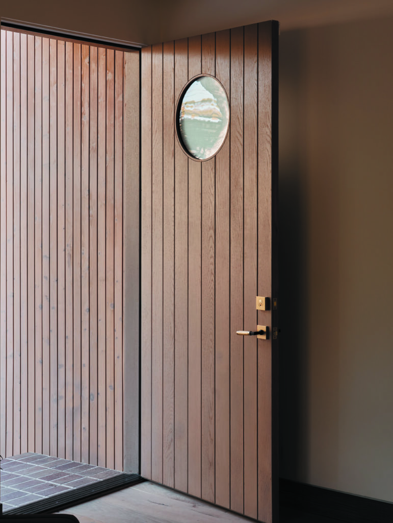
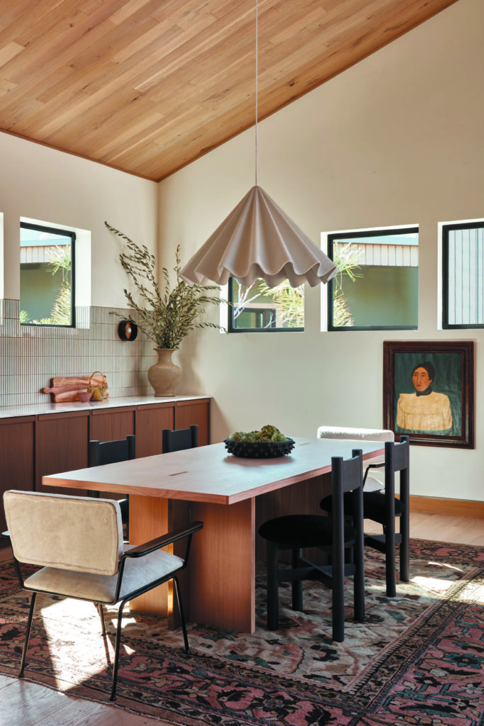
Curves are another standout feature inside the home, softening its exterior linear angularity. There’s the arc of that reed-fronted island, the porthole in the front door, and a circular window cut over the sliding doors that lead from the dining room to the exterior. That shape is also echoed in the home’s many intriguing light fixtures: the jaunty brass Pablo Designs pendants in the kitchen; the exuberant Dancing Pendant light by Iskos-Berlin in the dining room; and the ethereal Vertigo suspension pendant light from Petite Friture, designed by Constance Guisset, that spreads over the family room. “It’s a high ceiling and it needed a big light, but I didn’t want anything that felt too heavy,” Blazek says.
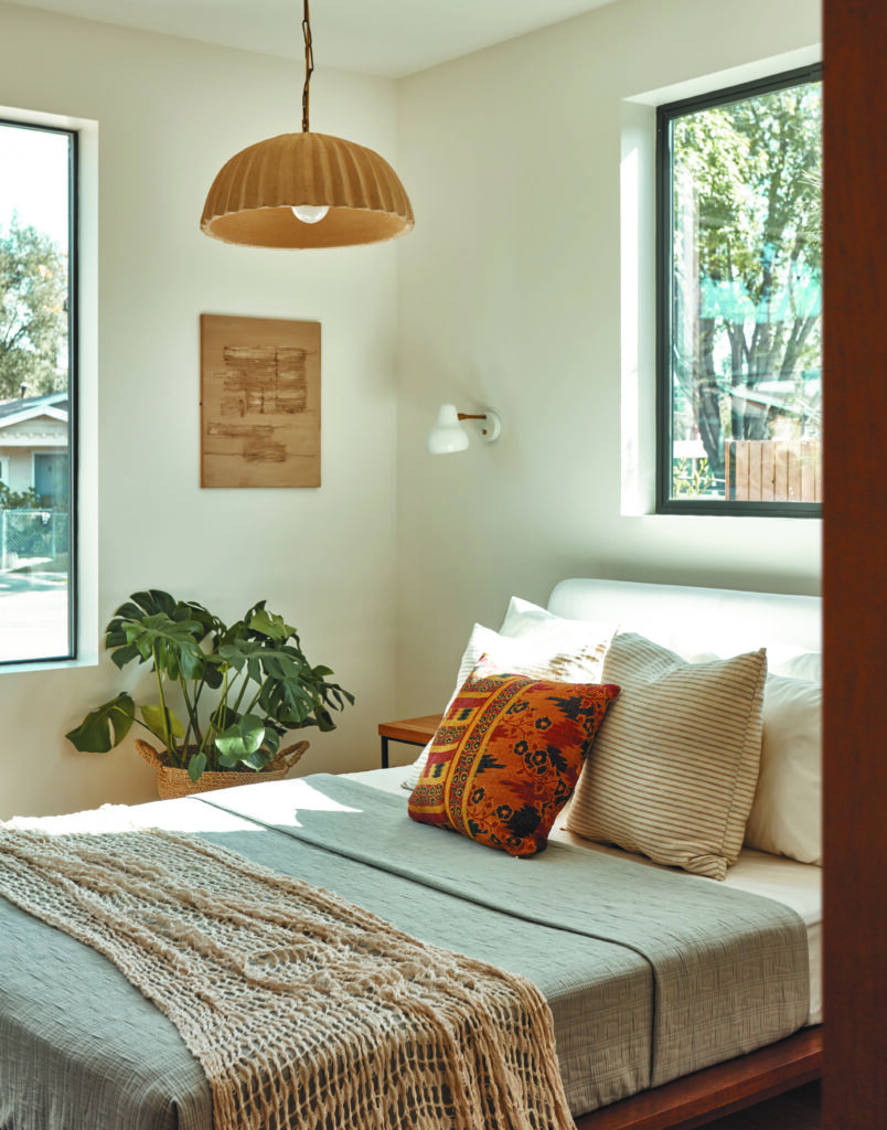
Photo by Michael Clifford.
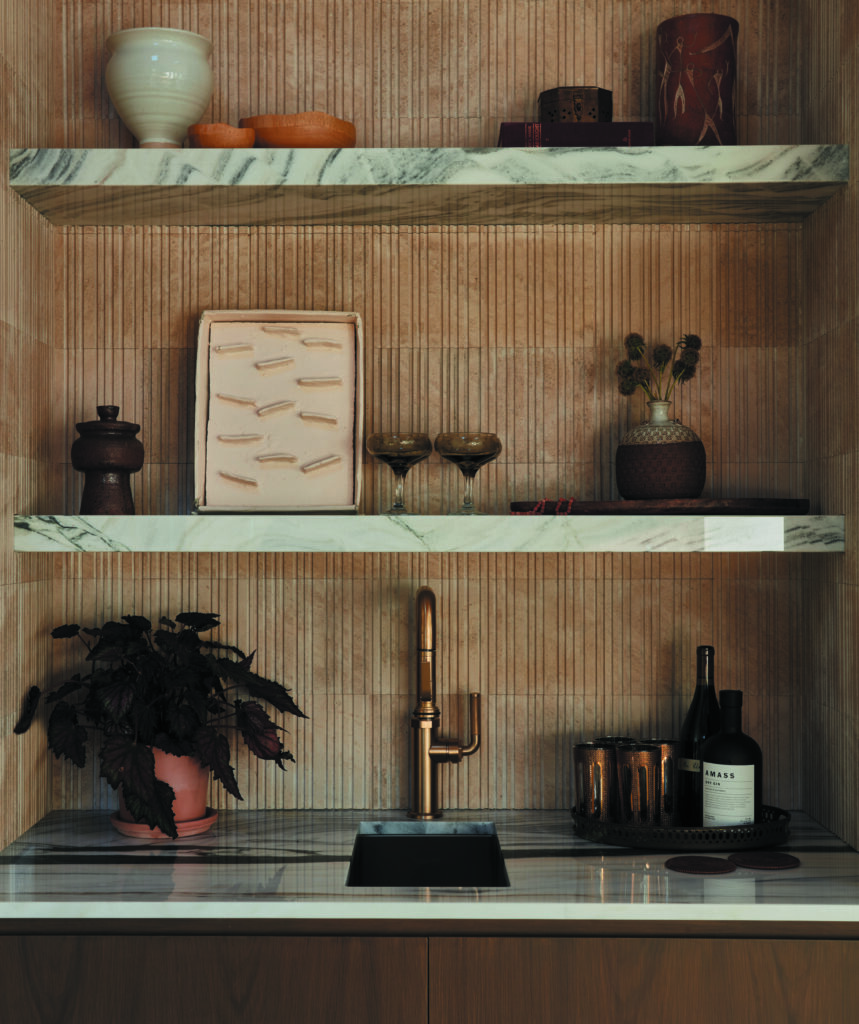
For the furniture, the team worked with Annie Carolin at Pride of Place Design to stage the home’s interiors, choosing sturdy, comfortable and inviting pieces. “We had a feeling that the buyer would be a young professional couple, so we wanted it to feel like it was a good home for entertaining,” says Blazek. The family room includes a reproduction of Mario Bellini’s bulbous Camaleonda Modular sofa that is covered in a nubby creme bouclé. A built-in bar with a sink confirms the home as party-ready.
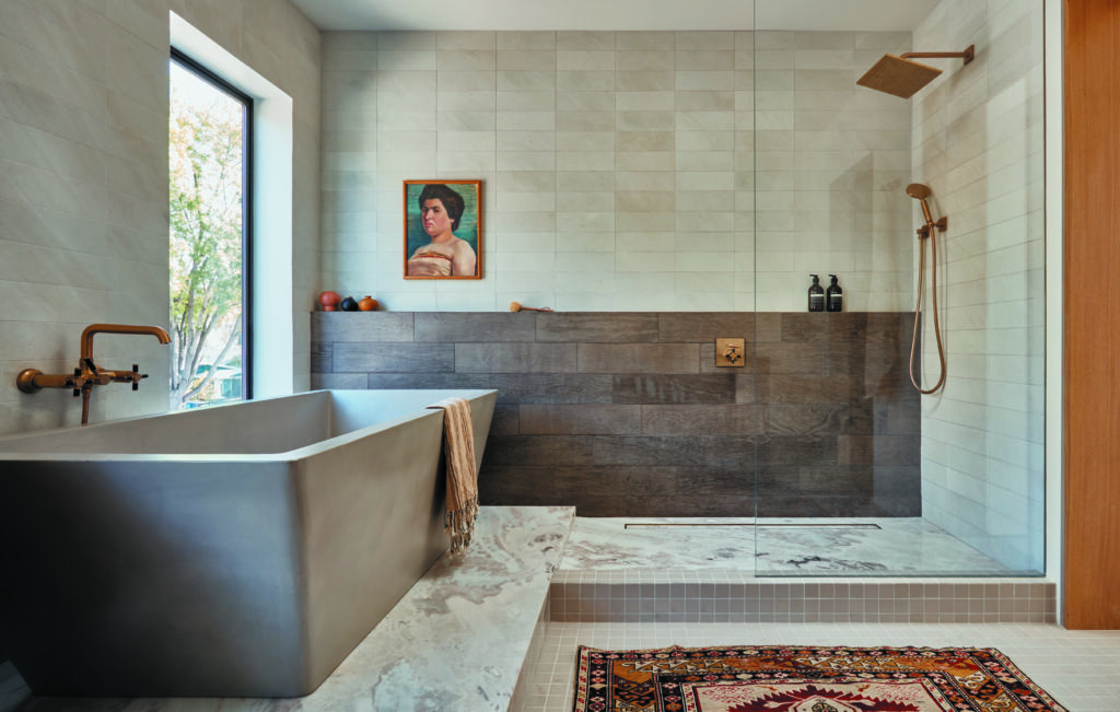
So, too, does the long table that anchors the dining room and the plethora of vintage floor coverings from Blue Parakeet Rugs. A subdued palette keeps the mood of the home laid-back and low-key but welcoming. “I’m very inspired by the high desert and the beiges, taupes and quiet, washed colors of the Southwest,” says Blazek. “Although the style of this home is much more modern than the rest of the structures on the street, the fact that it felt like it belonged among them was important to us,” Blazek remarks. “It felt like it slipped right into the neighborhood.” Just call it a block party.
