Reference Point
Author:Lindsey ShookKevin Sawyers looks to the past to realize his future home
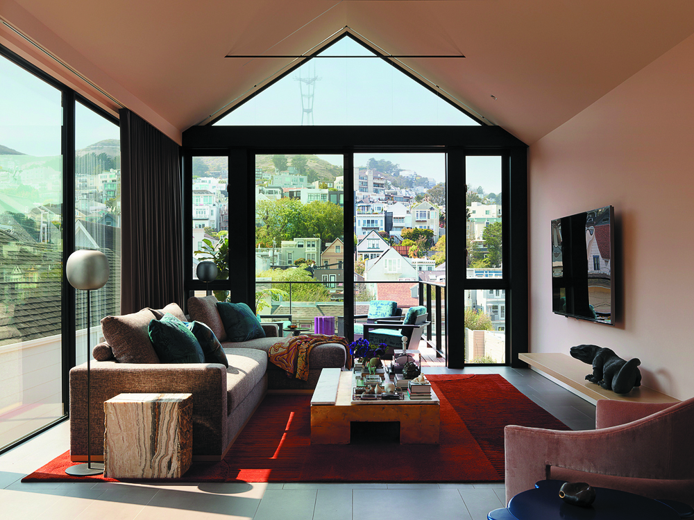
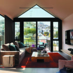
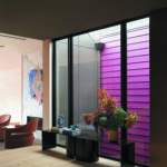
When it came to renovating and designing his own home, North Carolina native Kevin Sawyers—founder and principal designer of Sawyers Design—referenced visual memories from his childhood and past to curate an architectural gem that is full of fearless color. When searching for the property, he and his partner knew additional space was needed to run his design business. But more importantly, they wanted a structure that could be opened up to take full advantage of the surrounding San Francisco views. “There was an anecdote I told our friend and architect Hulett Jones, of Jones | Haydu, about the views from my childhood home at the foot of Sauratown Mountain in North Carolina. I called it my King Kong moment—the one where Kong sees the World Trade Center and remembers a similar- looking towering rock formation from his island home,” Sawyers recalls. “The mountain was to the west with a large tower atop, just like our view of Sutro Tower to the northeast. I could see a white church—similar to the Church of Mary of the Assumption—in the neighboring town, and far to the east was a mountain mentioned in The Andy Griffith Show, Pilot Mountain, which is identical to Mount Diablo. With this in mind we set out to open the home to the views.”
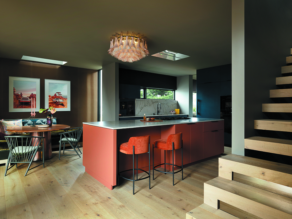
What initially drew Sawyers and his partner inside the home was the overall feel. The original shake shingle siding exterior evoked mountain or river vacation home energy, while the interiors showed promise for creating flexible spaces that could grow with the couple and Sawyers’ work. “At the start of the property search I had to decide if my business would be home based or if I needed a second property just for Sawyers Design,” he notes. “We found a property that fit the bill but after working from home in our condo the preceding five years I decided I didn’t want to give up that benefit of walking up a flight of stairs to get to work. It turned out the person who owned the property we looked at specifically for Sawyers Design also owned this home. He was an architect who used one property as his studio and rented this home over the years.”
Photos by Matthew Millman.
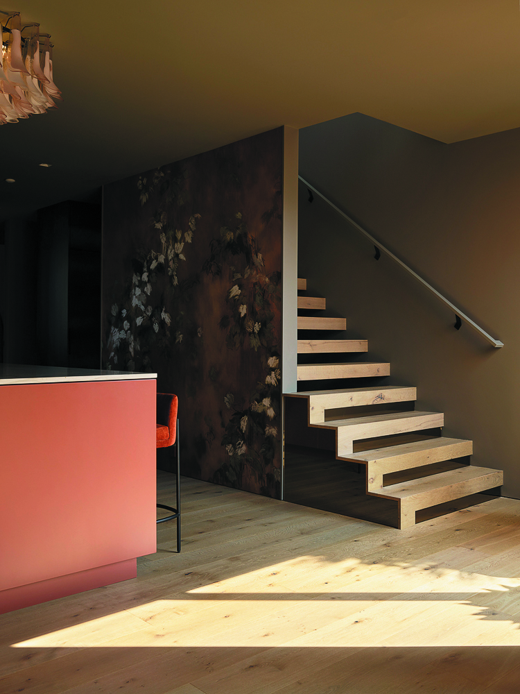
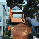
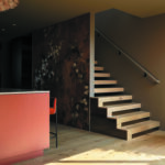
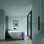
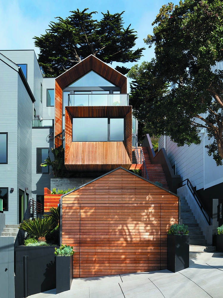
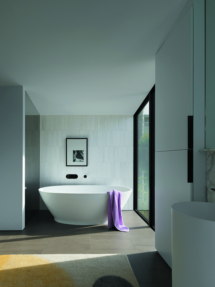
While much of the original footprint was retained, Sawyers worked with Jones to add volume, height and space via a cantilevered addition on the front of the home, an elevated roofline on the back that accommodates the new primary suite head heights and an expanded basement level that made room for a new interior stairwell. “One of the bigger challenges was getting the structural engineering to coincide with the interior space planning without cutting off too many fenestration options,” Sawyers notes. “I think we landed on some great compromises that actually closed the home where it needed to be closed to the outside so those windows and doors that remained are more special and focal points.”

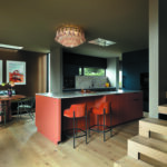
The overall goal was to keep spaces open while adding privacy and sound control through unique elements rather than creating real division through unnecessary walls and doors. “The kitchen cabinets are a line of blocks that divide the kitchen from my husband’s office and the guest/office bathroom,” says Sawyers. “Hallways become spaces like a kitchenette, wine area and laundry on the ground floor, and shoe storage cabinets line the hallway and primary closet on the top floor. Even the kitchen is a thoroughfare in the middle of the home.”
Photos by Matthew Millman.
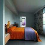
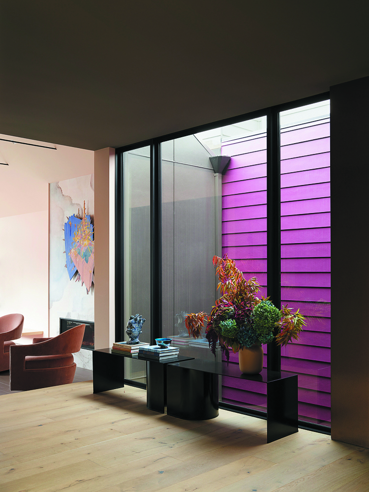
From film to fashion and paying homage to global cultures, Sawyers and his team leaned into bold color and materials to modernize the home. “I’ve always loved the concept of the wardrobe styling in the movie American Gigolo in which Richard Gere was dressed in what were at the time revolutionary designs by Giorgio Armani,” he notes. “You can see the care taken to coordinate not only the clothes to the man and the character but also the clothes to the set. I wanted our home to feel as though we were integrated into it with personal color palettes included.” They pulled color references from the film’s 1970s elements as well as its futuristic 1980s palette. “Take a look at the scene where Gere’s character meets Lauren Hutton’s or when Gere was being fitted for his suit,” he remarks. “Our custom living room rug is a direct hit with its rusty earth tone.”
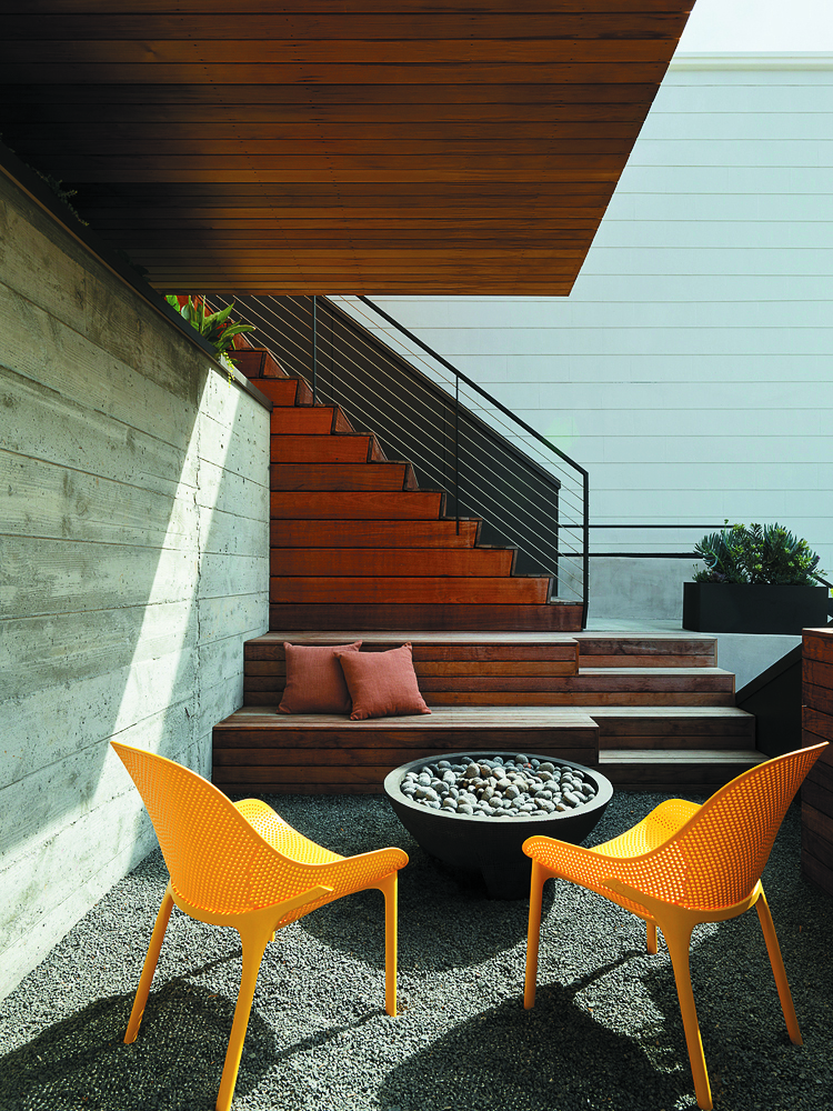
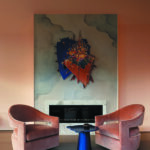
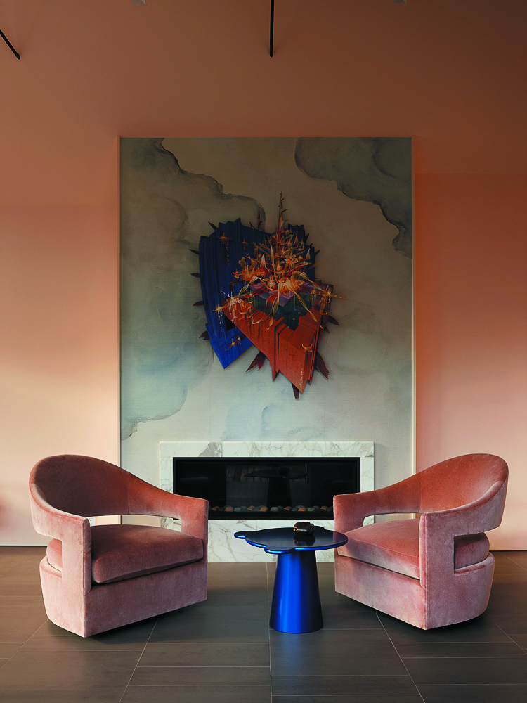
Sawyers also turned to the book Tibet Style and the bold painted walls at the Legion of Honor to curate his own personal home. “I just love being engulfed in color,” he says. “How did white become the go-to for interiors? Color has been so luscious in interiors in other time periods. I often look to those eras and other cultures for color palette inspiration.”
