Taking Shape
Author:Anh-Minh LeArchitect Eric Olsen and interior designer Michele Trout collaborate on a triangular dwelling that is as striking as its prime coastal locale
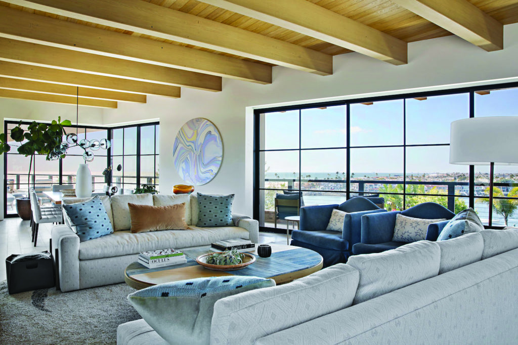
The living room is appointed with custom Bonesteel Trout Hall pieces—including the sofas, coffee table and armchairs—while the dining room includes a Lindsey Adelman chandelier; an Andy Moses painting hangs between the two spaces.
Photos by Karyn Millet.
For decades, the house in Corona del Mar, next to the beach and a popular lookout spot, was notable primarily for its location, which offers spectacular ocean and bay views. But the two-story 1950s dwelling itself was “nondescript,” recalls architect Eric Olsen, who grew up in the area and lives just a mile away. Now, thanks to Olsen and the current owners who hired him, the newly built home on the property is as remarkable as the site.
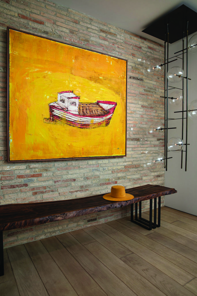
The same brick on the exterior is carried over into the entry, which also includes a custom Bonesteel Trout Hall bench and a Gallotti & Radice light fixture. Photos by Karyn Millet.
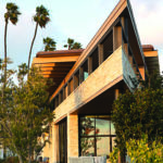
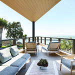
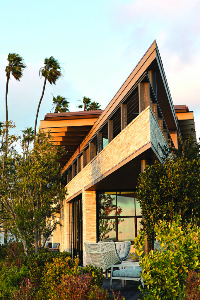
The 4,500-square-foot residence derives its form from the wedge-shaped sliver of land it sits on, prompting some to call it the Triangle House. Olsen and interior designer Michele Trout regard their collaboration in nautical terms: “When you’re in the structure, it really feels like you’re on a yacht,” says Trout, principal at Bonesteel Trout Hall. “Because it’s glass almost all the way around, you just see water around you” On the second floor, where the deck constitutes the point of the narrow triangle, “the view is the best,” says Olsen. “and it’s like being on the bow of a boat.”
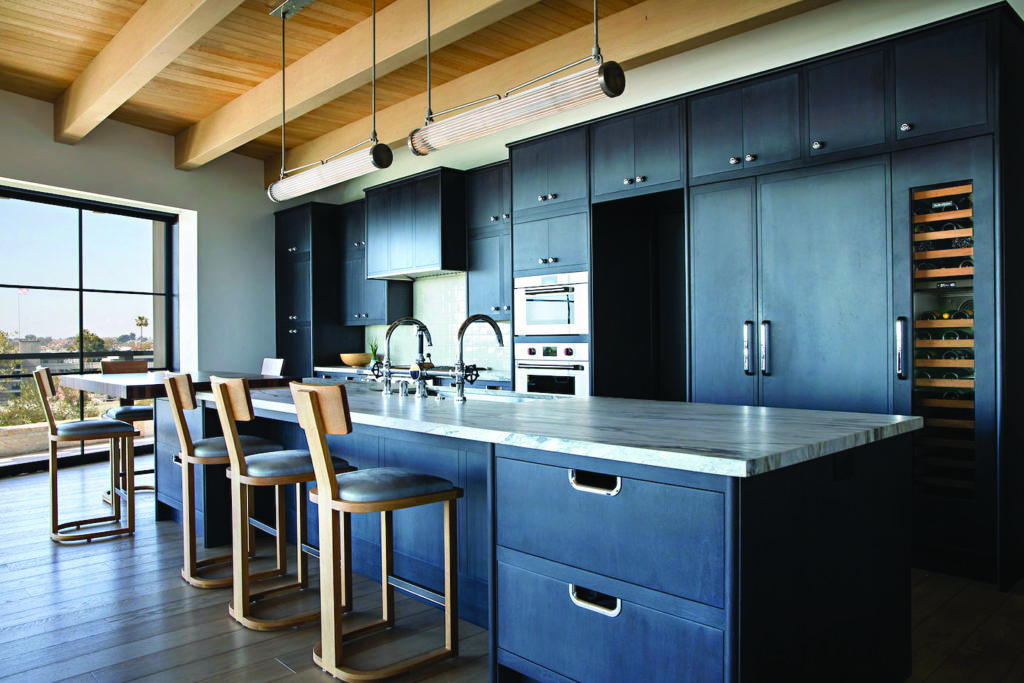
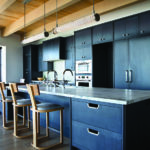
With a Waterworks kitchen as the backdrop, interior designer Michele Trout selected Urban Electric lighting and leather-covered Nickey Kehoe stools; the generous island is comprised of a section with Calacatta Viola as well as a butcher block-topped seating area closer to the window (which overlooks the bay). Photos by Karyn Millet.
Initially, Olsen had an orthogonal concept in mind. But with the parcel’s “tight angle,” he says, “the biggest challenge was fitting the program the clients wanted and maximizing the potential of the lot. I quickly realized that I had to embrace the triangle.”
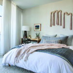
The primary bedroom suite and the great room (kitchen, dining and living) are upstairs, while the first floor contains guest bedrooms, an office and a den/media room. With beachgoers regularly passing by the house, Olsen sought to balance the desire to capture the postcard views with the need for privacy. To that end, he raised the foundation of the house several feet above the street level. Tiered planters implemented by Molly Wood Garden Design, along with two layers of drapery in the rooms, create further separation between the occupants and the sidewalk.
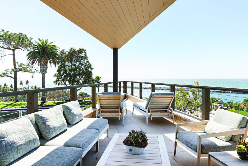
Architect Eric Olsen likens the deck, whose roof is lined with white oak, to the bow of
a boat; the furniture is from Brown Jordan. Photos by Karyn Millet.
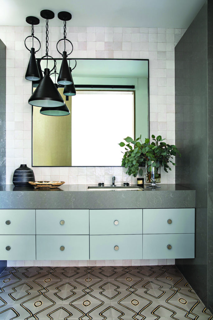
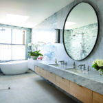
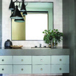
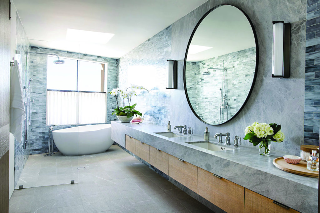
In a guest bathroom, wall and floor tiles from Ann Sacks and Exquisite Surfaces, respectively, are combined with PentalQuartz countertops and a trio of pendants from Circa Lighting. Photos by Karyn Millet.
As is often the case with Olsen’s designs, materials were repeated inside and out. The exterior is clad in brick, which also appears on a wall in the entry. White oak is used for the second-floor ceilings and the underside of the roof overhang. The materials on the facade, which includes copper and stained Western red cedar as well, “don’t have to stay perfect,” Olsen adds. “They’ll weather and get better with time.”
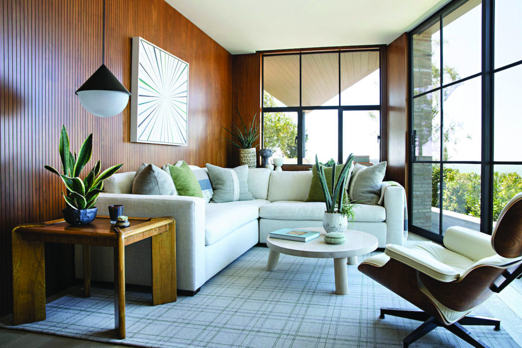
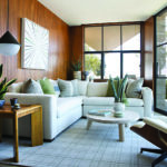
The client’s office features ribbed walnut walls, a custom Bonesteel Trout Hall sectional, a Christian Woo coffee table from The Future Perfect, a Roll & Hill pendant, an Eames lounge chair from DWR and a painting by Kenton Parker. Photos by Karyn Millet.
Trout’s interiors scheme emphasizes materials, too. “The textures really bring everything to life,” she says. “That’s what makes this house not feel like a big glass box.” In the living room, sofas upholstered in gray mohair flank a coffee table comprised of raked oak and sandblasted walnut; the pieces are all custom. Wallcoverings, among them grasscloth and gray flannel, were introduced in practically every room. In the office, inspired by a church door, Trout conceived a ribbed walnut wood wall that the home’s builder, Longman Construction, brought to fruition.
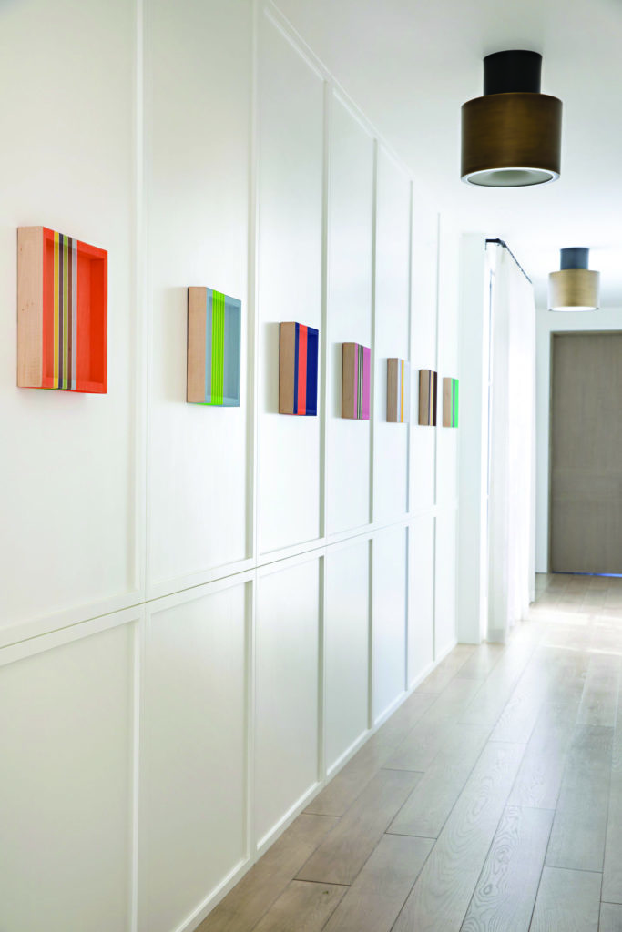
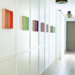
With its copious expanses of glass, there were limited walls on which to display art—meaning each selection had to be particularly well thought out. Enter art consultant Anne Mennealy, who arranged for the homeowners to meet with a number of artists and learn about their creative process. “I think that makes it even more special,” says Trout of the works that hang in the house.
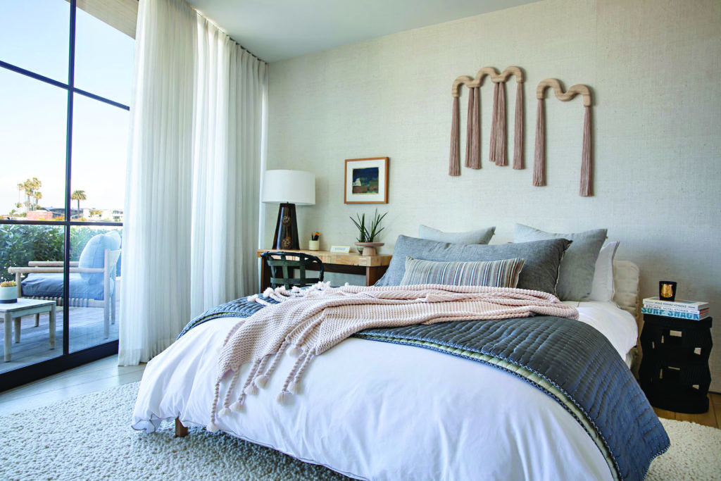
Reflecting on the two-and-a-half-year undertaking, Olsen and Trout marvel at the trust that the clients—who did not live locally during the construction of the house—placed in their firms. “It was really mine and Eric’s project,” says Trout. “We knew what they wanted and ran things by them when we needed to, but they trusted us, which is a unique situation.” Says Olsen: “It’s so rewarding to design a house, especially on a difficult lot, and have them be so excited and so pumped with the result.”
