Mother Knows Best
Author:Abigail StoneRebecca Loewke draws on her experience as a parent to renovate a family’s dream home
While Rebecca Loewke holds a BFA in Interior Design from the Design Institute of San Diego and a certificate from the National Council for Interior Design Qualification, putting that knowledge to work at top interior firms in both San Diego and San Francisco, where she oversaw multiple high profile residential projects, it’s her experience as a parent, reflected in the nuances of her design work, that draws clients to her. “As a mother of three, I really understand a need for function,” she says. “My goal is to make everything—floor plans, cabinetry, finish selections—function first and foremost and then bring in layers of design to create a warm and welcoming home for everyday living and entertaining.”
Take this project for example. Like Loewke, the clients had three young children. “Both parents are busy, balancing their high-pressure tech jobs, with spending time with family and entertaining friends,” Loewke explains. “They love the outdoors, especially surfing in Santa Cruz and spending time at the beach.” The renovation would need to reflect that.
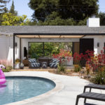
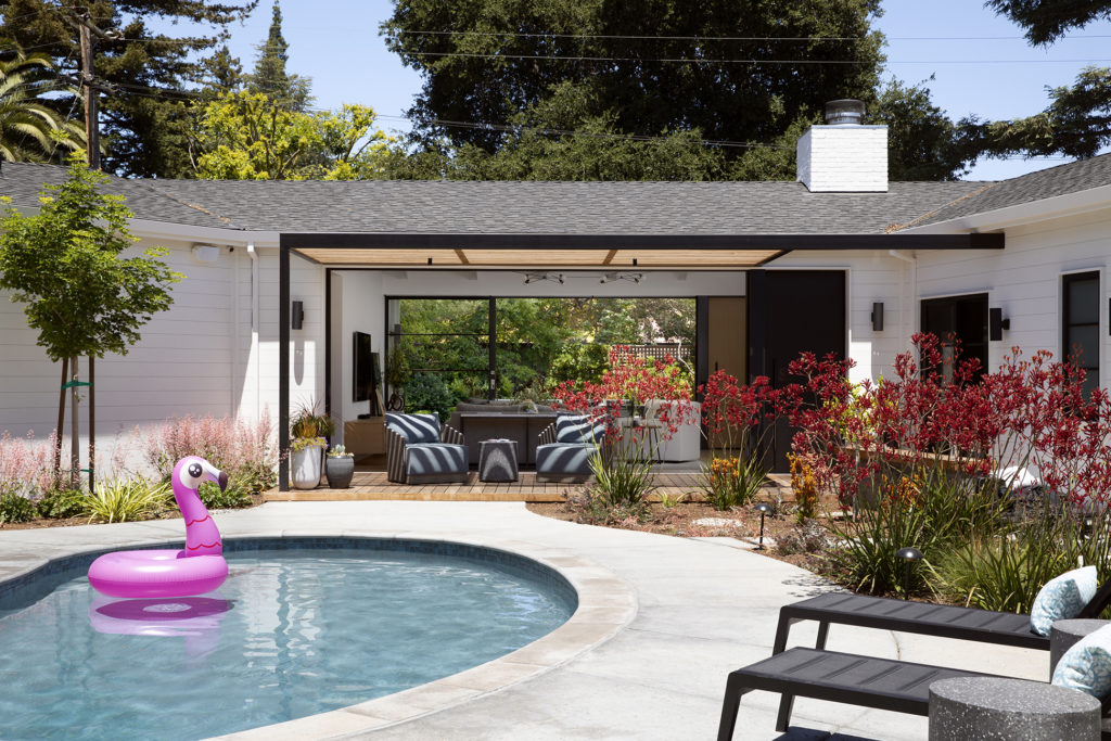
Loewke knew that they wanted to provide each of their daughters with their own room. She also knew that they didn’t want to move the home’s pool. “The pool is in the front yard of the house and it was important that it remain in that location,” says Loewke.
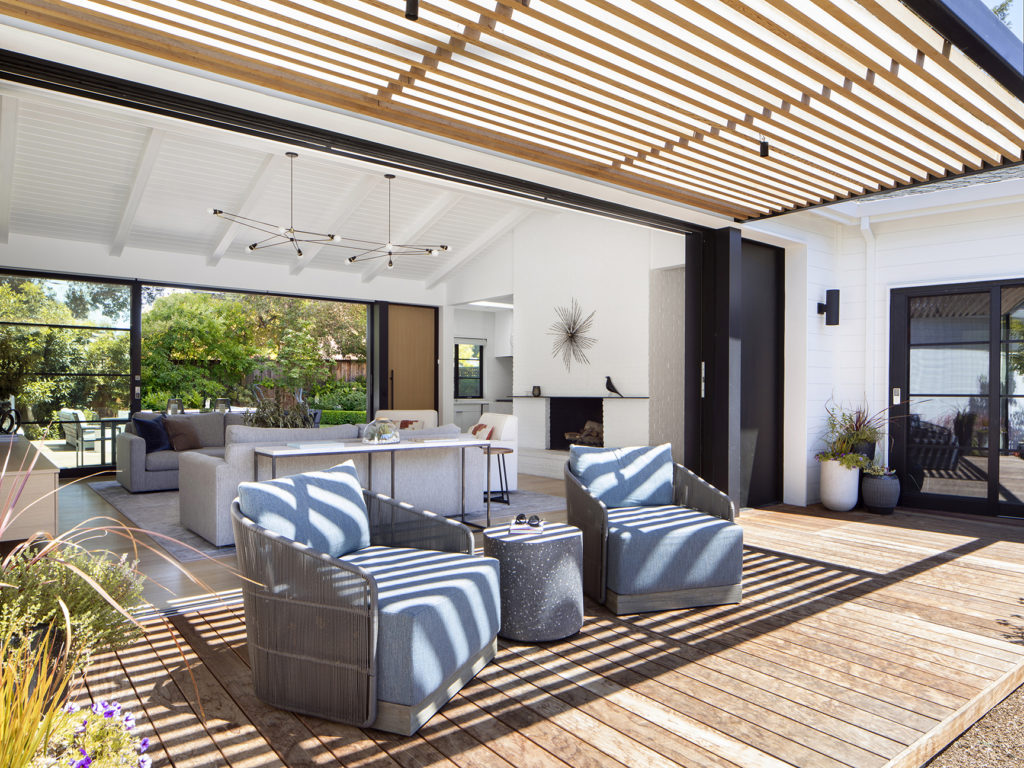
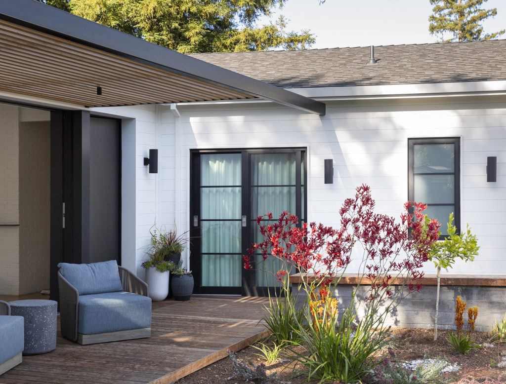
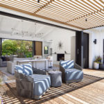
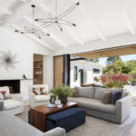
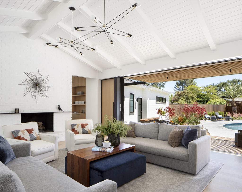
With these parameters in mind, Loewke worked with Peter Hamilton of Studio Peter Hamilton to re-envision the floor plan of the classic 1950s ranch home, expanding its footprint to hug the pool. Now, an open-concept design enables the easy flow from indoors to out, from front yard to back. “Early on, when they bought the house, they had envisioned opening up both sides of the living room with views to the pool,” she explains. A slatted roof over the decks that lead to the exterior on both sides of the house helps to blur the line between indoors and out.
Photos by Paul Dyer.
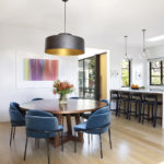
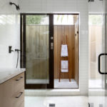
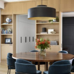
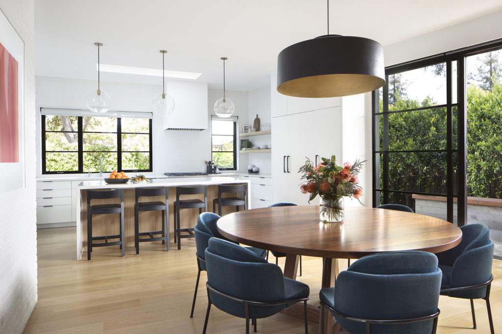
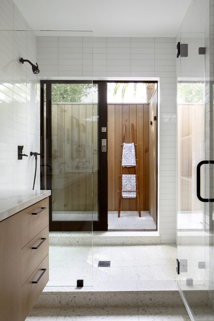
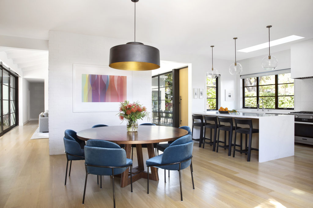
With the home’s focus on light and the exterior, Loewke kept the color palette neutral, instead relying on texture and accents. “Both the kitchen backsplash and the tile in the girls’ bathroom have great pattern that brings dimension and interest to the spaces without being too trendy,” Loewke points out. “In the primary bathroom, we installed a terrazzo floor and added brass accents.” She also nodded to their love of the outdoors by including an outdoor shower in the primary bathroom. “That’s what they exclusively use,” Loewke says.
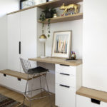
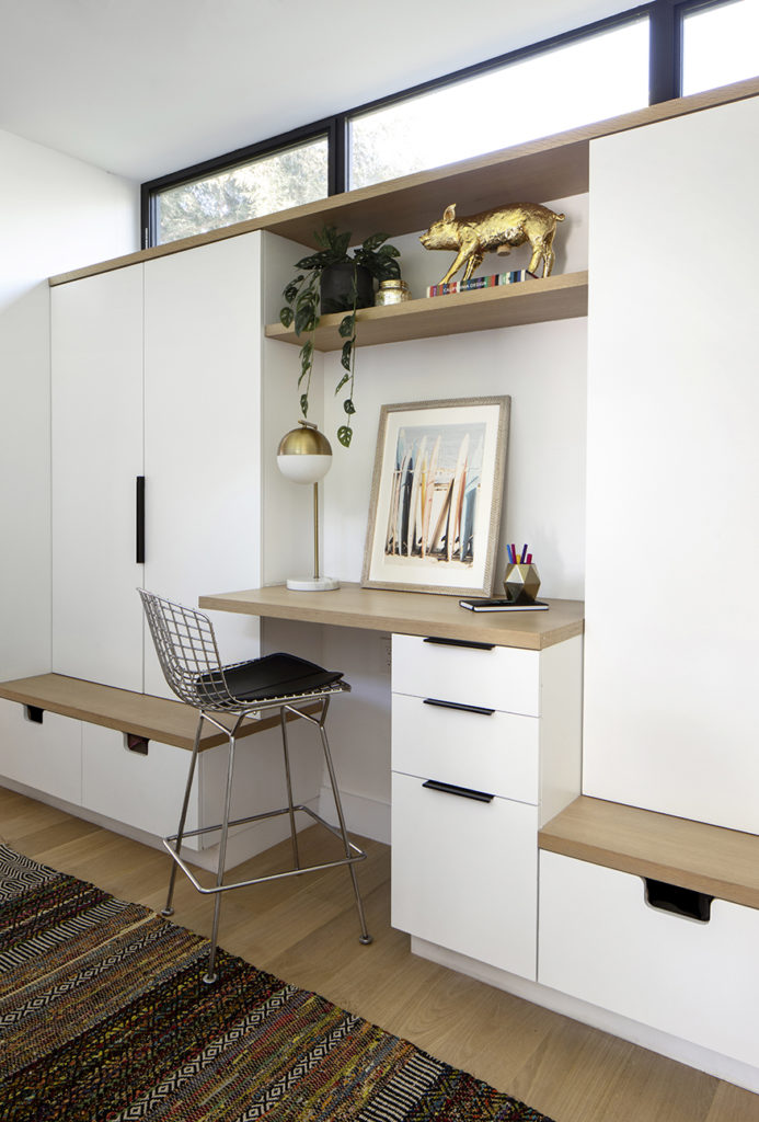
A back hallway, dubbed the “support hall” and located between the kitchen and the garage, offers a multitude of storage. In addition to providing a place to hang backpacks and coats, it hides the home’s pantry, its appliances and cleaning supplies and a desk. “We went with “bulletproof” materials like nylon rugs and Fabricut Alta fabrics that turned out so well,” says Loewke. Proof of the benefit of her experience is in the client’s reaction: “They’re so happy,” Loewke shares, “The space is functioning better than they imagined.”
