Haight and Narrow
Author:Abigail StoneThe impeccable collaboration between Mansfield + O’Neil Interior Design, John Lum Architecture and Christopher Gate Construction turns a narrow Victorian into a splendid modern home in San Francisco’s Lower Haight.
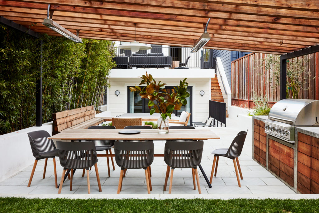
San Francisco’s slender Victorians stun with their beauty and color. But their dim, old-fashioned, maze-like interiors can seem at odds with modern life. Such was the case with this home in the city’s Lower Haight. “The primary goal of the remodel was to solve the spatial complexities of a classic Victorian layout, where the rooms were long, narrow, dark, and compartmentalized,” explains Mansfield + O’Neil Interior Design’s Lisa O’Neil who, in collaboration with partner, Tiffany Mansfield, creates homes for the way that people live today. “We design approachable, comfortable interiors that richly reflect our client’s individual tastes,” she says. “We’re often called in to create unique homes for families, who particularly value the confluence of both function AND style, and who need designers who understand their “kid-friendly but style-forward” lifestyle requirements.”
Photographs, here and throughout, by John Merkl.
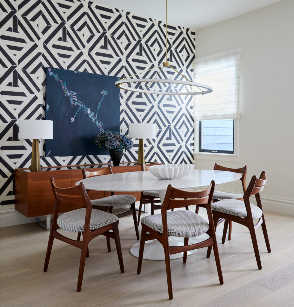
Above: The dining room’s black and white wallpaper is by Nobilis. Dangling over the classic Saarinen table is a pendant from Roll + Hill
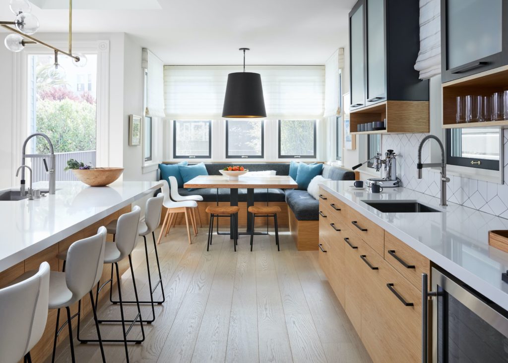
That was certainly the case here. The clients — she flourished in a distinguished career as a ballerina while he works in technology — were very committed to creating a space that would support their two children, cat and super-spunky dog. “Initially, the goal was to do a quick remodel, but as they got deeper into the design, they realized they would have to do a more comprehensive remodel and a minor addition due to the aging infrastructure and lack of structural foundation,” remembers John Lum of John Lum Architecture .“One of their core values was to preserve the home and not expand it unnecessarily. They desired a refined and elegant home that did not lose the funky and historic charm of the Victorian, but one that would be cozy for their children to grow up in.”
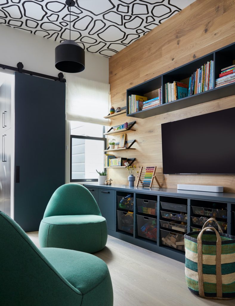
The home is also a gathering place for their friends and the many family members who live nearby. “This is a family that loves to entertain,” says O’Neil. “Even with the constraints of the narrow property, they wanted to open up the living area, integrate the play space with the public space, and, frankly, maximize every inch – both functionally and aesthetically.”

“The original home felt cramped and was laid out in such a way that it was a tight living space for a family of four. There was a ground level space that was just crying out to be used,” remembers Christopher Gate of Christopher Gate Construction. Lum knew going in that the rooms would be tall and narrow. But instead of fighting it, he leaned into it, accentuating soaring ceilings to give the home a feeling of air and light. “The house is not large in terms of square footage but it feels ample,” he says. The new layout includes a master suite, wine storage, laundry room, two bedrooms and a bath on the ground level while upstairs, the removal of walls revealed space for an open kitchen/living space, playroom, guest bedroom/office, full bath, playroom and sitting room. To the envy of visitors, Lum even managed to slot in a mudroom and his and her closets.
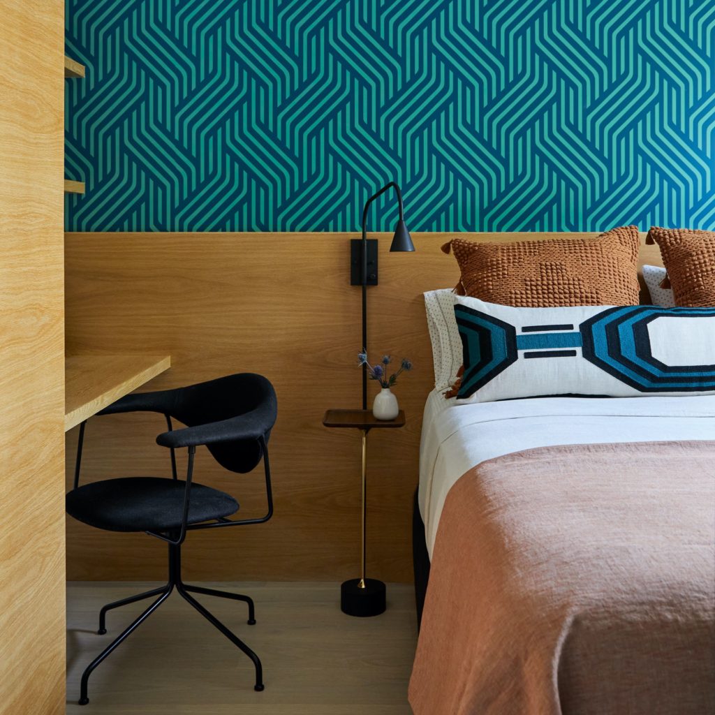
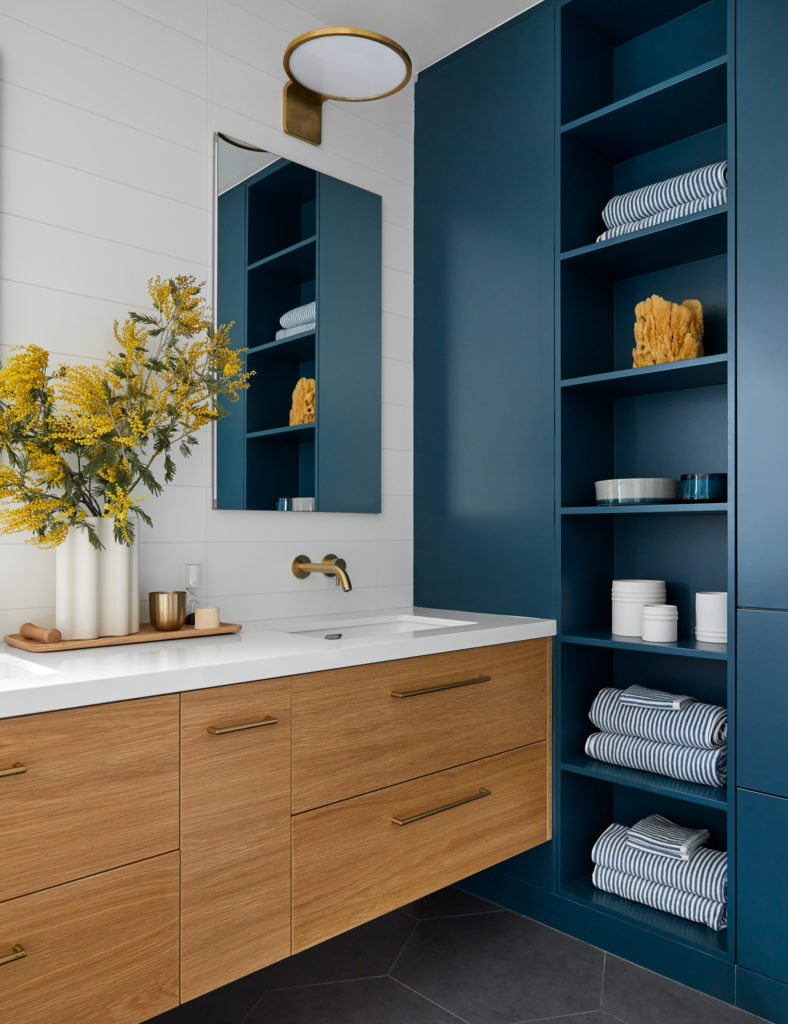
When it came to the interiors, the client had a very clear directive. “She wanted to achieve a bohemian-mod vibe with natural, organic elements mixed in with modern ones, and also integrating some mid-century components,” O’Neil shares, “She was very specific about color, and knew that she loved aloe green and black, juxtaposed with creams and natural tones.”
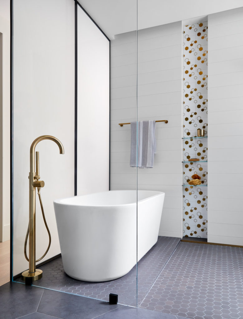
Hexagons, a favorite motif, wind throughout the home. Concerned that using plain hex patterns would feel dated, O’Neil gave the design a twist. “We integrated hexagons in a variety of forms through the design: graphics on hex such as the floor tiles in the boy’s bathroom, split or elongated hexes as seen in the kitchen and laundry backsplash; multi-scale hexes in the primary bathroom’s floor and niche; and, geometric drama in the fabrics, wallpapers and rugs, like the one in the living room.”
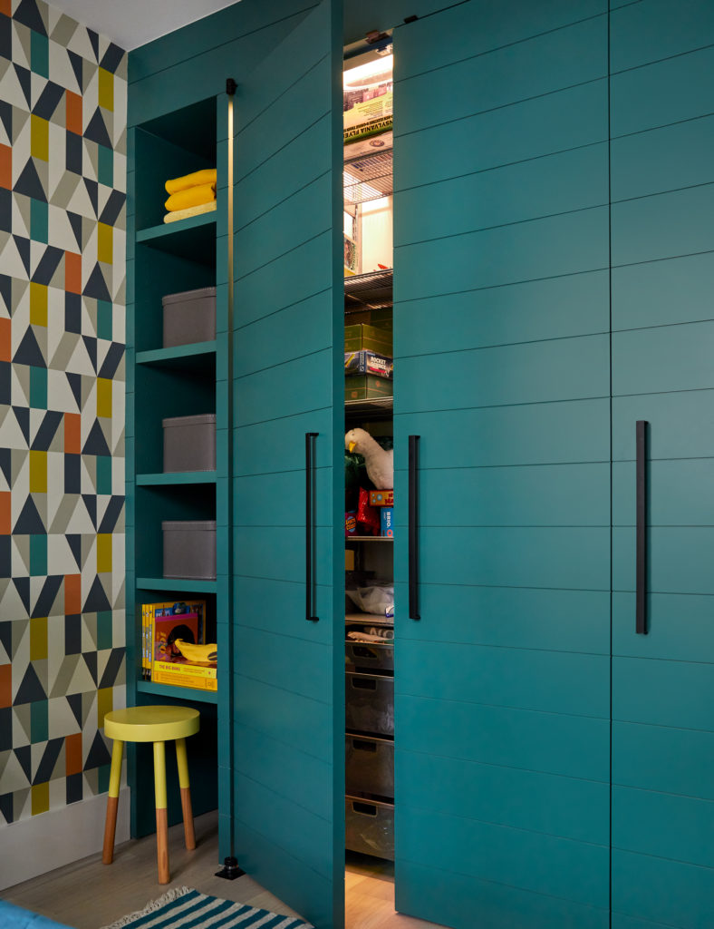
The exacting work of Gate and his crew turned the visions of the architect and the interior designer into a beautiful reality. “We pride ourselves not only on the quality of our work, but also the highly collaborative nature of our teams,” says Gate, “Executing with precision goes without saying, but we also believe that a strong standard of teamwork makes the difference between a good project and a great one.”
O’Neil agrees: “We were each able to bring unique ideas to the project and work collaboratively to execute them,” she shares. “It was really a delight to work with such a thoughtful and creative group of experts, and alongside an enthusiastic client who embraced change.” This home proves that teamwork makes the dreamwork!
