Star Quality
Author:Abigail StoneOz Architects breathes new life into a Bel Air home
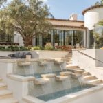
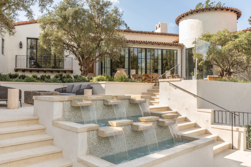
Situated on a two-acre lot just moments from Bel Air’s majestic East Gate sits a beautifully maintained estate that seems plucked from the Paul R. Williams playbook. That first impression is reinforced by the home’s elegant proportions: its twin flights of graceful stairs, bordering a cascading fountain, that lead down to the generous main pool area; its Provencal- inspired wine cellar; its 13 fireplaces; gracious courtyards; and its solarium, which overlooks the home’s lush landscape. And, in fact, the original home had been designed by the renowned architect at the behest of a movie mogul back in the early 1930s.
Photos by Lisa Romerein.
However, a half-dozen ill-conceived renovations over its 80-year history bloated the home from a modest 3,000 to 21,000 square feet, obscuring the original design under layers of poor decisions. “We really didn’t have a good starting point,” explains Don Ziebell, president and founder of Scottsdale, Arizona-based Oz Arhitects who, along with the firm’s interior design director, Inga L. Rehmann, was hired to rethink the property. “Any trace of Williams’ original design had been obliterated,” Ziebell says. “We couldn’t even tell where that original house was!”
Photos by Lisa Romerein.
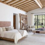
The structure Ziebell and Rehmann encountered was dark, with low ceilings, heavy beams and small windows. “There were all these token gestures to Spanish style minus the deep sense of integrity that some of the really authentic projects have,” remembers Ziebell. The pair saw the home’s potential but they also knew they would be starting from scratch. “The majority of the plan was taking it way down, reframing it and increasing the height of the ceilings,” says Ziebell. They would also need to amplify the indoor-outdoor connection that is at the heart of the Southern California lifestyle. “Even though there was a courtyard and a big backyard there weren’t a lot of spaces outside that felt livable,” says Rehmann.
Photos by Lisa Romerein.
Photos by Lisa Romerein.
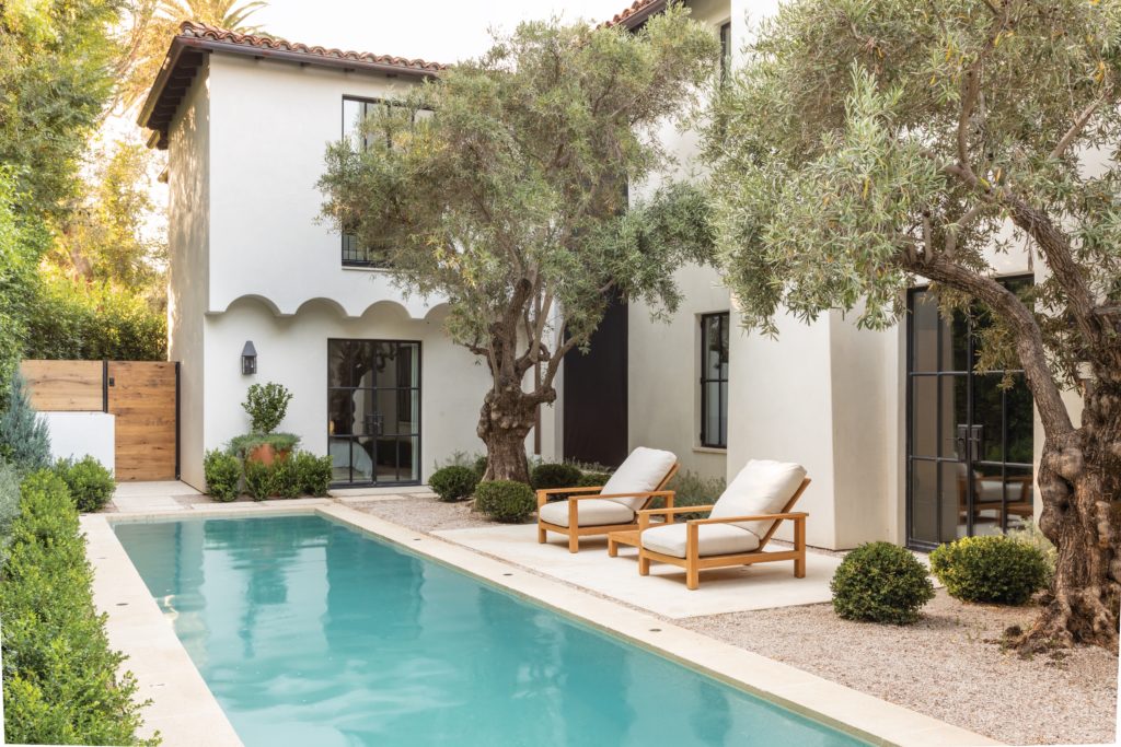
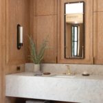
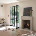
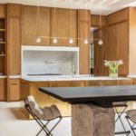
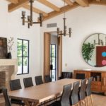
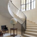
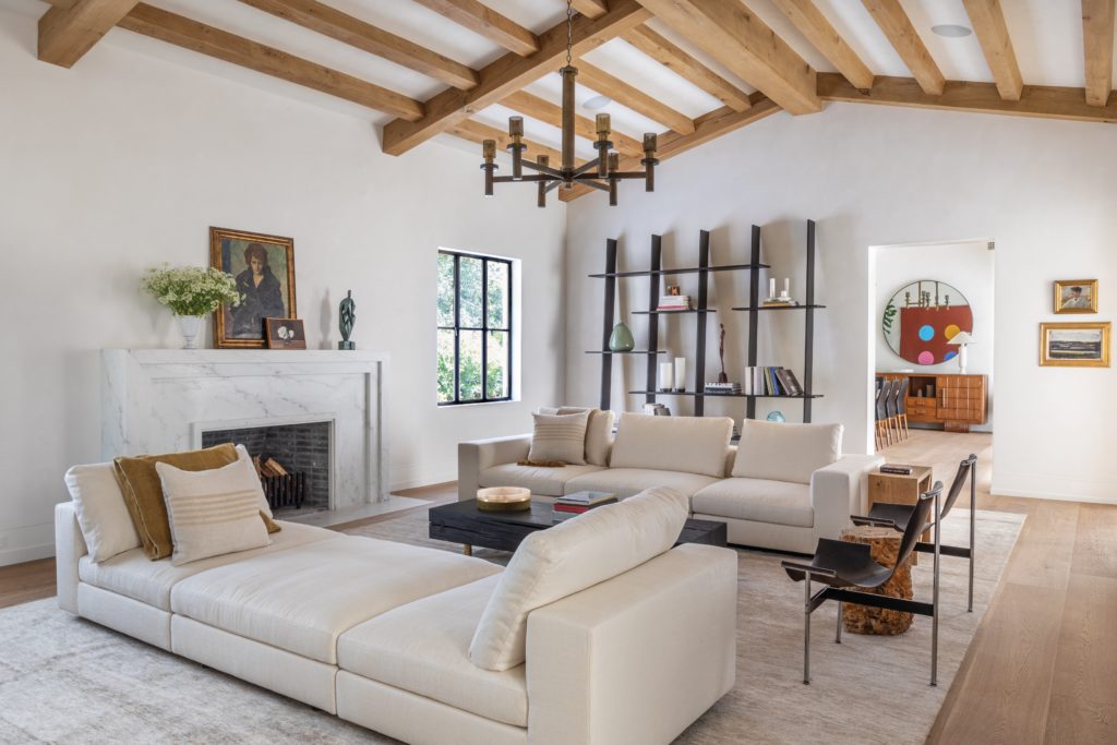
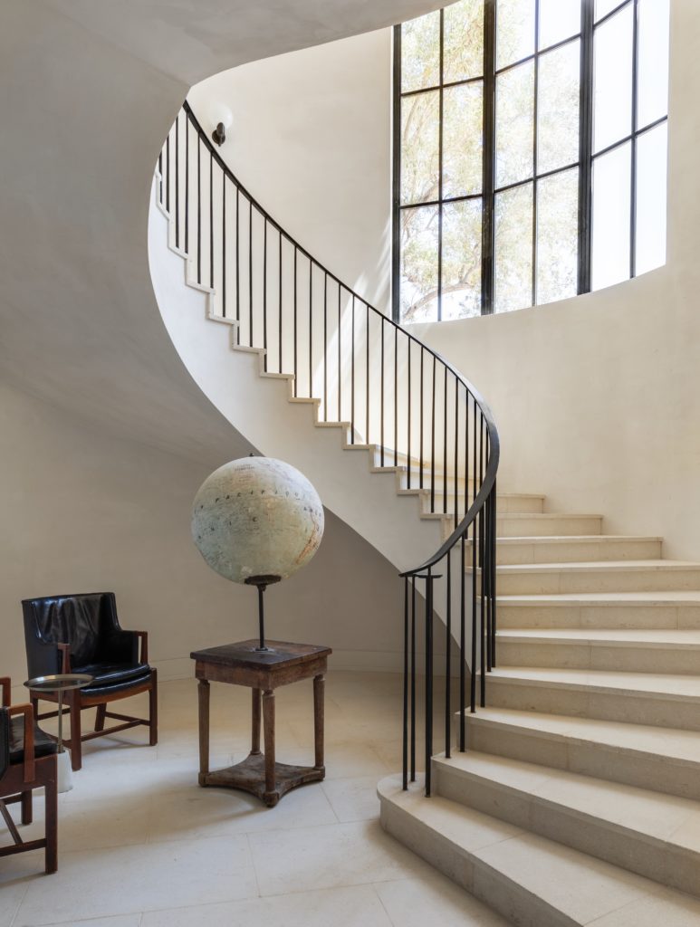
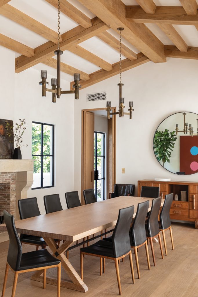
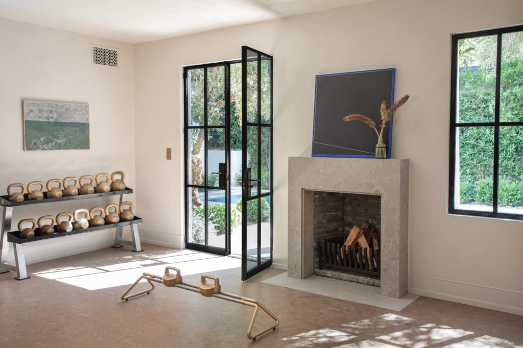
Now the home is suffused with light and air. Steel-framed windows and doors, plaster walls, stone floors and wide plank flooring evoke the Spanish Revival-style homes characteristic of Los Angeles. But upon closer inspection, subtle, important differences are revealed: The glass panes have been enlarged, plaster walls have been hand-troweled, the large-format stone floors are constructed of reclaimed, imported French limestone and the wood underfoot is 12-inch-wide European oak that’s been custom wire-brushed and smoked to achieve its barely bronzed tone and silken finish.
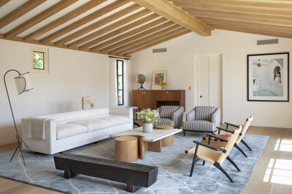
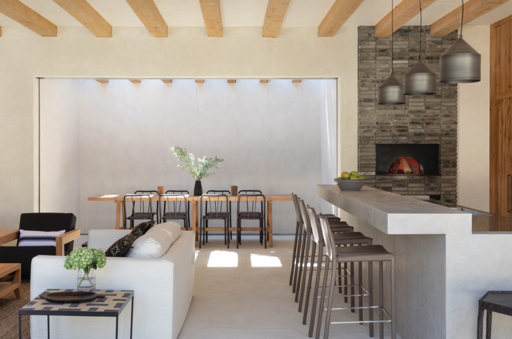
“The house is certainly a Spanish Revival house,” Ziebell acknowledges, “but the traditional details have been modernized with contemporary materials and streamlined to create a more luxurious sense of scale.” Adds Rehmann, “Those elements create a feeling of timelessness and serenity that links the past and the present.”
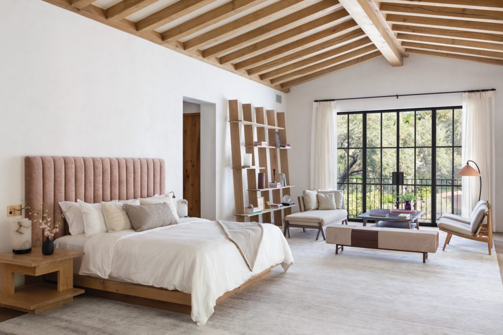
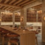
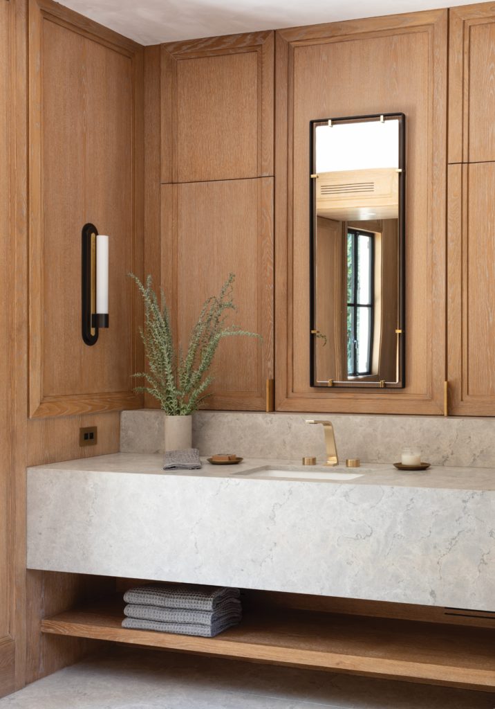
They worked with Elizabeth Law Design to curate a cohesive palette of colors and finishes was used to link the spaces together so the home feels inviting rather than cavernous. “Furnishing this incredible space alongside Oz Interiors was a dream project,” says Law. “Compiling our resources, using local vendors and artisans, as well as custom pieces helped make this space stand out. Certainly an elevated take on staging, the team had great creative fun. Designing barstools specifically for the wine cellar with Thomas Hayes Studio, and gas lanterns that I sketched and Don made by hand, it was a true collaboration.”
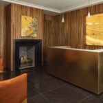
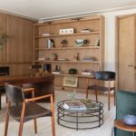
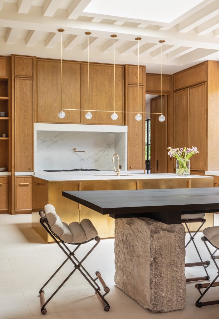
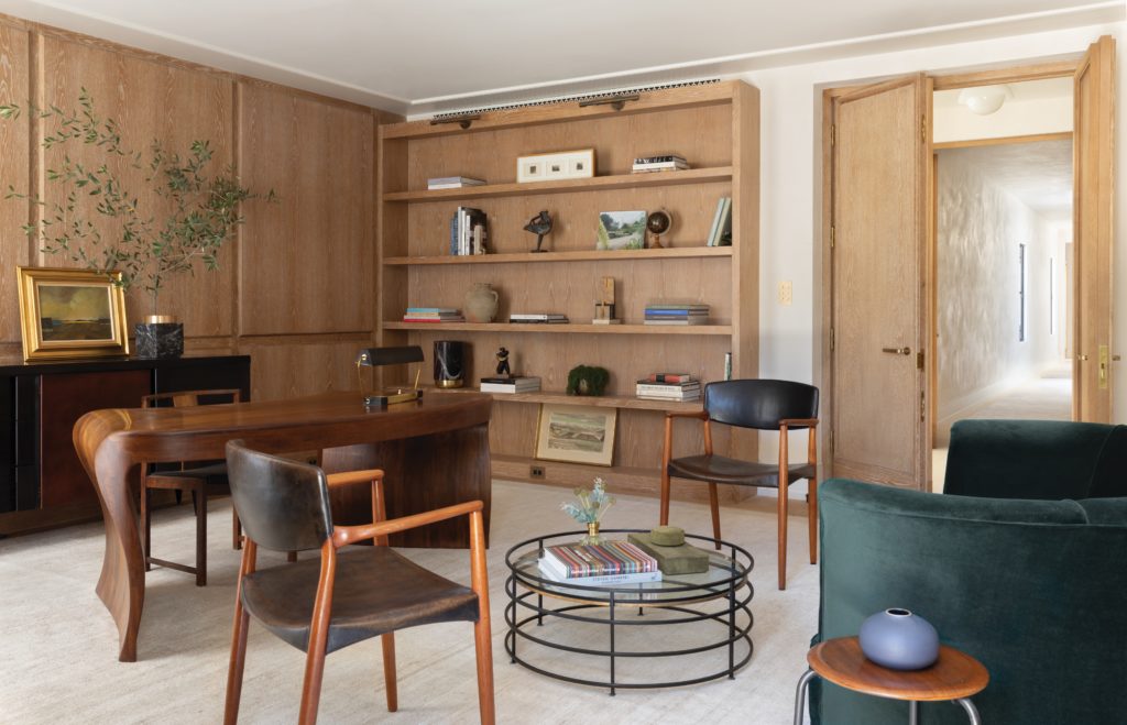
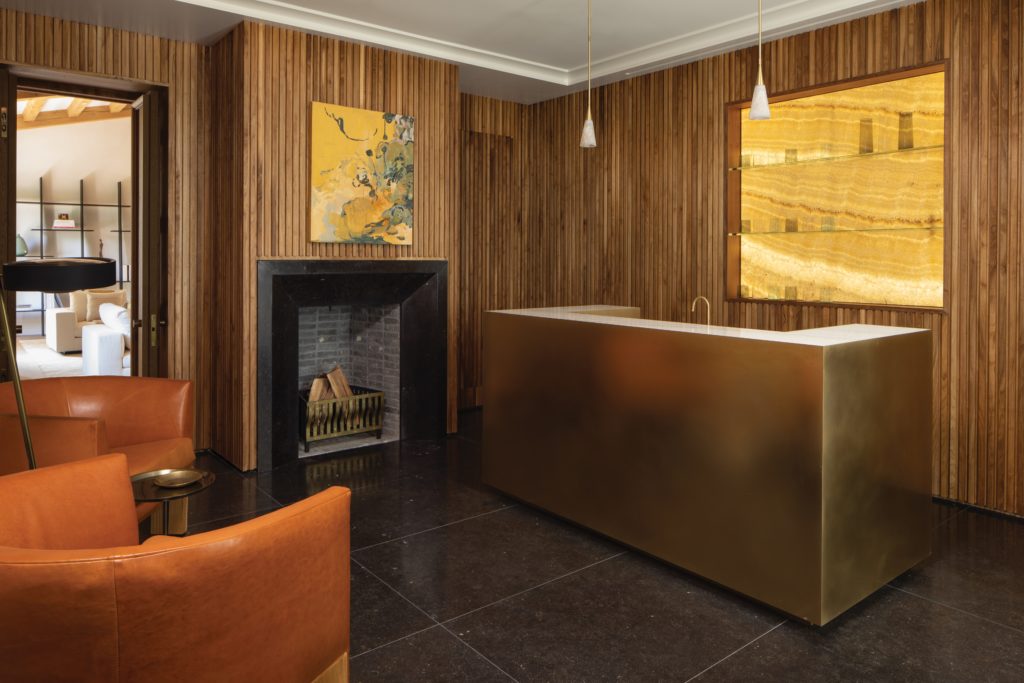
The deft use of light fixtures, sourced from the Urban Electric Co., Articolo, Allied Maker and Apparatus, among others, also emphasizes the home’s intimacy. “Warm-toned lights add to the feeling of welcome,” Rehmann acknowledges. So, too, does the controlled flow from one area to the next. “The undulation of large and small rooms, and from indoors to out, offers a pleasing rhythm of enclosure and openness,” says Ziebell. Take the tête-à-tête room. “So often in a big house there are no private spaces within which to have a conversation,” says Rehmann. “We really wanted to create a cozy room in the house you could slip away to for a quiet conversation or moment in an otherwise large home—especially during a private event at the home.” The appeal of the room’s paneled walls, onyx backsplash, fireplace, brass bar and leather club chairs is underscored by its juxtaposition with the bright and expansive living and dining areas just beyond.
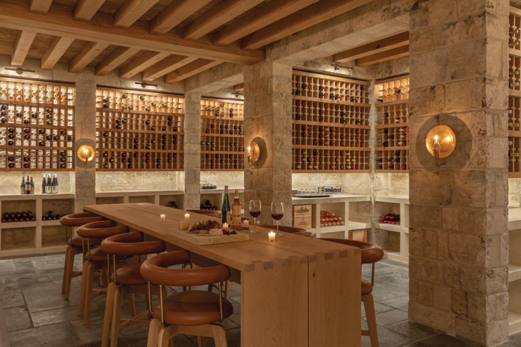
The wine cellar—formerly the home’s screening room—is another space that spotlights the duo’s dexterous approach. “A really important part of the concept for the home was to create an authentic wine cave,” says Ziebell. “The clients wanted to make this the best cellar they’d ever seen in the U.S.” Ziebell and Rehm- ann took their cues from the storied vineyards of Southern France. “Someone sug- gested we put glass on the outside of all the wine bottles so you could set different temperatures and we said ‘absolutely not,’” says Ziebell. Instead, its below-ground location and materials—including thick antique stone walls, terra-cotta inserted between the ceiling’s sturdy wooden beams and flawless millwork—perform in concert to naturally keep the space chilled on warm L.A. days. Combined with the flickering of the oil-fueled sconces, the narrow dimensions of the custom tables and the comfortable leather-covered custom stools, the camaraderie of the wine-tasting experience is emphasized. “The aspects of wine that stand out are its history and age,” says Ziebell. “There’s a sense of timelessness that you feel when you’re down there.”
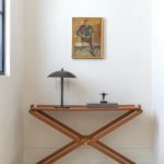
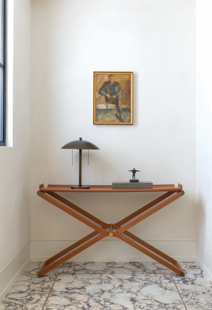
It’s a feeling that permeates throughout the home. It’s there in solid, thick doors, patterned after a 16th-century model used in the wine cave. It’s there in the heavy brass hardware, sourced from the Nanz Company. The Meljac NA’s brass lighting control panel, discovered during a research trip to France, offers an elegant inter- face with the home’s Lutron system. Custom furniture and vintage finds mingle with carefully chosen pieces from Thomas Hayes and Lawson-Fenning atop rugs from Mansour Modern and JH Minassian. “The object was to make everything elegant and purposeful, with things that will patina,” says Rehmann. “I think we re- captured that quality of California life that’s both classic and completely modern,” says Ziebell. “It has an integrity and quality that lasts.”
