Mix Master
Author:Lindsey ShookJeff Schlarb employs statement pieces as well as myriad patterns and textures, all of which yield an enthralling San Francisco residence
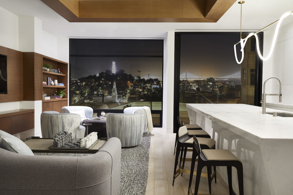
IN THE DESIGN REALM, contemporary is often associated with minimal, sterile and rigid. That’s far from the scenario, however, with this Russian Hill project that Jeff Schlarb completed last spring for a 40-something entrepreneur with two young daughters. “A lot of my clients and maybe even some designers are too scared to add traditional layers to a very contemporary residence,” says the founder of Jeff Schlarb Design Studio. “We use materiality choices that make it nice and clean but have the formality of traditional layers. It’s a really nice complement.”
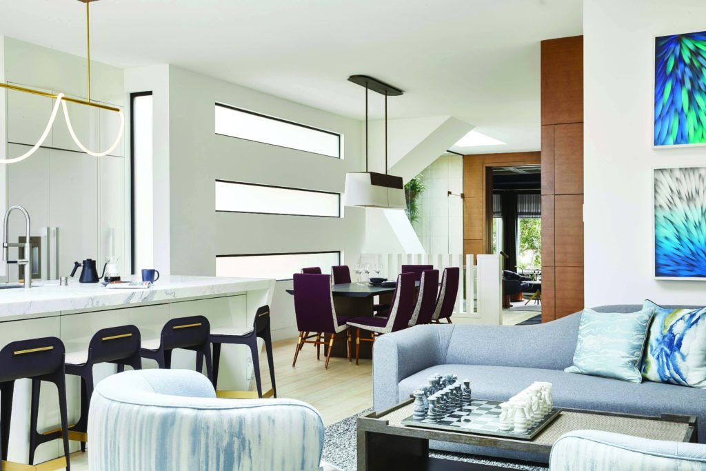
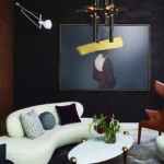
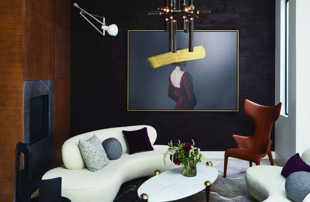
In the formal living room, a pair of cream-colored, sinuous Vladimir Kagan sofas flank an oval marble-and-brass coffee table, while a sculptural Philippe Starck-designed leather chair occupies a nearby corner. On an aubergine Venetian plaster wall hangs a commissioned Andrea Torres Balaguer painting that provides a visual punch to the room’s otherwise subdued palette. The lighting fixtures—a chandelier by Jason Miller and a vintage swing-arm sconce by Paolo Rizzatto—balance form and function to arresting effect.
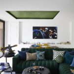
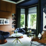
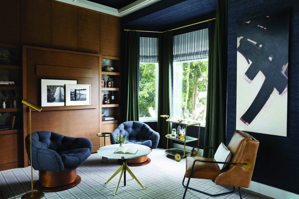
The living room is situated between the den and the open-plan kitchen, dining and family area. In the den, existing rich wood paneling sets the tone for an inviting space; the rest of the walls, as well as the coffered ceiling, are lined in navy grasscloth. A couple of tufted gray wool chairs and a leather chair rest atop plaid carpeting that “hugs the entire room,” says Schlarb. Pinstripe Roman shades are combined with British racing green drapes, which nod to the homeowner’s heritage. Brass accents—the curtain rods, side-table legs, bar cart and floor lamp—permeate the scheme.
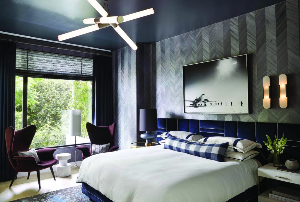
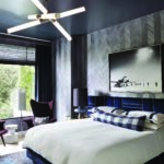
In the client’s bedroom, an “exaggerated” custom headboard that stretches beyond the king-size bed is wrapped in navy velvet with contrast piping. Rather than positioning sconces symmetrically on either side of the bed—as might be expected—Schlarb installed two bronze-and-alabaster sconces over a single side. When switched on, he observes, “it shows the minerality of the stone.” The opposite side of the bed is illuminated by a table lamp with a bulbous frosted-glass base. The walls are covered in Phillip Jeffries’ Against the Grain, composed of thin wood veneers that are dyed, cut into strips and arranged in a chevron pattern.
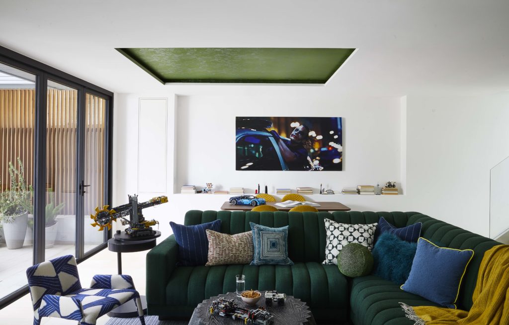
Schlarb’s enthusiasm for this project is palpable. Recalling the covetable furnishings, accessories and art in the four-story abode, descriptors such as “killer,” “cool” and “extraordinary” pepper the conversation. “We kept it really simple, but all the pieces have a sculptural, artistic quality in their own right,” he elaborates. “We didn’t try to over-design or over-furnish. We just let the pieces have a nice conversation together.” – Anh-Minh Le
